
Colour harmony10
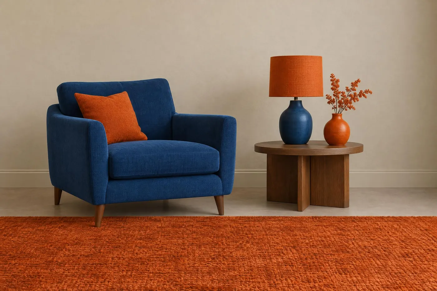
Complementary
Two colours from opposite sides of the wheel, and nothing else.
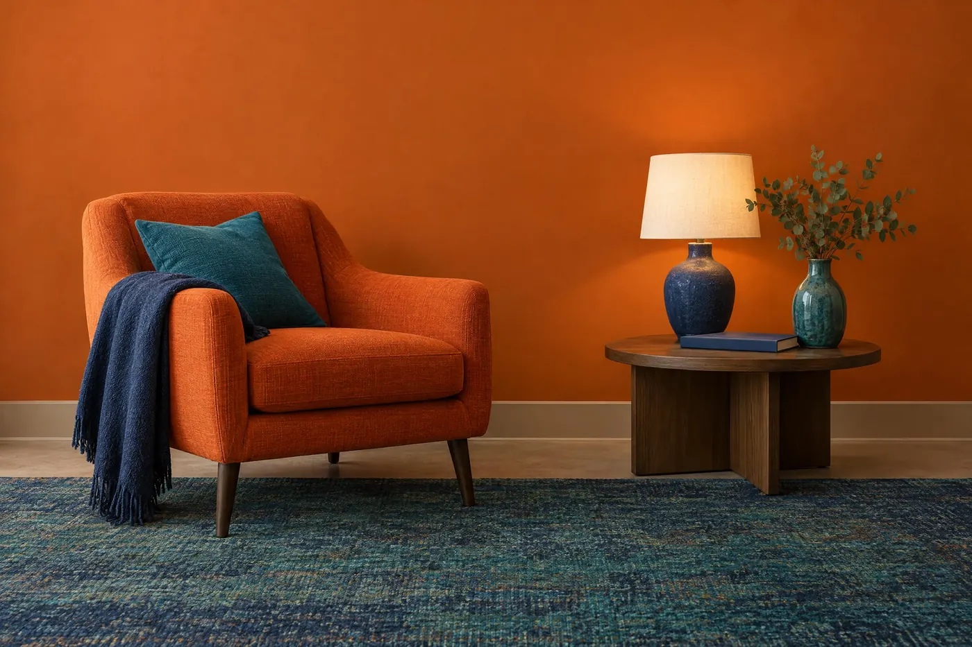
Split-Complementary
One colour against the two sitting either side of its opposite.
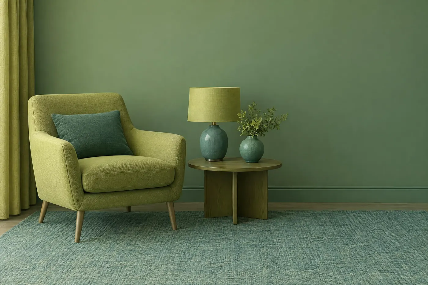
Analogous
Three or four neighbours on the wheel, with no opposition anywhere.
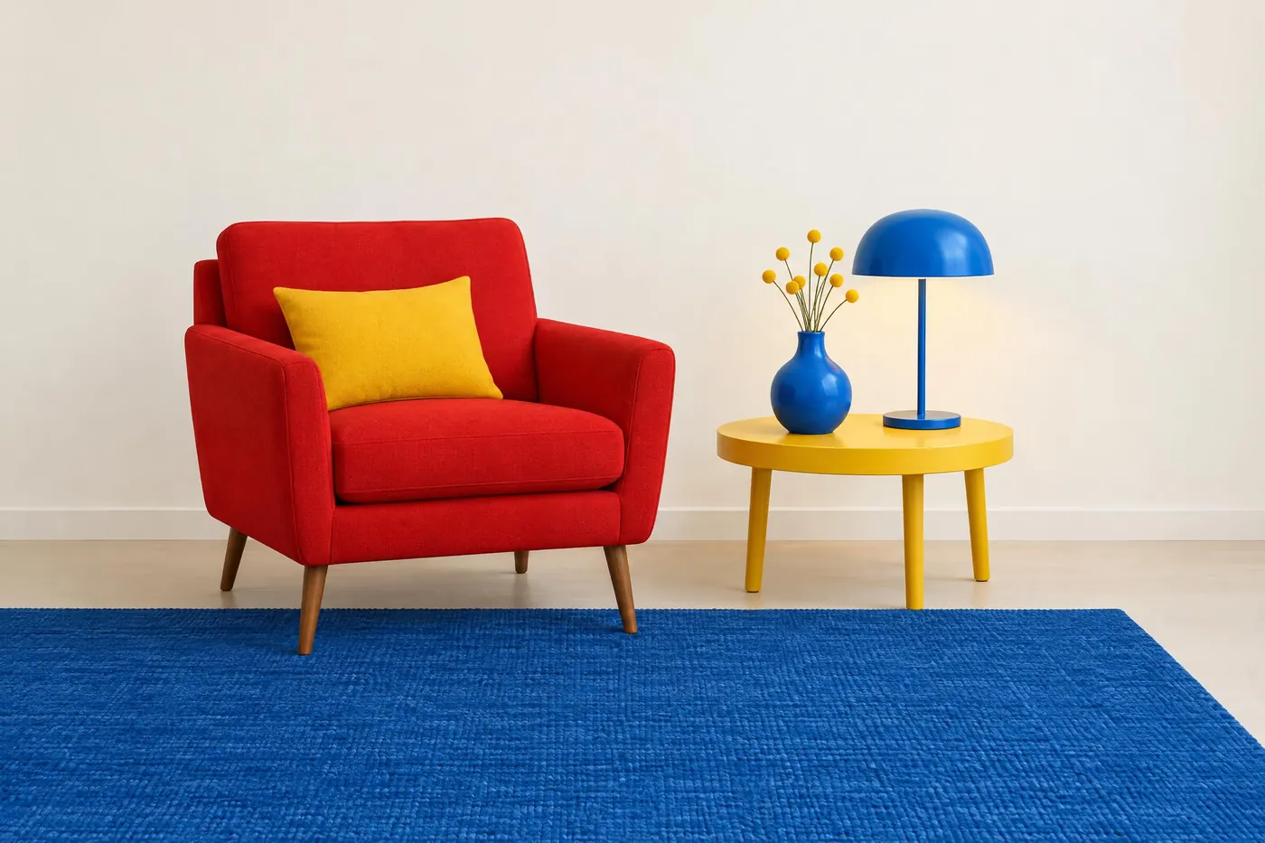
Triadic
Three colours spaced evenly around the wheel, balanced and loud.
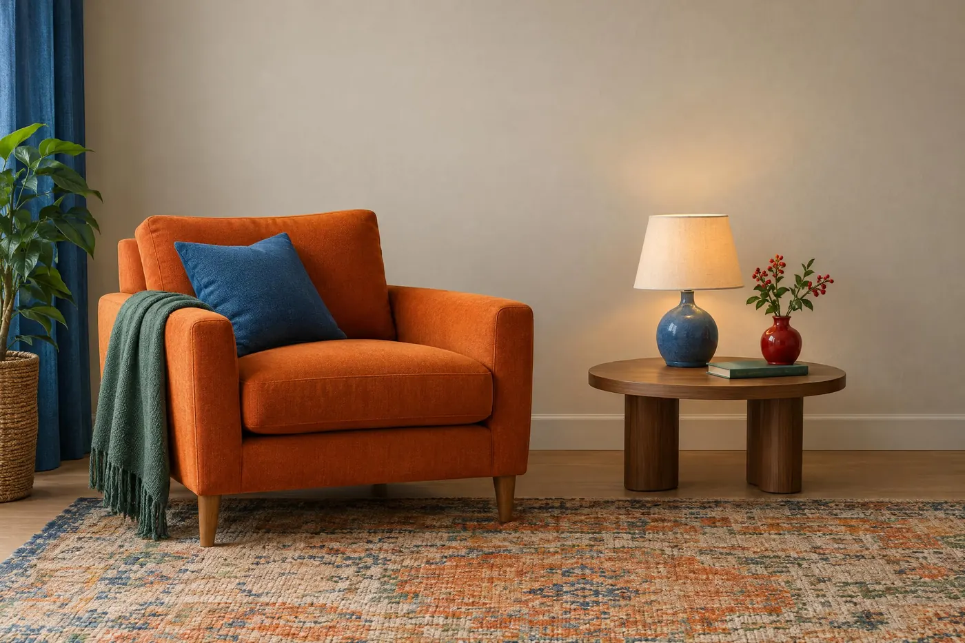
Tetradic
Two complementary pairs at once. The richest scheme, and the hardest to hold.
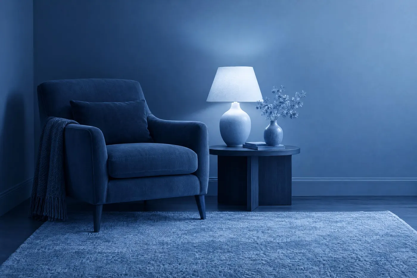
Monochromatic
One hue, five values. Everything separates by light and dark alone.
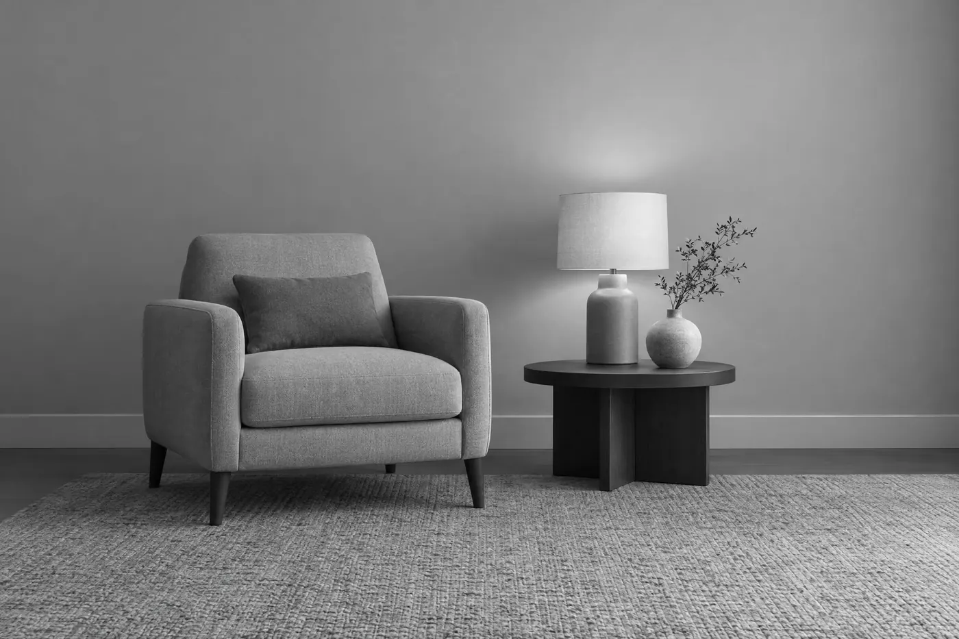
Achromatic
No hue at all. Black, white and the greys between them.
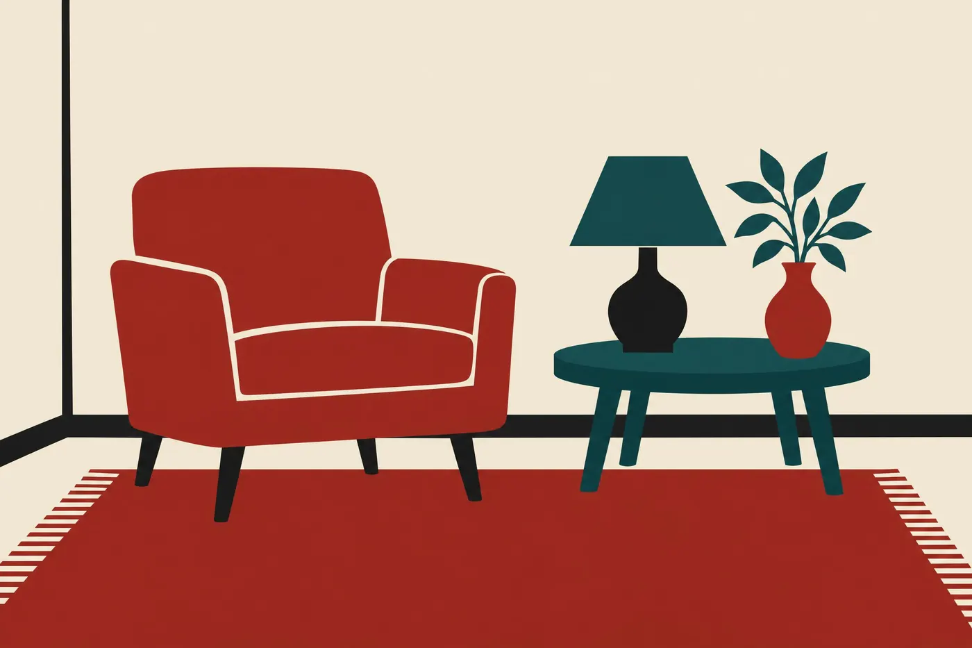
Limited Palette
A small fixed set of colours, chosen freely and then strictly obeyed.
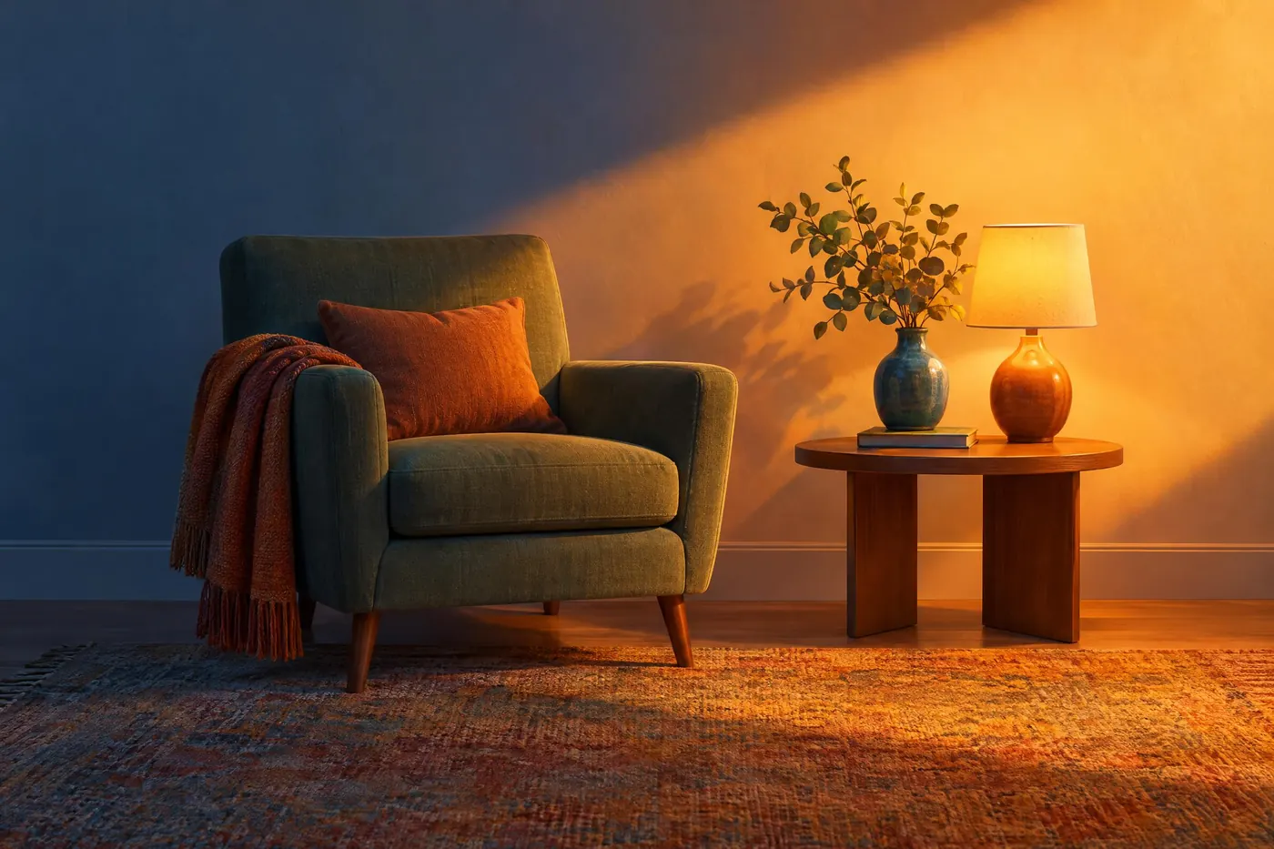
Warm and Cool Split
The picture divided by temperature rather than by hue. Warm light, cool shadow.
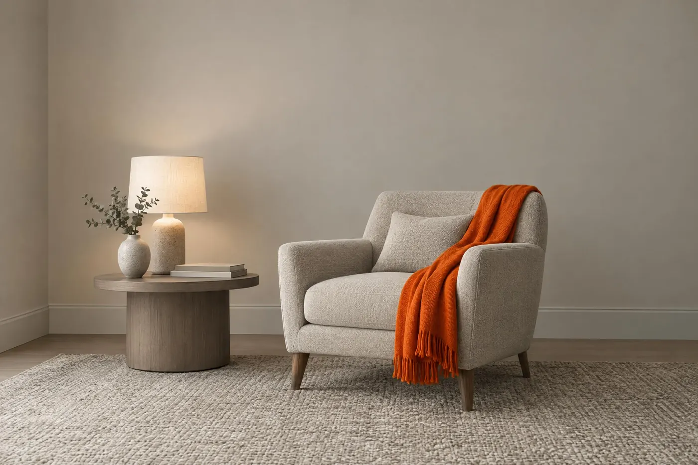
Neutral and One Accent
A neutral picture with one saturated colour, placed where you want the eye.
Period palettes15
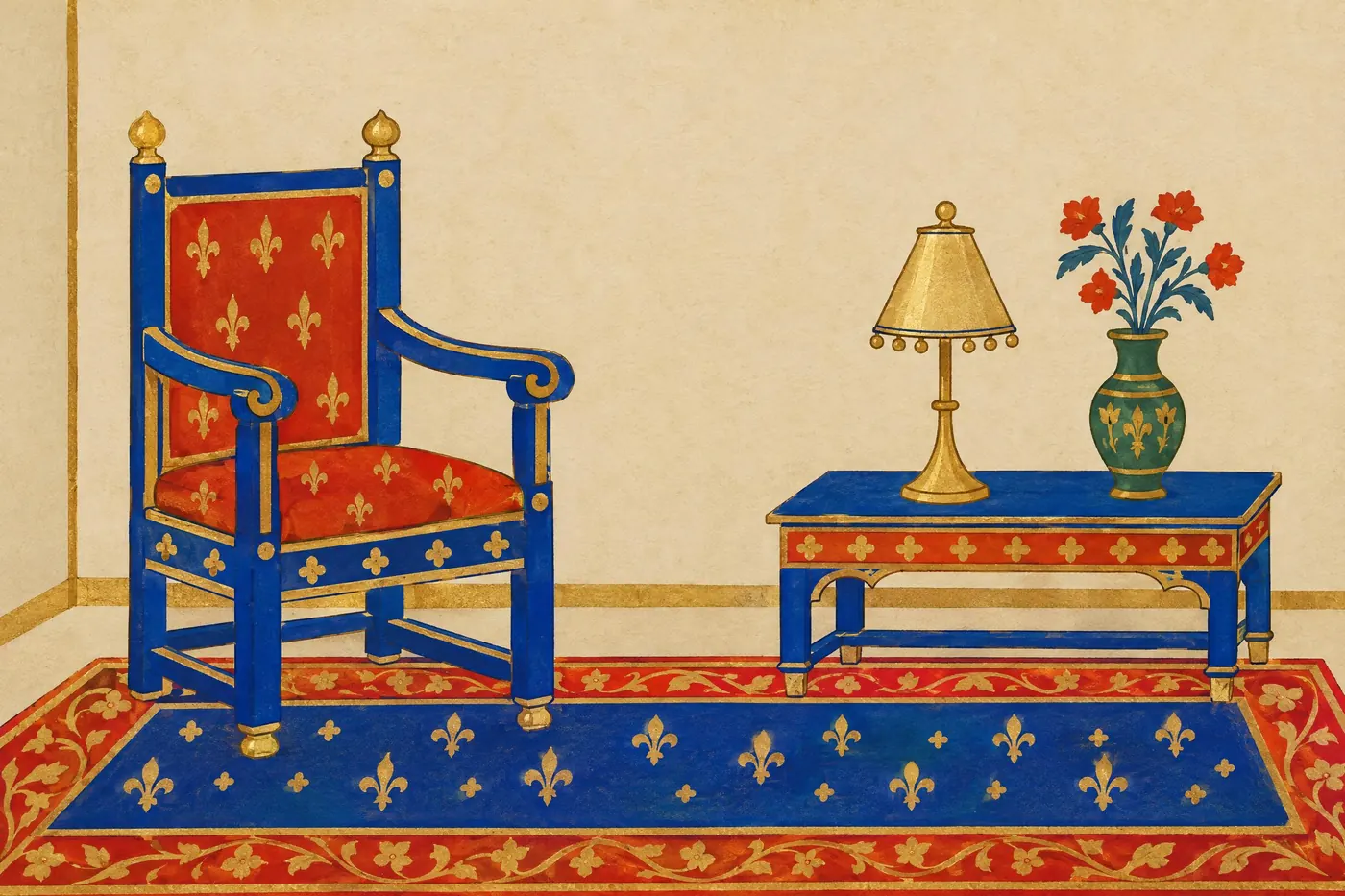
Medieval Manuscript
Lapis blue, vermilion and gold leaf laid flat on undyed vellum.
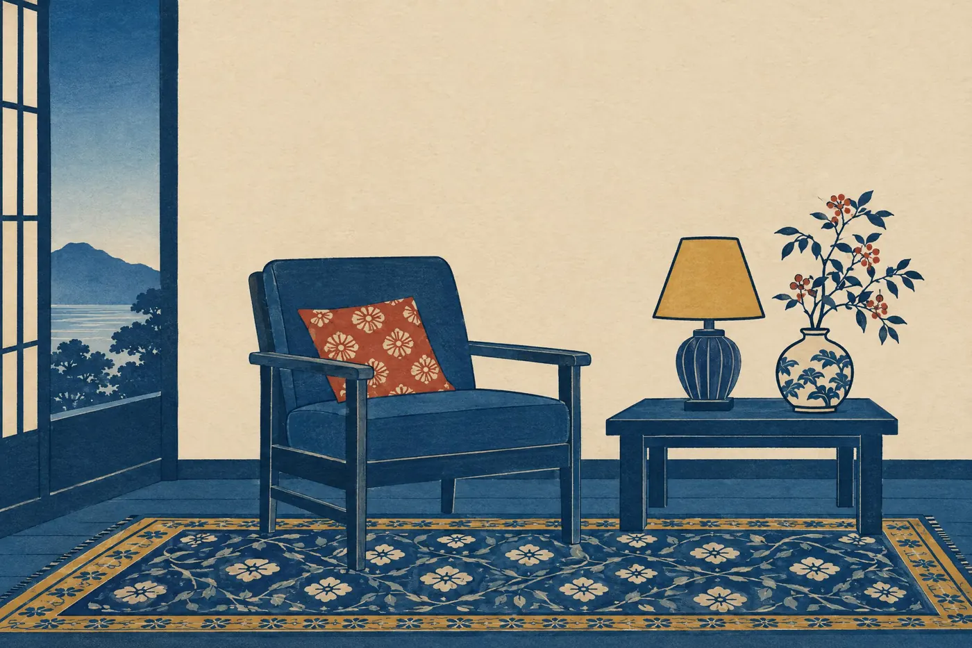
Ukiyo-e Indigo
Two blues carrying the picture, with one earth red and a dull mustard as accents.
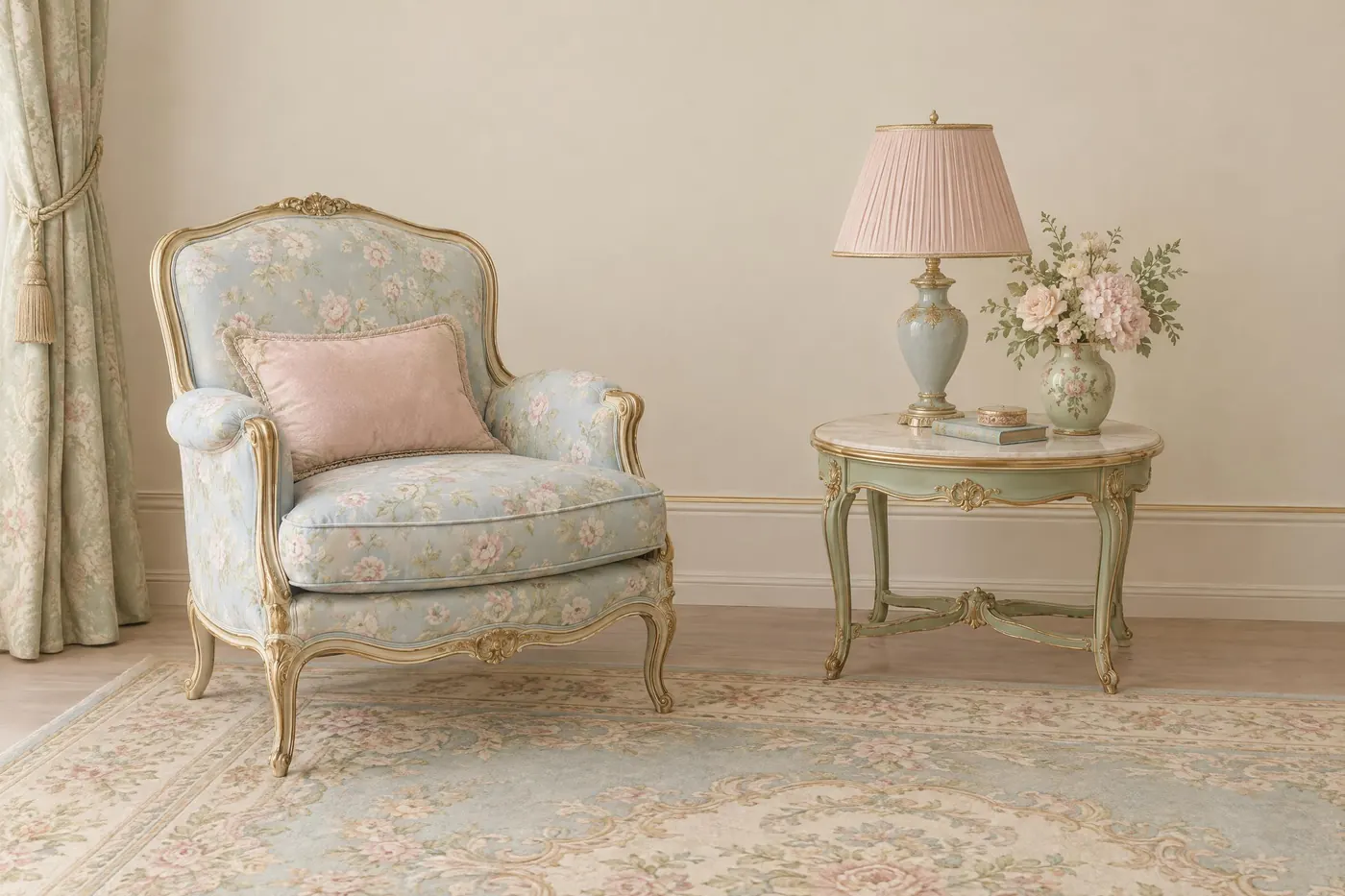
Rococo Pastel
Powder blue, rose and pistachio at half strength, held together by cream and gilt.
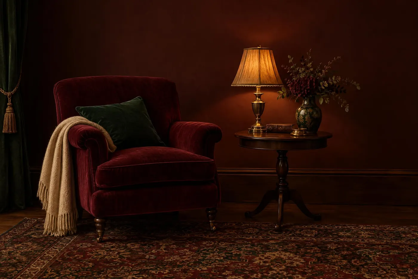
Victorian Parlour
Burgundy, bottle green and walnut lit low, with dull gold as the only bright thing.
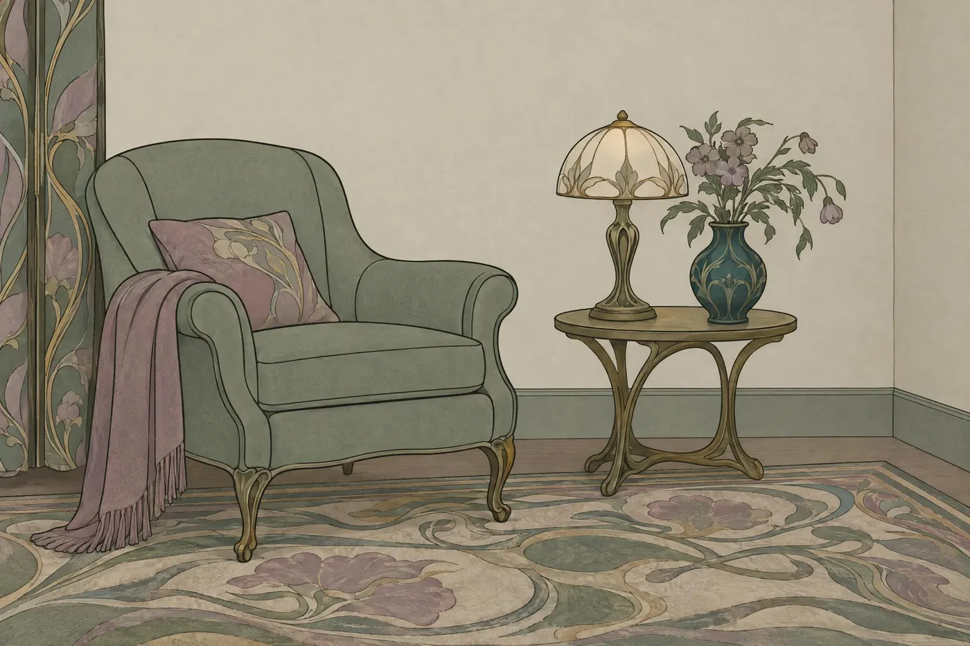
Art Nouveau Sage
Sage and soft mauve with old gold, every colour greyed down, on ivory.
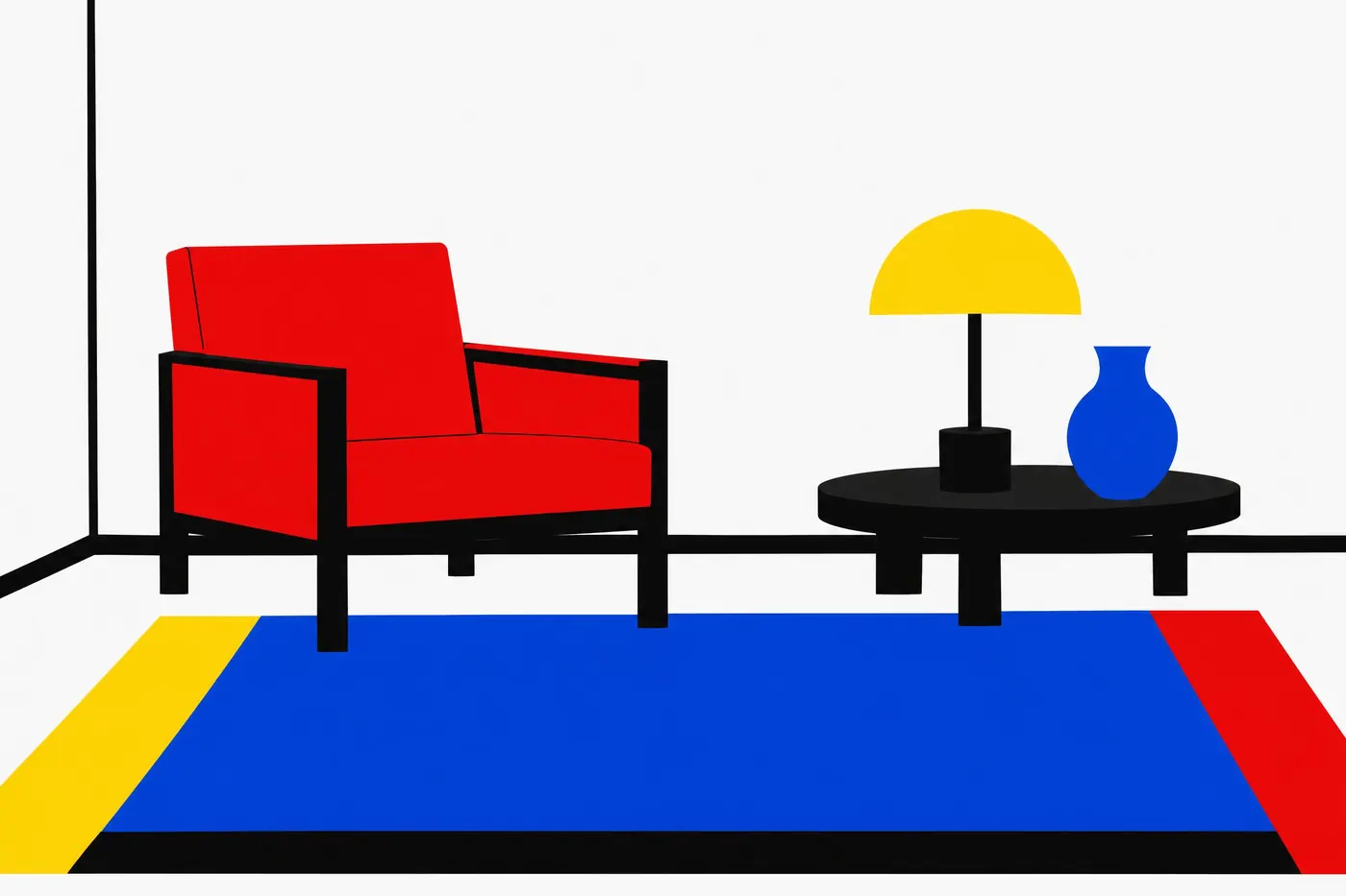
Bauhaus Primaries
Red, yellow and blue at full strength, plus black and white, and nothing else.
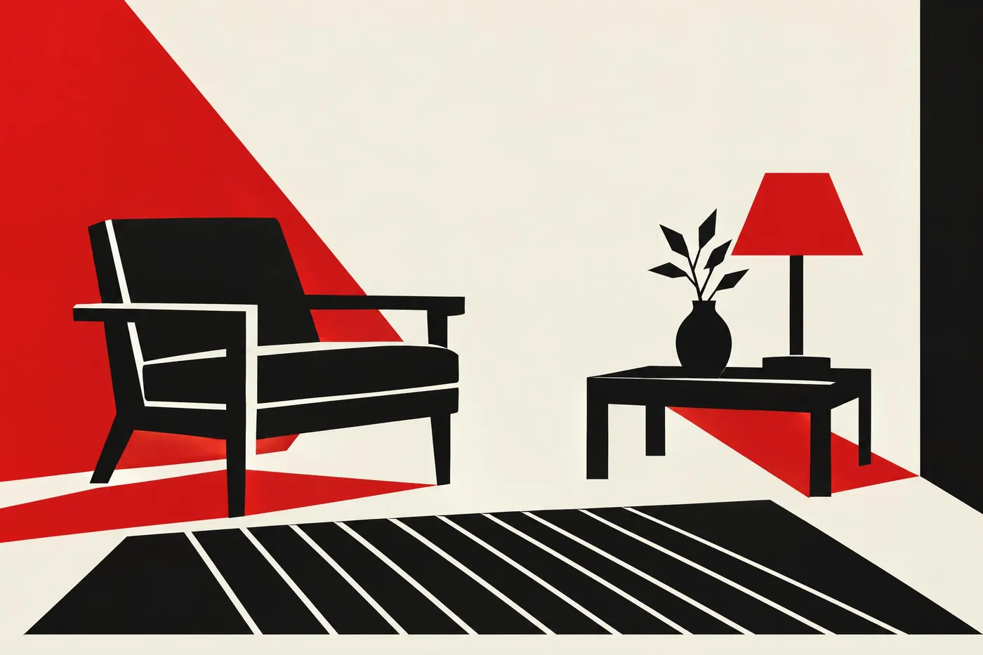
Constructivist Red
One red and one black on cheap paper, with no third colour allowed in.
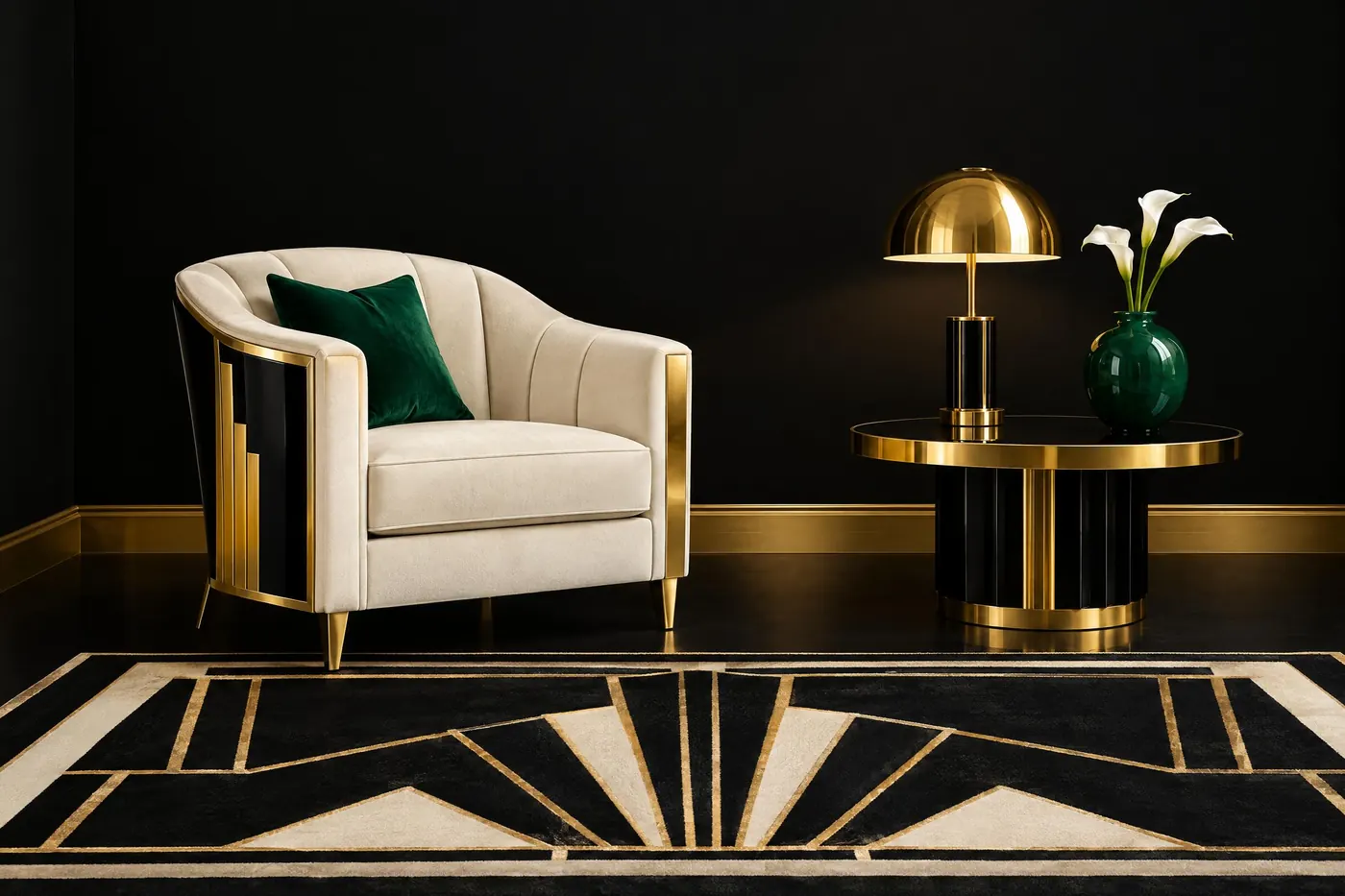
Art Deco Gold and Black
Black and polished gold, with ivory and one jewel colour to stop it becoming a logo.
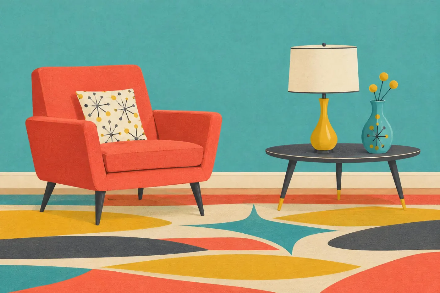
Fifties Atomic
Turquoise and coral against charcoal and cream, with mustard doing the shouting.
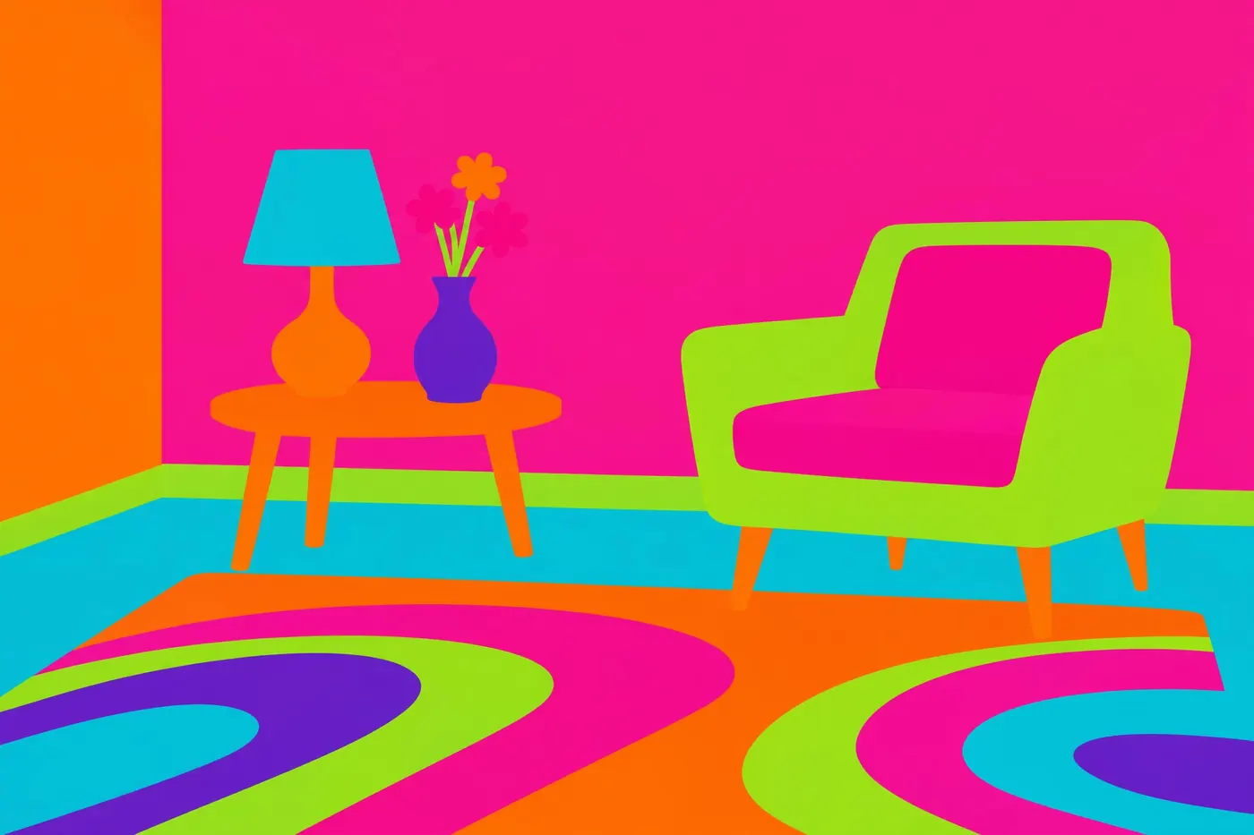
Sixties Pop
Hot pink, orange and lime at full strength, flat, with nothing to calm them down.
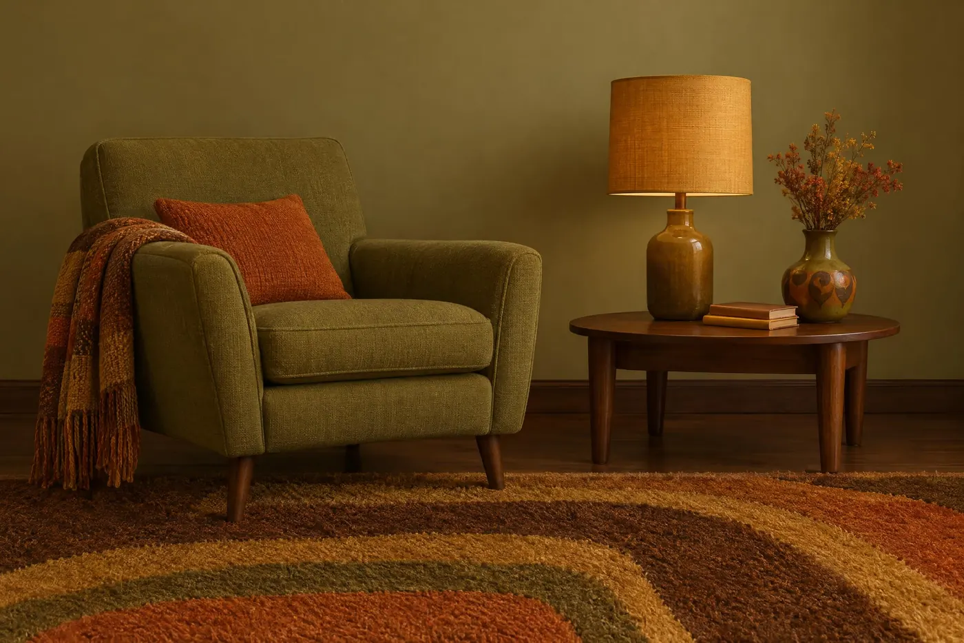
Seventies Earth
Avocado, harvest gold and burnt orange over brown, with every hue pulled toward earth.
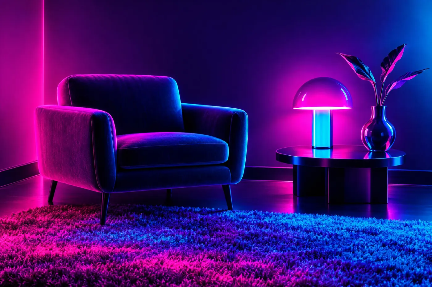
Eighties Neon
Magenta and cyan glowing on black, with violet between them and nothing neutral.
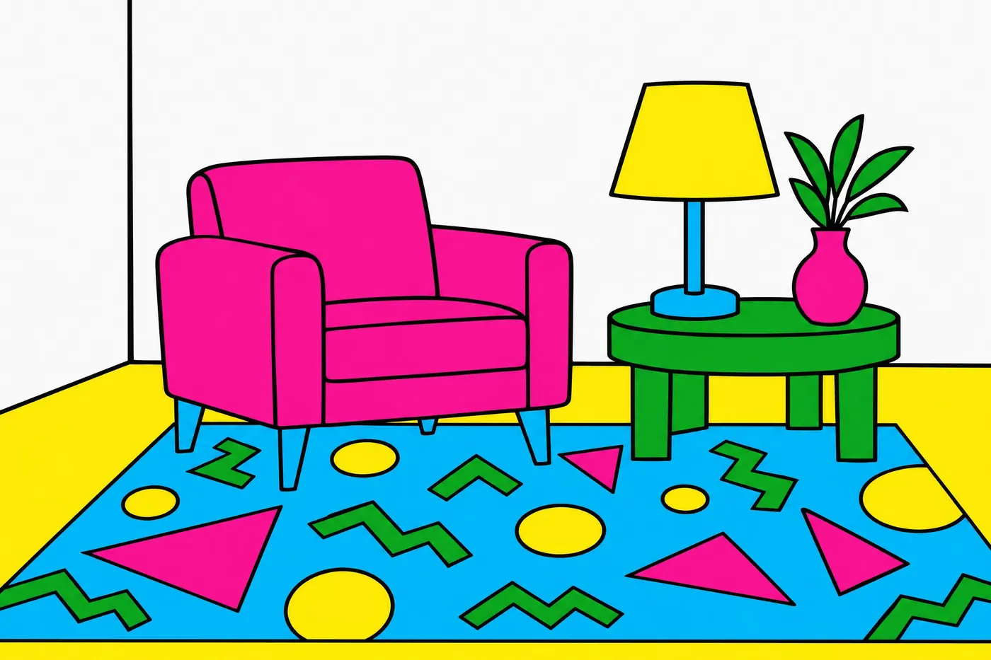
Memphis Clash
Four bright colours chosen not to go together, on white, with black doing the drawing.
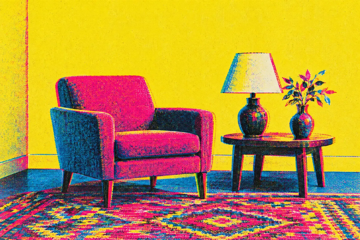
Nineties CMYK
The four printing inks used raw and overprinted, with no colour correction.
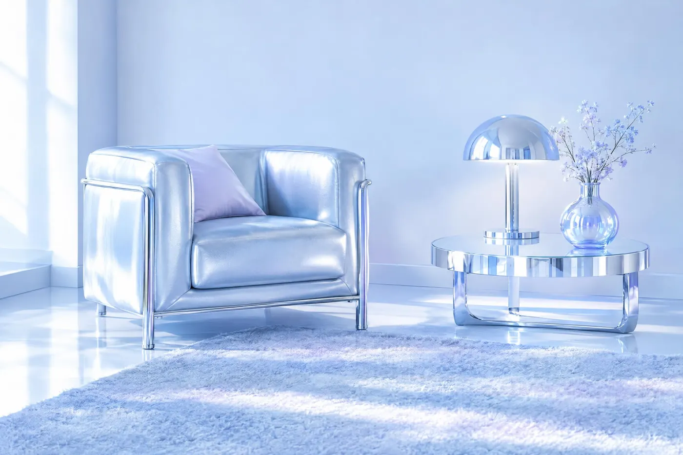
Y2K Chrome and Ice
Brushed silver and ice blue with a lilac tint, lit from every side at once.
Screen palettes12
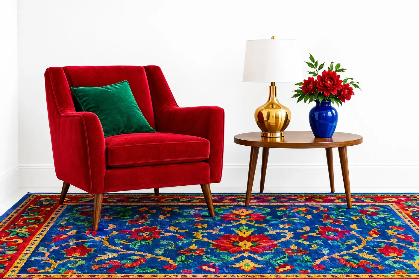
Technicolor Three Strip
Ruby, emerald and sapphire at full strength, on brilliant white.
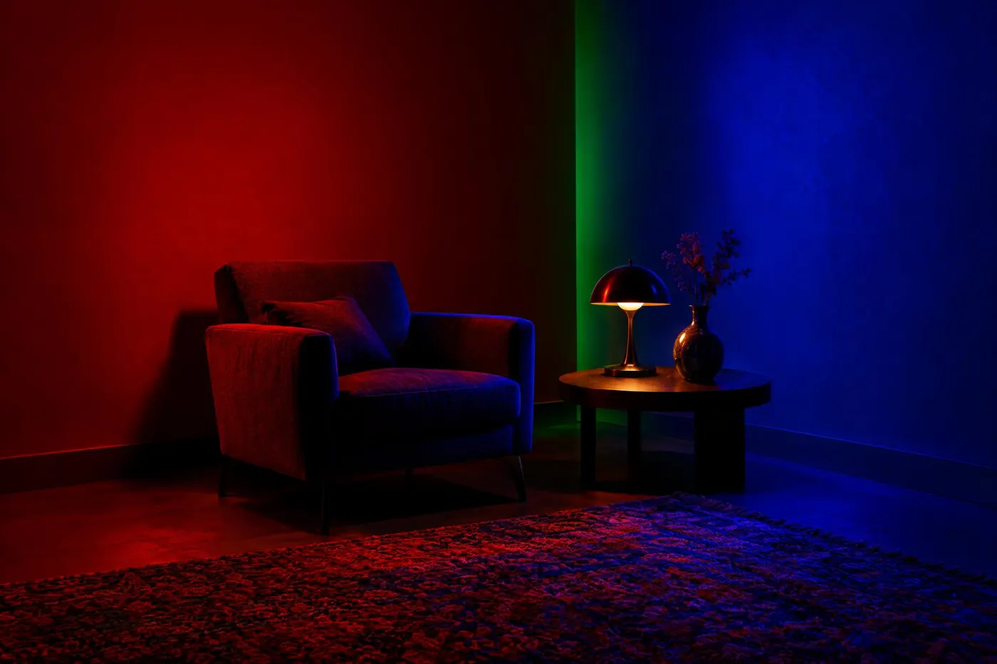
Primary Gel Wash
Saturated coloured light thrown across a dark room, one hue per surface.
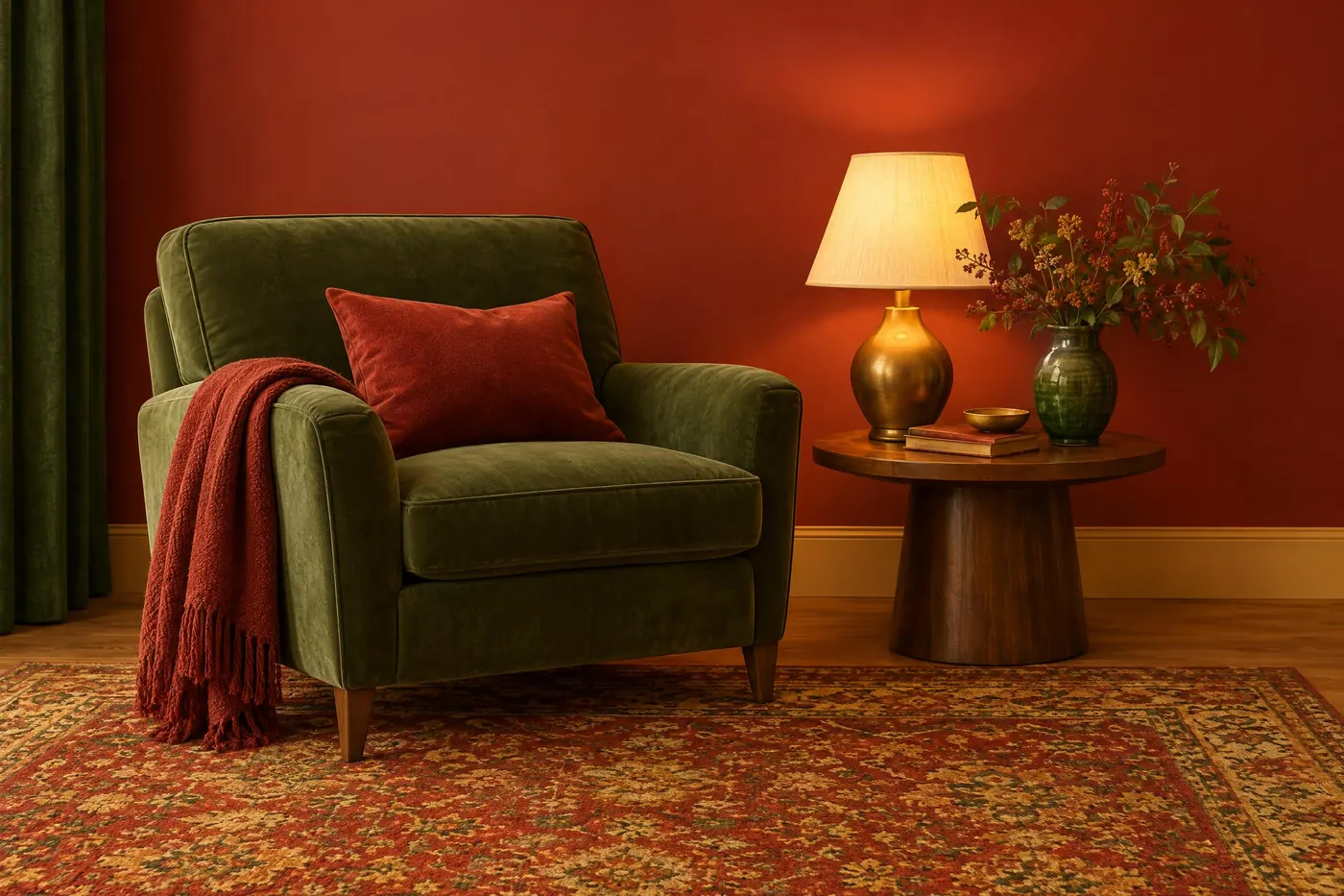
Red and Green Glow
Warm red and bottle green held together by gold, with every surface kept warm.
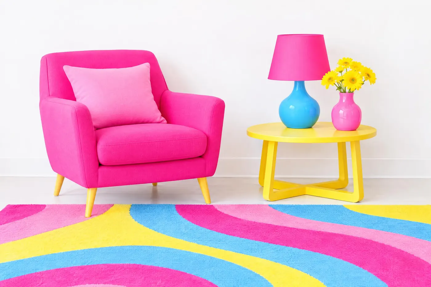
Bubblegum Pop
Hot pink leading, sky blue supporting, and nothing darker than a mid tone.
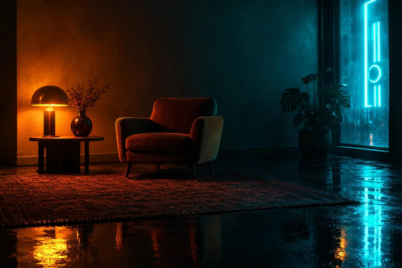
Amber and Cyan
Amber light sources against cyan haze, on a black wet ground.
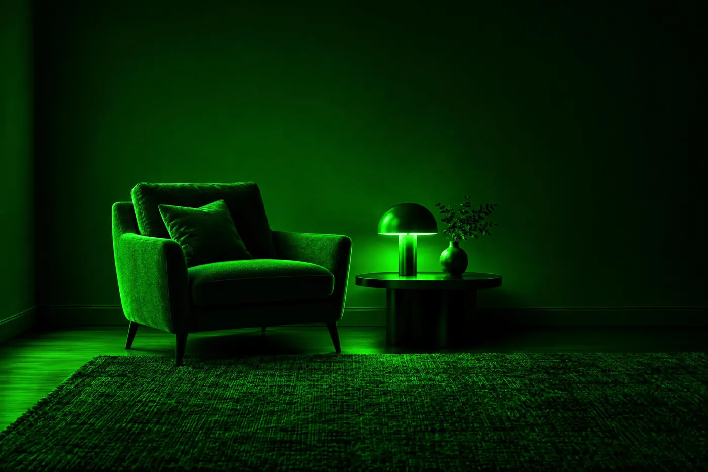
Digital Green
One green hue at every value on black, as if a screen were the only light.

Night Blue and Magenta
A deep indigo night with magenta light cutting across it.
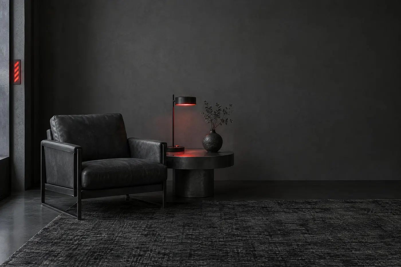
Warning Red
A steel grey world with one red, used as a signal rather than as decoration.
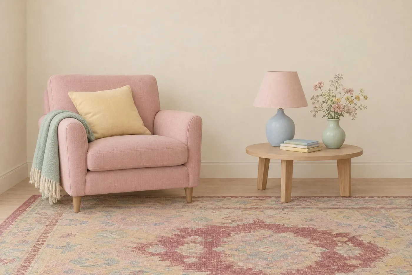
Pastel Symmetry
Chalky pastels in flat even light, with one muted deep colour to anchor them.
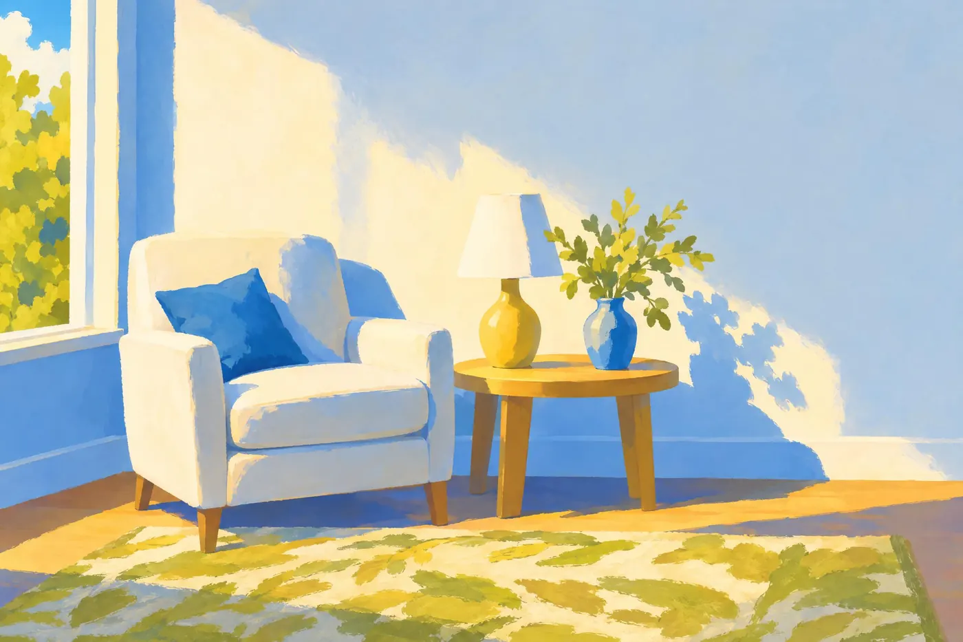
Anime Sky
A deep cerulean sky over painted greens, with the clouds kept pure white.
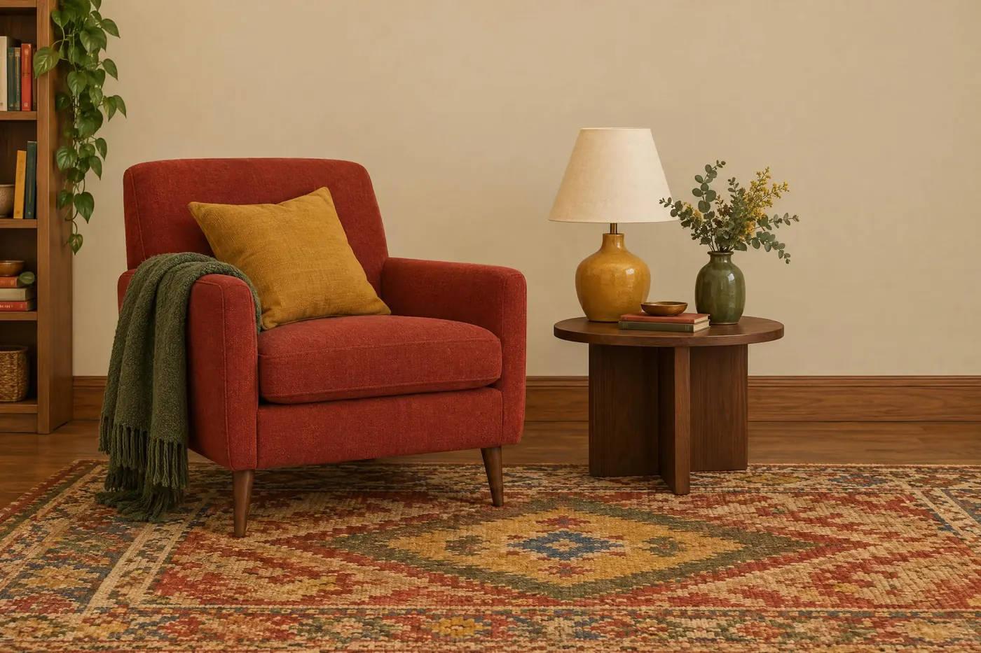
Sitcom Brights
Warm primaries on wood and cream, lit flat so nothing falls into shadow.
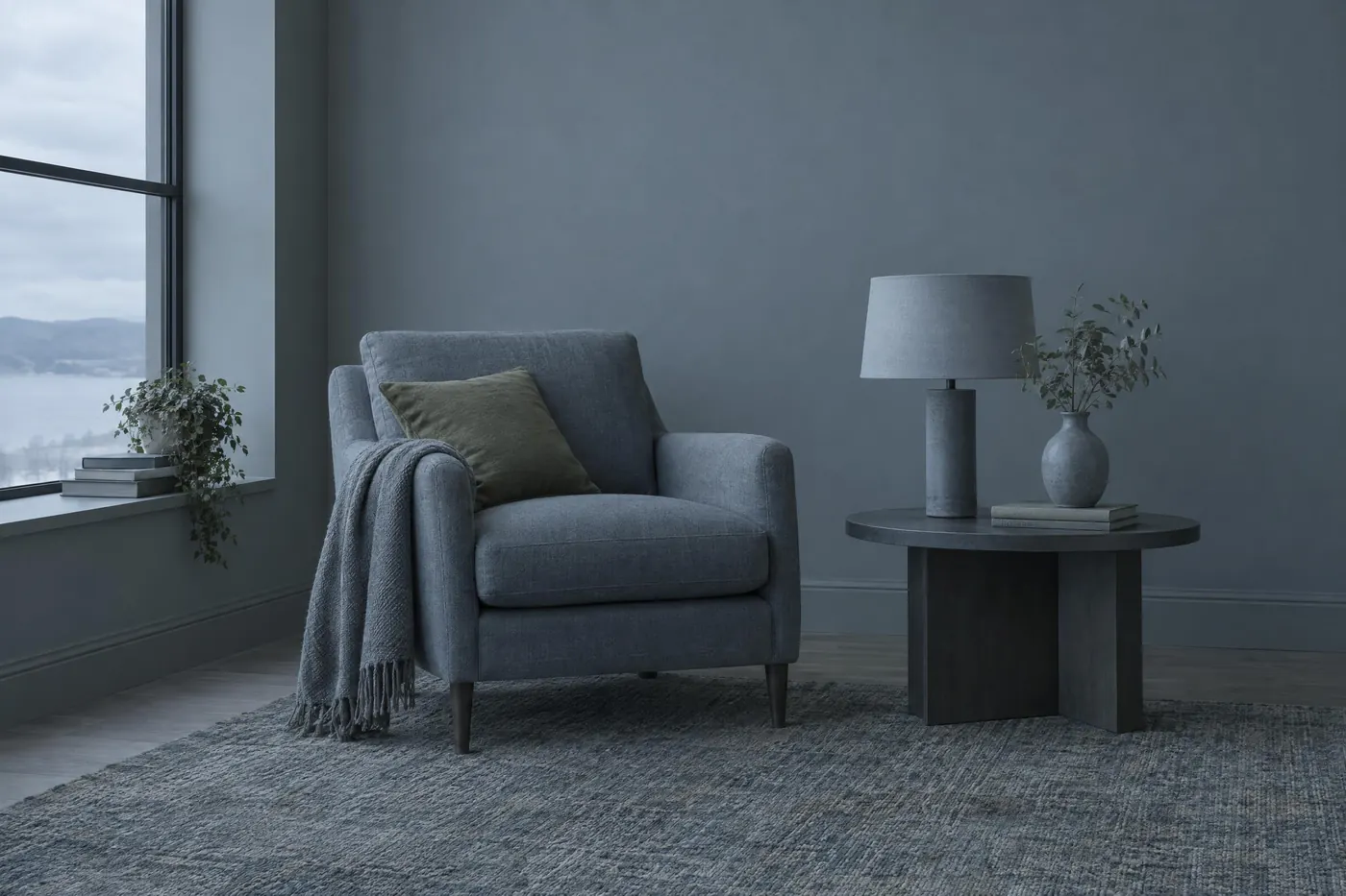
Steel Blue Grey
Cold blue-greys with one dull olive, and no warm colour anywhere.
Nature and material12
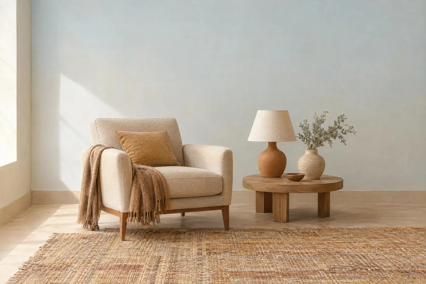
Desert Sand
Pale sand and warm clay, held down by grey green scrub and a bleached sky.
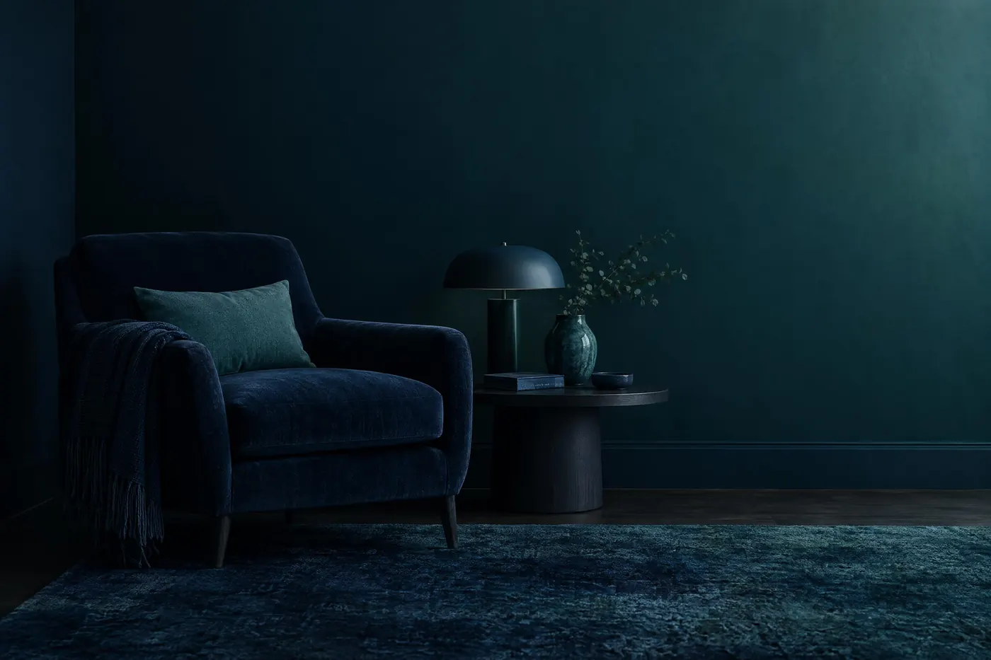
Deep Ocean
Near black to teal in one long climb, with a single pale foam note at the top.
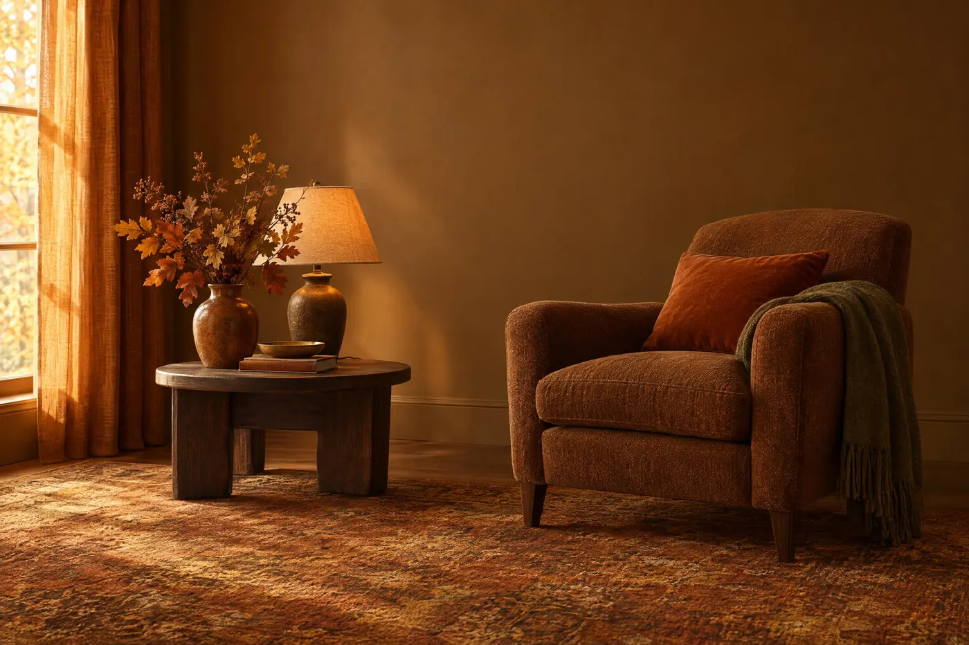
Autumn Woodland
Dark bark under russet, amber and gold, with one olive green left over from summer.
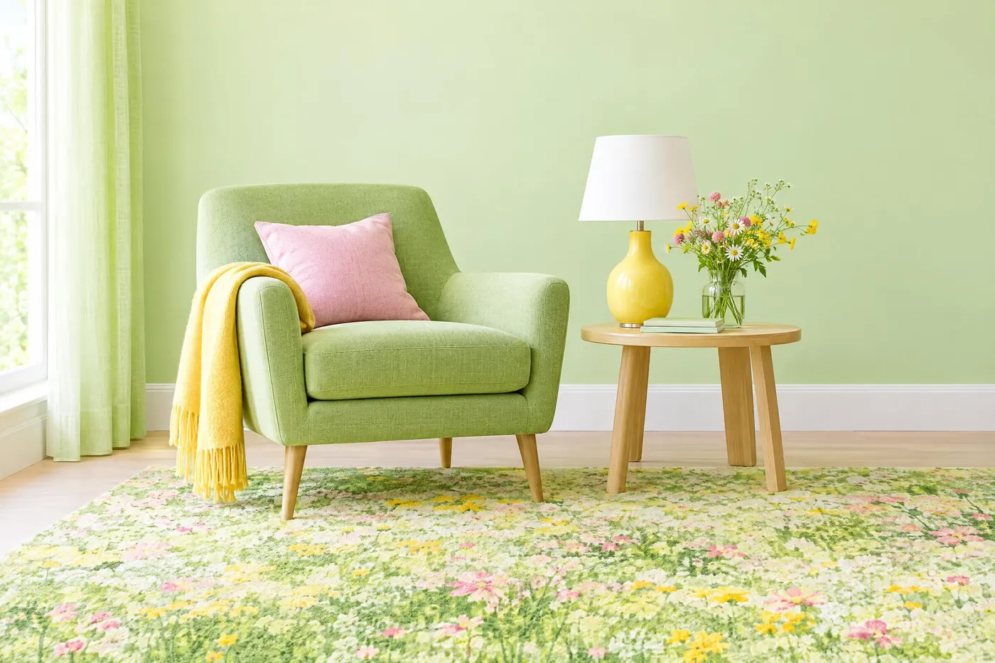
Spring Meadow
Four greens climbing from pale to deep, with a buttercup yellow and a clover pink in them.
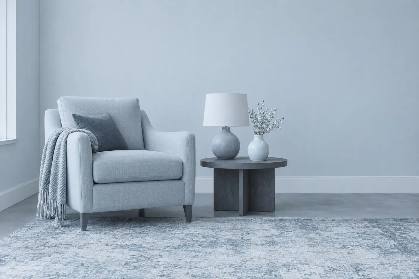
Alpine Snow
White to slate in five cool steps, with the weight held at the light end.
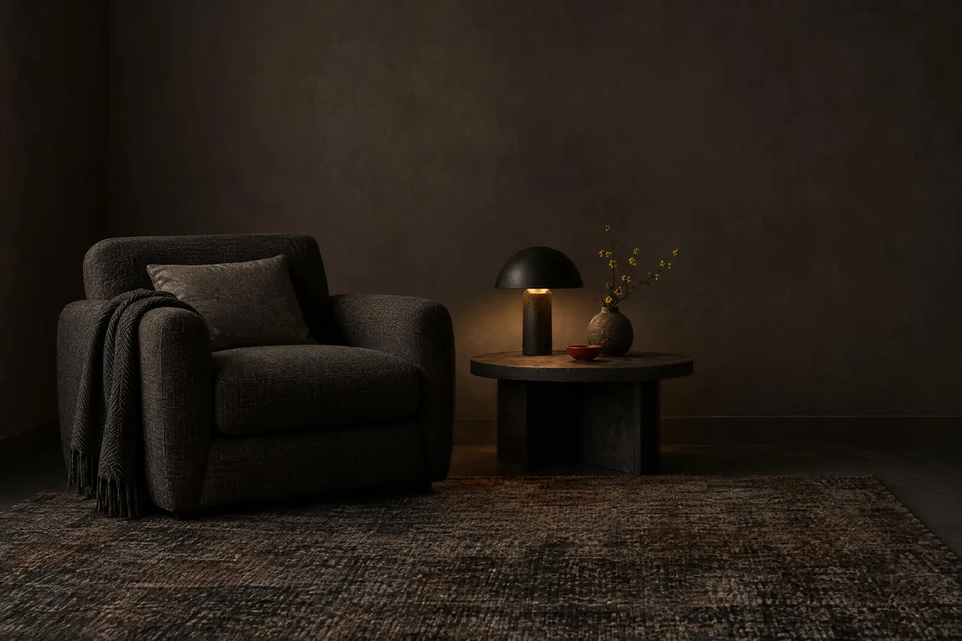
Volcanic Basalt
Four steps of black rock and ash, lit by one ember red and one sulphur gold.
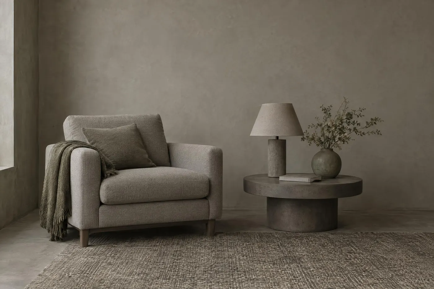
Concrete and Moss
Four warm greys with two greens growing out of the damp ones.
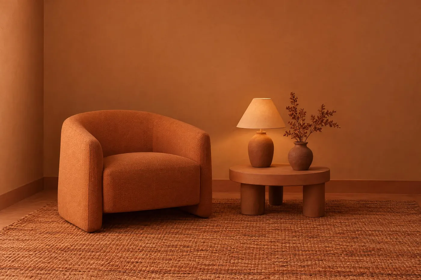
Terracotta
One clay colour at six depths, from raw slip to a hard fired brown.
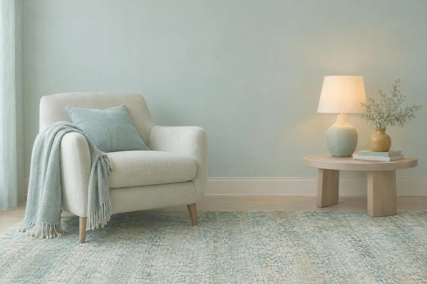
Sea Glass
Frosted greens and a soft blue, with one amber and a chalky off white.
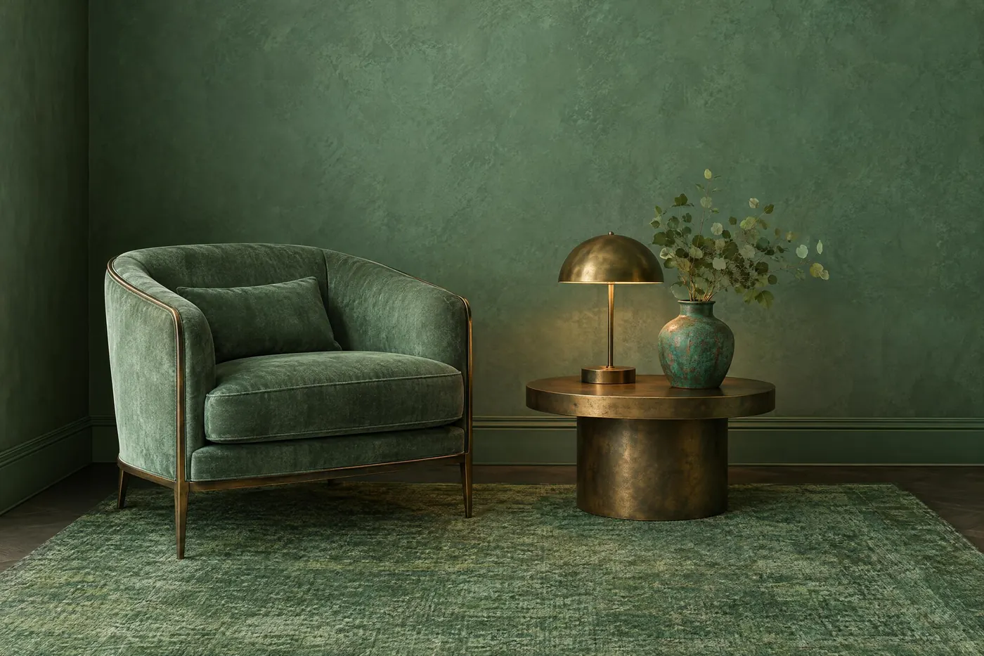
Verdigris
Four patina greens over the bare bronze and brass they came from.
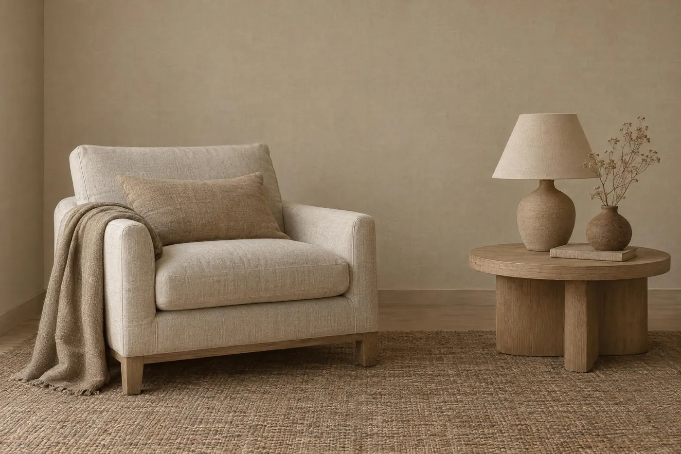
Raw Linen
Six undyed fibre tones, from bleached flax to a dark unwashed brown.
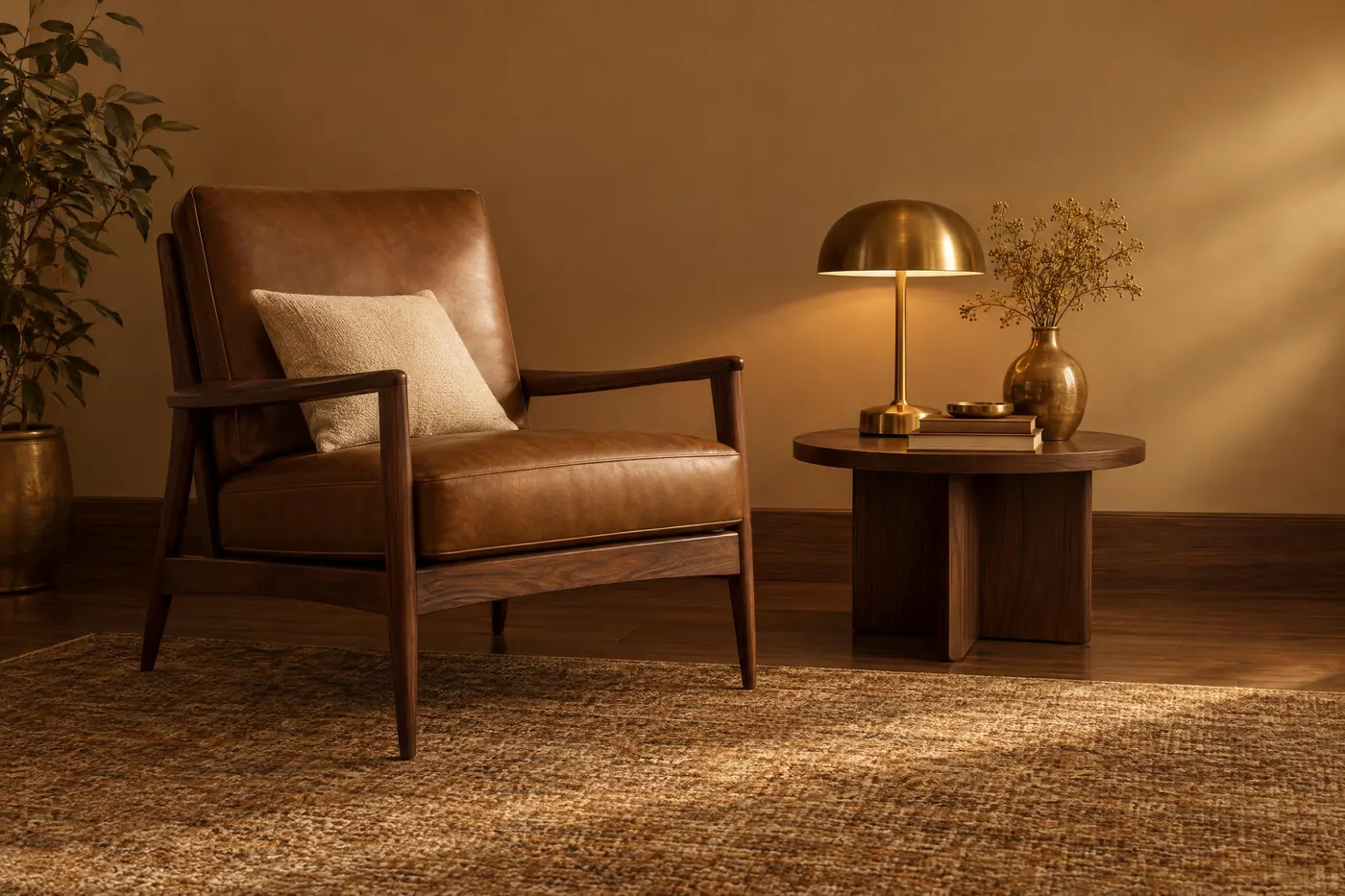
Brass and Walnut
Dark wood climbing into warm metal, with one cream to lift it.
Functional palettes10
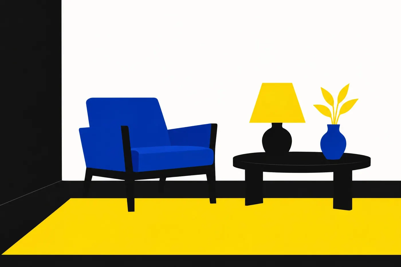
High Contrast
A near-black ground with white, yellow and cyan on it, every pair well past 7 to 1.
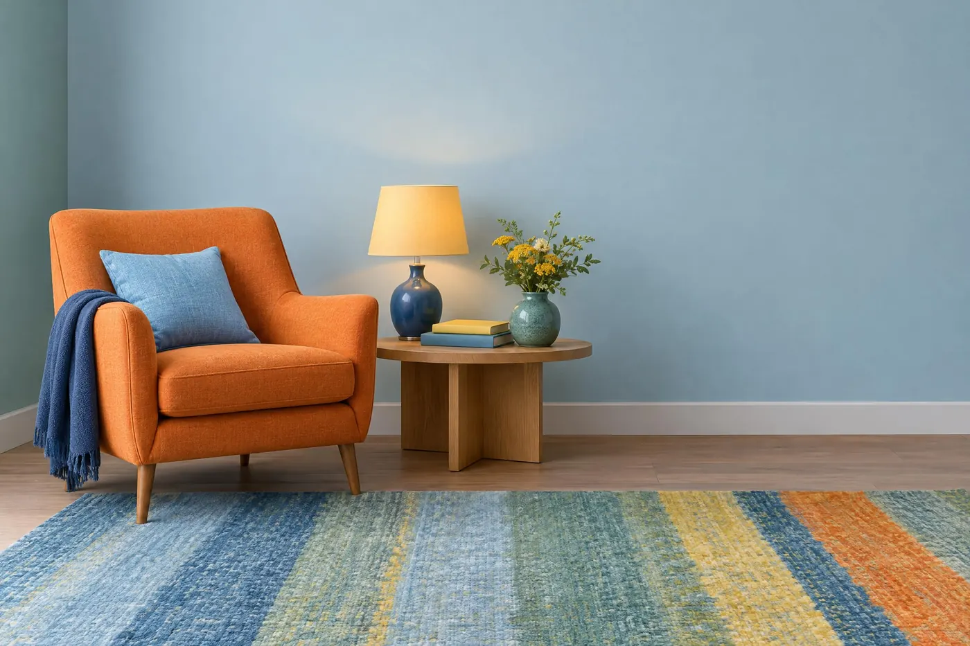
Colour Blind Safe
Six hues from the Okabe and Ito set, which stay apart for the common kinds of colour blindness.
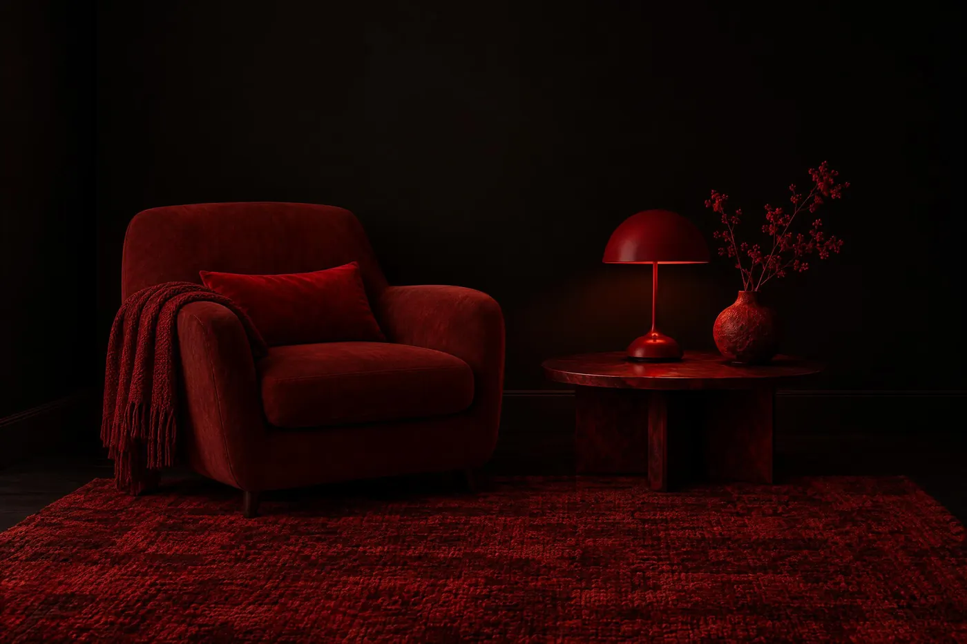
Night Safe Red
Deep reds on pure black, so a reader keeps their dark adapted eyes.
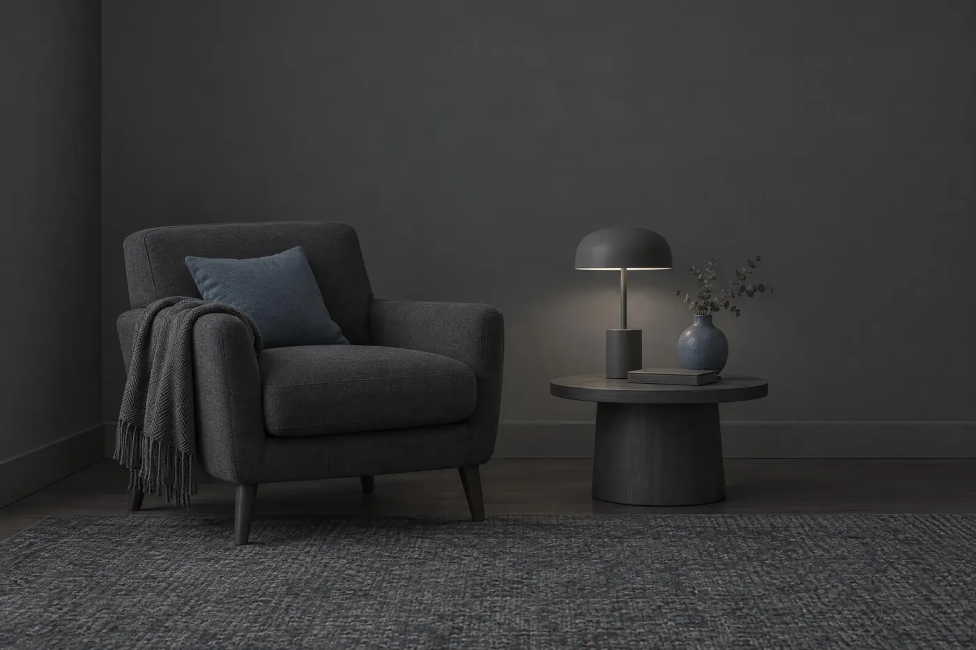
Dark Interface
Three near-black surfaces, two greys of text and one cool accent.
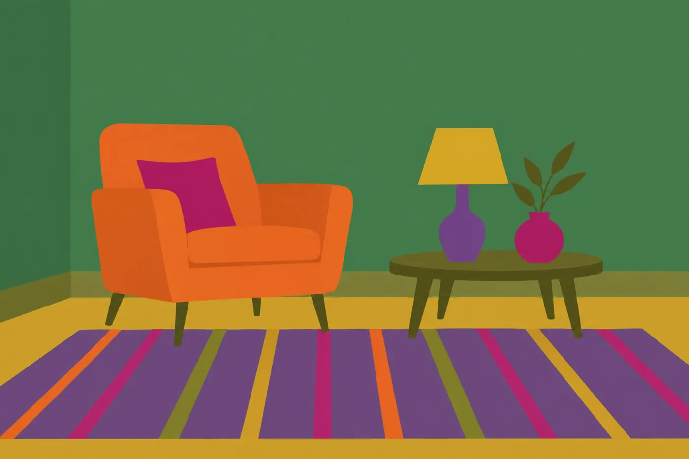
Categorical Data
Six unrelated hues held at one depth, for six things that have no order.
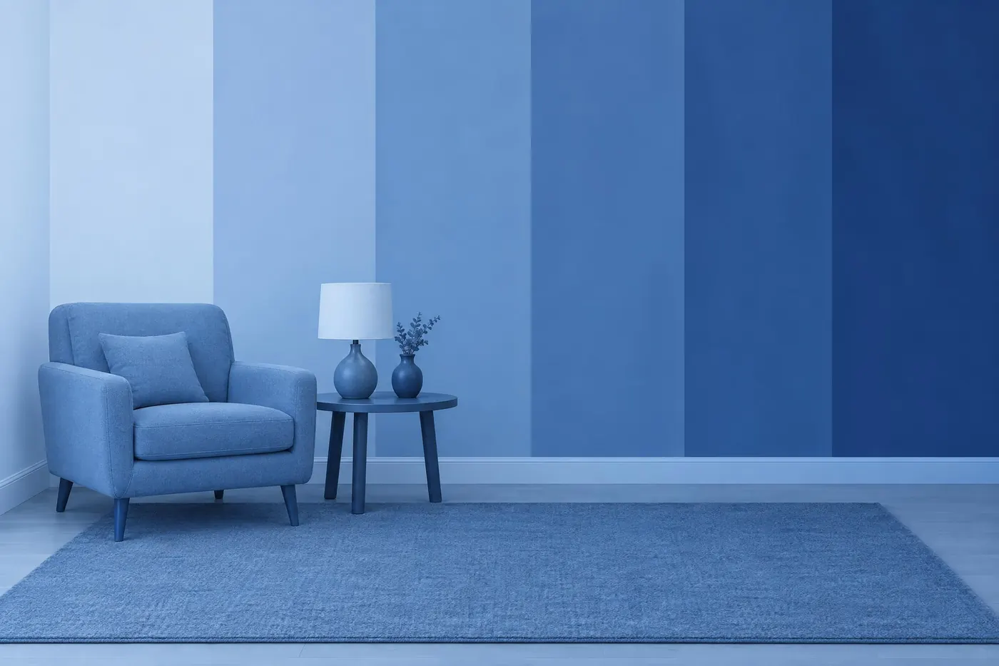
Sequential Data
One hue in six even steps, pale to deep, for a number that goes up.
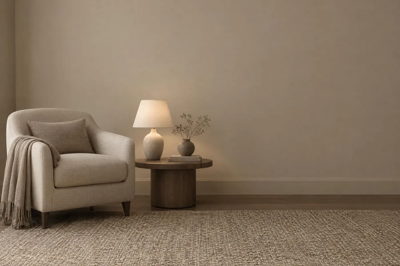
Brand Safe Neutrals
Six warm neutrals, pale to near-black, that sit under anybody's logo.
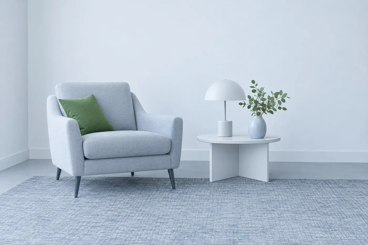
Clinical White
Cool whites and pale blue greys, with one green for the instrument.
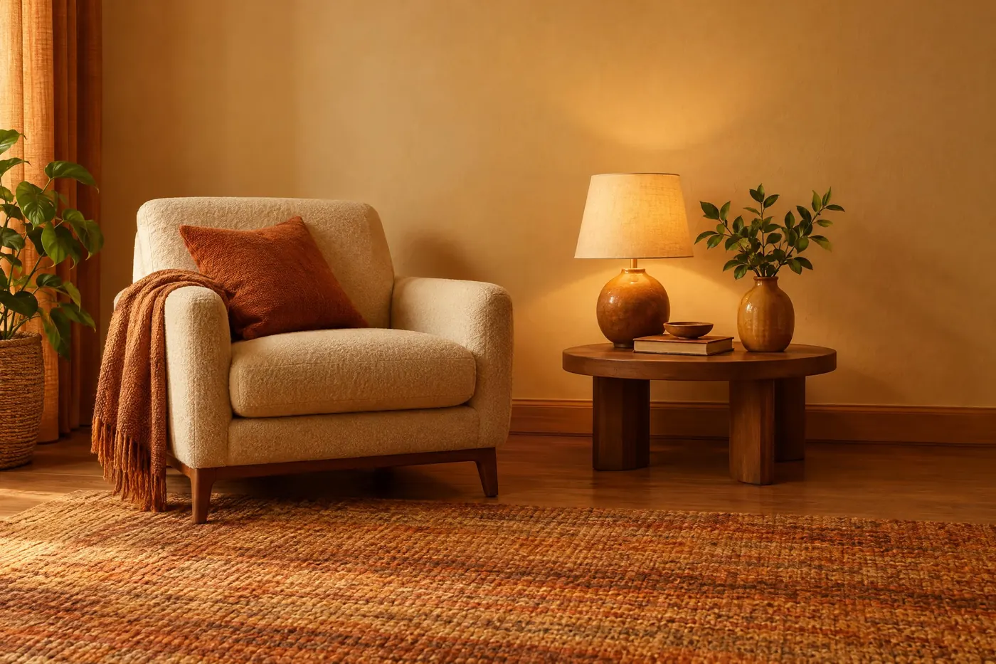
Food Warm
Creams, honey ambers and roasted browns, with one green for something fresh.
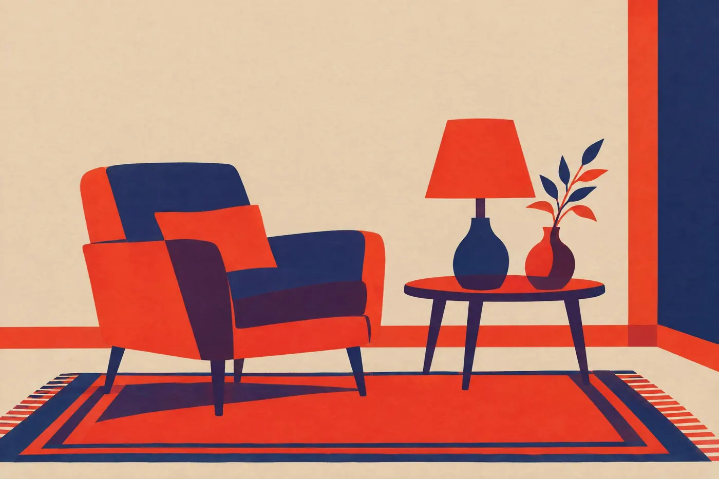
Two Ink Duotone
Two inks and the paper, plus the third colour where the two cross.
Three rules under all of them
- Words beat hex codes
- A model will not honour #A3B18A. It will honour muted sage. The hex is for your design tool and the sentence is for the prompt.
- Give one colour the room
- Split evenly and two colours fight. Hold one to about a fifth of the picture and let the other carry the rest.
- Name what to keep out
- A palette is as much what is missing as what is in it. Say no third hue, or no primary colour, and the model stops adding one.
Try one
Every model prints its dollar price before you sign in. You pay for the run, not for the month.
Open an image model