Food Warm
- appetite colours
- menu palette
- bakery warm
Creams, honey ambers and roasted browns, with one green for something fresh.
Opens an image model with the palette in the prompt. The same words work on a video model.
- #FFF6E8
- #F6C77A
- #E08B2E
- #B4501E
- #5E3210
- #5E7F3E
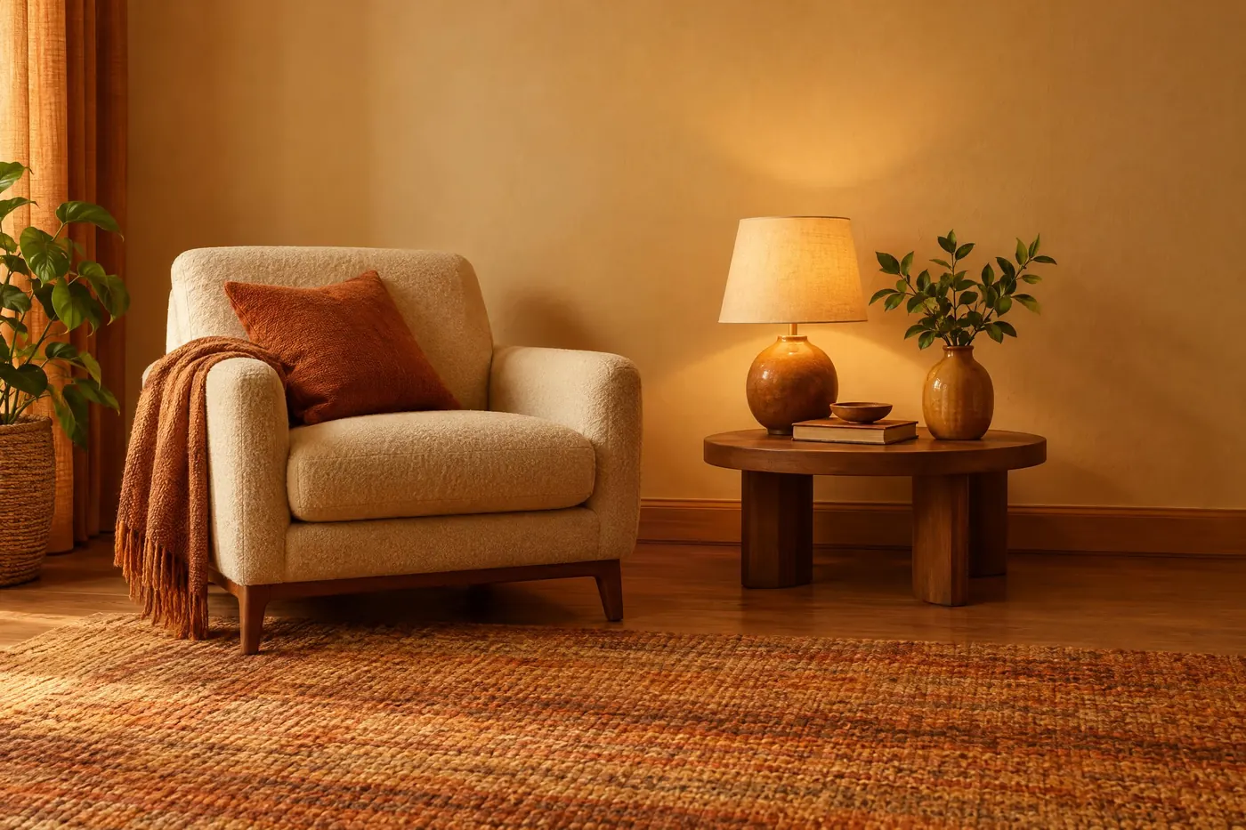
What it is for
Warm colour is what cooking does. Bread, roast, caramel and crust all move the same way, from pale to amber to brown, so a palette that follows that path reads as food before the viewer has identified what the food is.
The one green matters as much as the warm range. Without it the set reads as cooked and nothing else. With it the set reads as cooked and fresh, which is what almost every food business is selling.
How it works
Run the whole set warm, including the shadows. A cool shadow on a warm subject is the single thing that makes food photography look wrong.
Keep blue out entirely. There is almost no blue food, so the eye reads blue on something edible as mould or as spoilage.
Check the pairs. The deep roasted brown reaches about 10.1 to 1 on the cream, and the toasted orange about 4.8 to 1, which passes AA for normal text but not AAA. Put the brown on packaging copy and keep the orange for headings.
When to use it
Use it for food packaging, a menu, a bakery, a coffee brand, a recipe page, or any picture that has to make somebody hungry.
Leave it alone for anything that has to look clean or cold. The same warmth that makes bread look good makes a medical device look unhygienic.
Told apart from its neighbours
Terracotta is a material palette about fired clay, and it stops at the brown. This one adds the fresh green and the cream, which are what make it read as food rather than as a pot.
Seventies Earth covers a similar range and is duller and browner throughout. Food needs the saturation kept up, because a muted amber reads as stale.
Where it was used
Bakery, coffee and confectionery packaging has run on cream, amber and roasted brown for a century, with one green leaf or one green band to stand for freshness. Fast food went further and used red and yellow, which is a louder version of the same warm rule.
- Food packaging
- Menus
- Bakery branding
The prompt
Run it as it stands, or drop the colour clause into a prompt you already have. It works in an image prompt and in a video prompt.
<subject>, warm food palette of cream, honey amber, toasted orange and deep roasted brown with a single fresh green, everything warm, no blue and no grey anywhere, soft warm light with warm shadows
What goes wrong
A cool grey shadow arrives under the subject and the food looks refrigerated. Say warm shadows and say no grey anywhere.
The whole set comes back muted and the food looks stale. Say the ambers and oranges stay saturated.
Leave out
blue, grey, cool white, purple, a cold shadow
Watch for
Blue makes food look spoiled. Keep it out of the shadows as well as out of the subject.
Questions
Paint it
Pay for the one run. No subscription, and the price is on the model page before you sign in.