Dark Interface
- dark mode palette
- dark UI
- night theme
Three near-black surfaces, two greys of text and one cool accent.
Opens an image model with the palette in the prompt. The same words work on a video model.
- #0E0E10
- #18181B
- #27272A
- #A1A1AA
- #FAFAFA
- #7DD3FC
What it is for
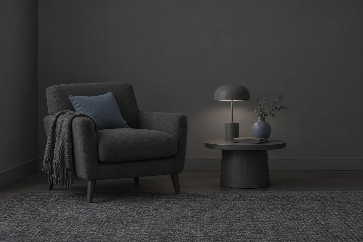
A dark interface is a palette with a structure. Depth on a light screen comes from shadow, and shadow does nothing on a dark one, so the surfaces have to separate by lightness instead. That is why this set has three near-blacks rather than one.
It also has to hold text for hours. Pure white on pure black is the pairing people reach for first, and it is the one that makes small type glow and smear. Backing both ends off a little fixes it and costs almost no contrast.
How it works
Stack three surfaces, darkest at the back. The page, the card on it and the control on the card each get one, and nothing else needs a fourth.
Run two text tones on the middle surface. The off-white here reaches about 17 to 1 on it, which is far past AAA. The mid grey reaches 6.9 to 1, which passes AA and sits just under the AAA mark, so keep it for secondary text rather than for body copy.
Allow one accent and keep it cool and light. The blue here reaches about 10.6 to 1 on the middle surface. A saturated accent at full strength on a dark ground buzzes, so lighten it rather than brightening it.
When to use it
Use it for anything looked at for a long time in a dim room: an editor, a player, a dashboard, a camera app, a reader.
Leave it alone for print and for anything read in bright sun. A dark page in daylight turns the screen into a mirror.
Told apart from its neighbours
Achromatic is greys for their own sake and runs the full range. This palette clusters at the dark end on purpose and holds one accent back.
Night Safe Red shares the dark room and solves a different problem. This one wants legibility and that one wants dark adaptation, and the two cannot both be had.
Where it was used
Code editors carried dark interfaces for decades before the rest of software followed. The three surface stack became the common pattern when operating systems shipped a system wide dark mode and every application needed a way to show depth without a shadow.
- Code editors
- Streaming interfaces
- Camera apps
The prompt
Run it as it stands, or drop the colour clause into a prompt you already have. It works in an image prompt and in a video prompt.
<subject>, dark interface palette of three near-black greys stacked as surfaces from darkest to lightest, off-white text, a mid grey for secondary text and a single cool blue accent, no pure black and no pure white, low saturation throughout
What goes wrong
The model returns pure black and pure white, and the type halates. Say no pure black and no pure white, and name near-black and off-white.
The three surfaces come back at one tone and the layout flattens. Say three near-black greys stacked from darkest to lightest as surfaces.
Leave out
pure black, pure white, a saturated background, a second accent
Watch for
Pure white on pure black glows and smears. Use near-black and off-white instead.
Questions
Paint it
Pay for the one run. No subscription, and the price is on the model page before you sign in.