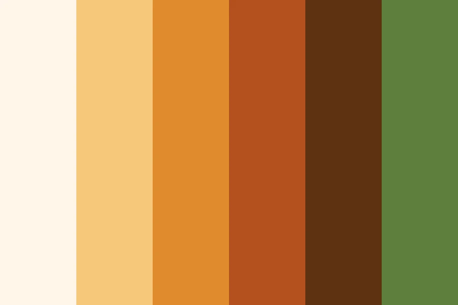
Brand Safe Neutrals
- warm greys
- neutral ground
- editorial neutrals
Six warm neutrals, pale to near-black, that sit under anybody's logo.
Opens an image model with the palette in the prompt. The same words work on a video model.
- #F7F5F2
- #E5E1DA
- #C9C3B8
- #8A8378
- #3E3A34
- #1C1A17

What it is for
A brand palette usually arrives after the picture does. A background made of neutrals accepts whatever logo, product or headline lands on it later, and it does so without a fight.
Warm neutrals do this better than cool ones. A warm grey reads as paper and skin, a cool grey reads as metal and screen, and paper flatters far more things than metal does.
How it works
Pick one family and hold it. Every value here has the same warm bias, which is what makes them look like one set rather than six greys that happen to be together.
Give one of them most of the frame. A neutral palette spread evenly across six tones has no ground, and everything in it floats.
Check the pairs you will put text on. The near-black on the bone white reaches about 16 to 1 and the dark brown about 10.4 to 1. The mid taupe only reaches 3.45 to 1, so keep it for large text, for a border or for a fill, never for body copy.
When to use it
Use it under a product, a logo, a piece of type, a lookbook, or anything where the subject supplies the colour and the picture supplies the room.
Leave it alone when the picture itself has to carry the mood. This palette is deliberately quiet, and quiet is the wrong answer for a poster.
Told apart from its neighbours
Neutral and One Accent is this palette with a job added. Put one saturated colour into this set and you have crossed into that scheme, which is a stronger and a narrower thing.
Achromatic is grey with no bias at all. These neutrals lean warm on purpose, and against a true grey they read as cream rather than as dirty.
Where it was used
Editorial layouts, catalogue photography and fashion lookbooks run on warm neutrals because the clothes, the food or the product has to be the only coloured thing in the frame. Set the same shot on a cool grey and the subject starts to look cold.
- Editorial layouts
- Product photography
- Fashion lookbooks
The prompt
Run it as it stands, or drop the colour clause into a prompt you already have. It works in an image prompt and in a video prompt.
<subject>, brand safe palette of warm neutrals running from bone white through oatmeal and taupe to near-black, no hue strong enough to name, low saturation throughout, one of the neutrals holding most of the frame
What goes wrong
A cool grey creeps into the set and one band looks blue. Say warm neutrals only and name the warm bias.
The tones arrive evenly spread with no ground. Say one of the neutrals holds most of the frame.
Leave out
a saturated accent, cool greys, a second family of neutrals, a colour cast
Watch for
Warm greys and cool greys do not mix. Pick one family and stay inside it.
Questions
Paint it
Pay for the one run. No subscription, and the price is on the model page before you sign in.