Two Ink Duotone
- duotone
- two colour print
- spot colour pair
Two inks and the paper, plus the third colour where the two cross.
Opens an image model with the palette in the prompt. The same words work on a video model.
- #F2EFE6
- #8FA0B3
- #1B2A41
- #3A2233
- #C43D1B
- #E8A08D
What it is for
Two inks is a budget before it is a style. A press charges by the pass, so a poster that uses two colours costs less than one that uses four, and generations of designers got very good inside that limit.
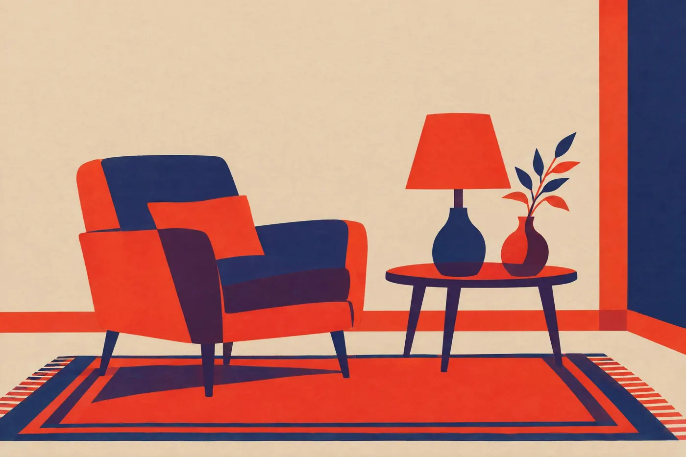
The limit gives something back. Two inks that overlap make a third colour for nothing, and planning where they cross is a design decision that full colour printing never has to make.
How it works
Choose two inks that are far apart in both hue and lightness. A deep ink and a bright one give you a dark, a mid, a bright and the paper, which is enough range for almost anything.
Use each ink at full strength and at about half. A halftone screen at fifty per cent reads as a separate colour, so two inks really give four tones plus the paper.
Plan the overprint. The dark plum here is what the navy and the vermillion make where they sit on top of each other, and it is the darkest value in the set.
When to use it
Use it for a poster, a zine, a record sleeve, a newsletter, a risograph print, or anything meant to look printed rather than rendered.
Leave it alone when the subject needs continuous tone in full colour. Two inks cannot describe a photograph of a face without changing what it is.
Told apart from its neighbours
Limited Palette is a rule about how many colours you allow yourself. Duotone is a rule about how many passes the press makes, and the overprint is the part that only the press produces.
Monochrome and One Accent in the design catalogue runs one ink plus a highlight. Duotone gives both inks equal standing, and the second one is not there to point at anything.
- Limited Palette
- Monochrome and One Accent
- Complementary
Where it was used
Newspapers ran a single spot colour beside black for decades, and risograph revived the whole method for short runs. Both work the same way: separate the artwork into two plates, print one over the other, and let the overlap make the third colour.
- Risograph printing
- Newspaper spot colour
- Two colour letterpress
The prompt
Run it as it stands, or drop the colour clause into a prompt you already have. It works in an image prompt and in a video prompt.
<subject>, duotone of exactly two inks on warm paper, a deep navy and a bright vermillion, each ink shown solid and at half strength, a dark plum where the two overlap, the bare paper as the lightest value, flat with no gradient
What goes wrong
A third ink arrives, usually as a blend that is neither of the two. Say exactly two inks plus the paper, and name the colour of the overprint.
The result comes back as a smooth gradient. Say flat with no gradient, and say each ink is shown solid and at half strength.
Leave out
a third ink, full colour, gradients, pure white paper
Watch for
The overprint is a third colour you get free. Decide where the two inks cross before you draw.
Questions
Paint it
Pay for the one run. No subscription, and the price is on the model page before you sign in.