
Colour harmony
The ways to choose a set of colours, and the wording that gets each one.
A harmony is a rule for picking colours, decided before anything is drawn. It is the cheapest decision in this catalogue and the one that changes a picture most: the same layout in complementary orange and blue and in three analogous greens is two different pieces of work. Every scheme here is a relationship you can check, not a matter of taste, and every one of them carries the wording that gets it out of a model.
Relationships on the wheel
5Five schemes defined by where the colours sit relative to each other. The further apart, the louder.



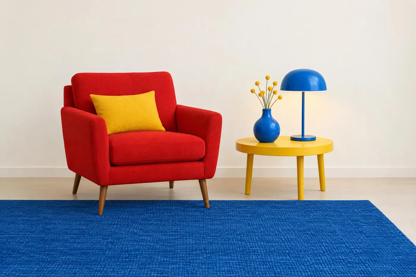

One hue, or none
2Two schemes that give up hue contrast entirely and make value do all the work.


Rules you set yourself
3Three schemes that are not wheel relationships at all. They are constraints, and they are the ones most used in practice.



Run one of them
Copy a palette into a prompt and pay for that one run. No subscription.
Open an image model