Achromatic
- greyscale
- black and white
- neutral only
No hue at all. Black, white and the greys between them.
Opens an image model with the palette in the prompt. The same words work on a video model.
- #111111
- #444444
- #808080
- #C4C4C4
- #F5F5F5
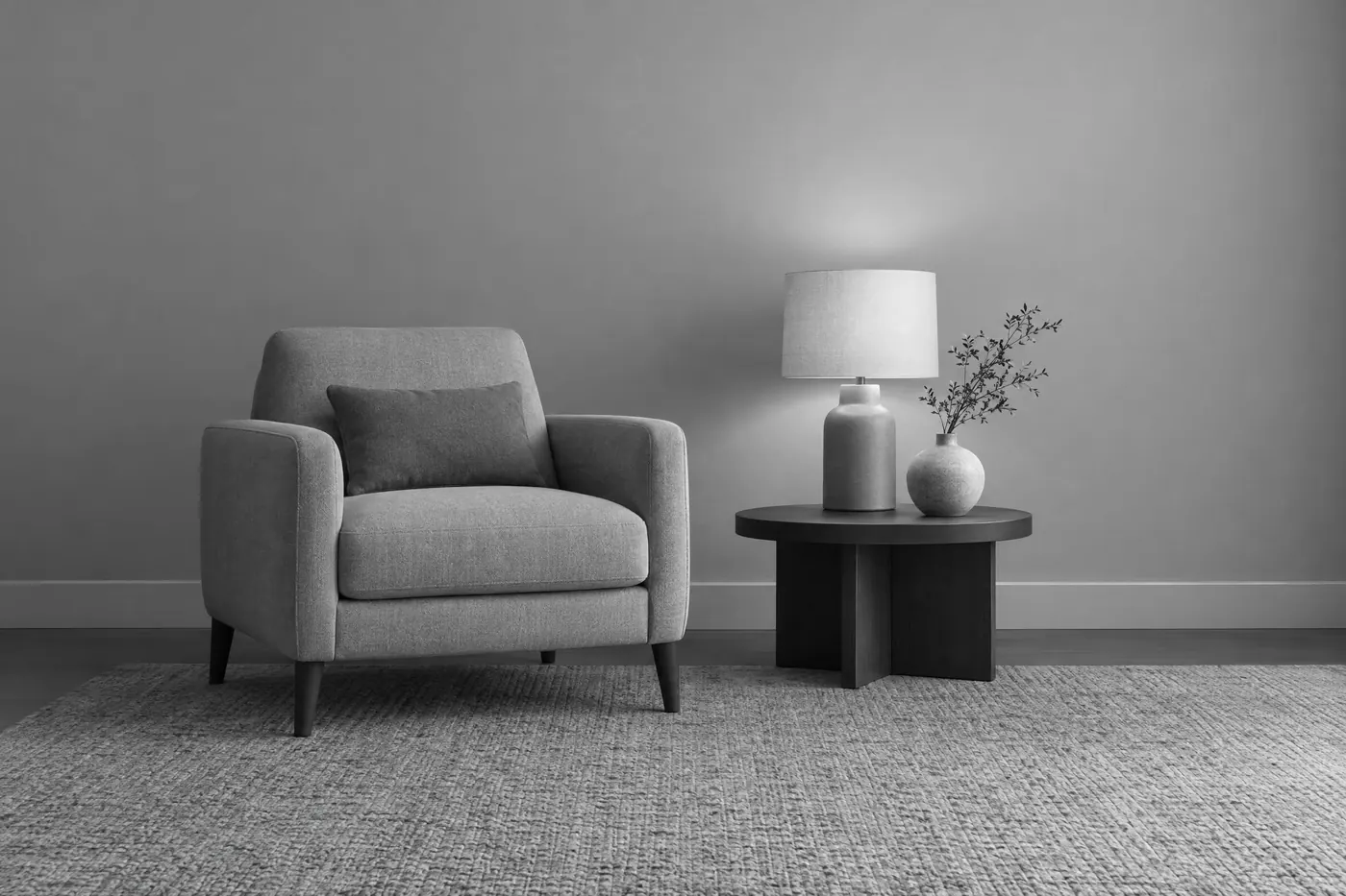
What it is for
With hue gone, the only things left are shape, value and composition. That is why achromatic work reads as serious: there is nothing decorative in it to hide behind.
It is also the most reproducible palette there is. It survives a fax, a photocopy, a newspaper and a phone screen at any brightness.
How it works
Build five neutral steps: black, dark grey, mid grey, light grey, white. Nothing in between needs to exist.
Keep the neutrals actually neutral. A warm black or a cool white is a hue, and a viewer will read it as one even if they cannot name it.
Contrast has to come from value alone, so plan the value structure first. Decide what is darkest and what is lightest before anything else.
When to use it
Use it for anything institutional, documentary or typographic: a Swiss poster, a report, a photographic series, an architecture study, a protest sheet.
Leave it alone when warmth matters. Achromatic cannot be friendly, and attempts to warm it up destroy the scheme.
Told apart from its neighbours
Monochromatic keeps one hue. This keeps none, and the difference is easy to test: hold a real grey next to it and see whether anything shifts.
Neutral plus one accent is this scheme with a single saturated note added, which changes it entirely by giving the eye somewhere to go.
Where it was used
The Swiss school used it because it was honest and cheap, and the posters from the 1950s still read at any size. Ansel Adams built a whole zone system around getting the full value range out of it.
- Swiss poster design
- Ansel Adams
- brutalist graphic design
The prompt
Run it as it stands, or drop the colour clause into a prompt you already have. It works in an image prompt and in a video prompt.
<subject>, achromatic palette of pure neutrals only, black through five greys to white, absolutely no hue anywhere including in the shadows and highlights, contrast carried entirely by value
What goes wrong
The greys come back warm or cool, usually a blue cast in the shadows. Say the neutrals are truly neutral, neither warm nor cool, including in shadow and highlight.
A single colour appears as an accent. That is a different scheme. Say no hue anywhere at all.
Leave out
any hue, warm blacks, cool whites, a single colour accent
Watch for
Most models leak a hue into the shadows. Say the neutrals are truly neutral, not warm and not cool.
Questions
Paint it
Pay for the one run. No subscription, and the price is on the model page before you sign in.