
Period palettes
The sets of colours that date a picture, and the wording for each one.
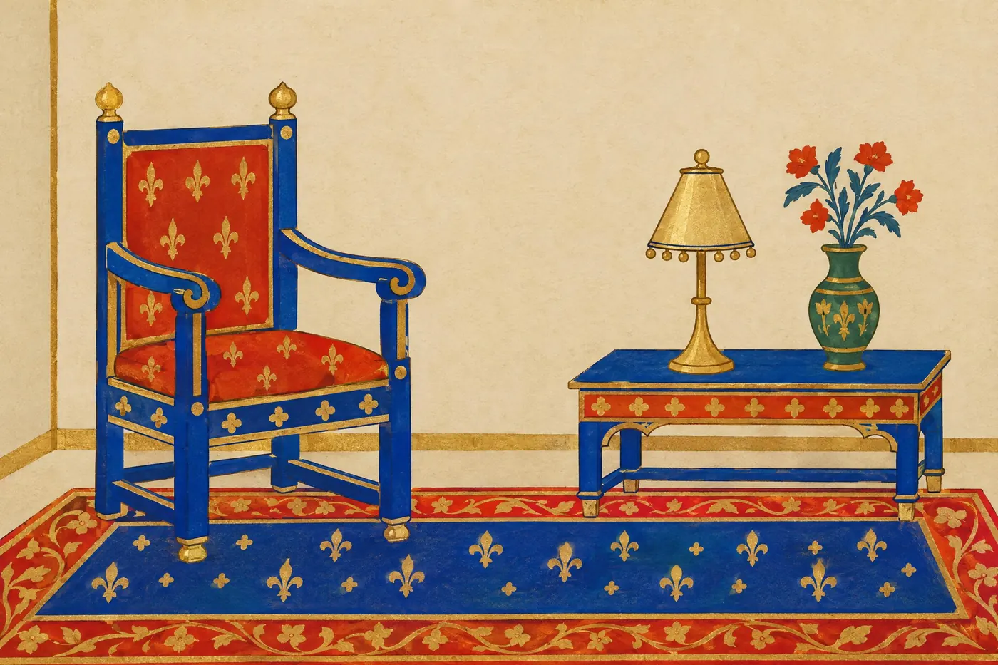
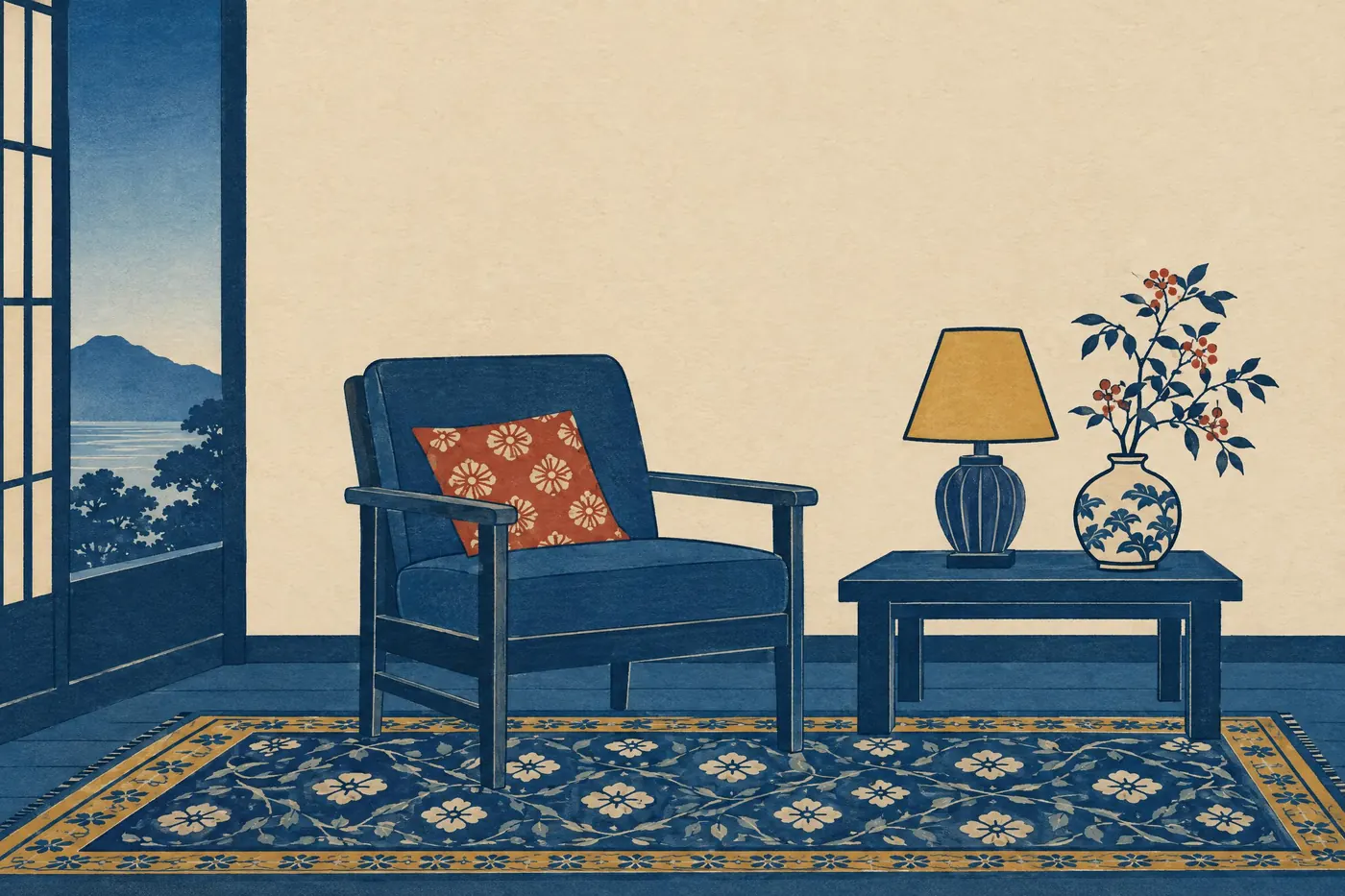
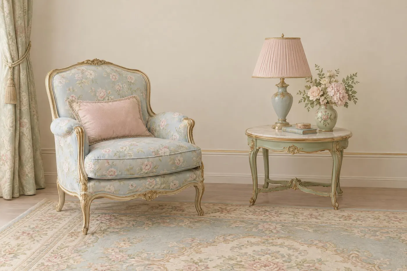
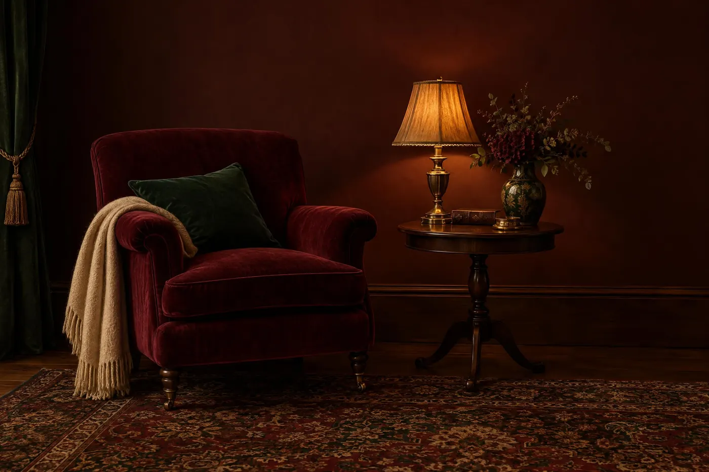
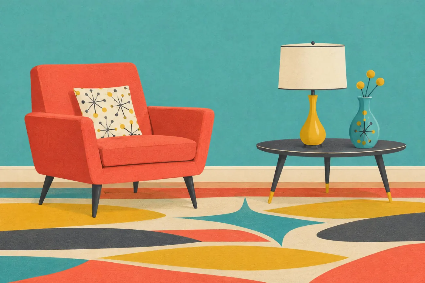
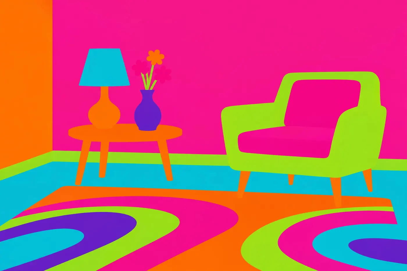
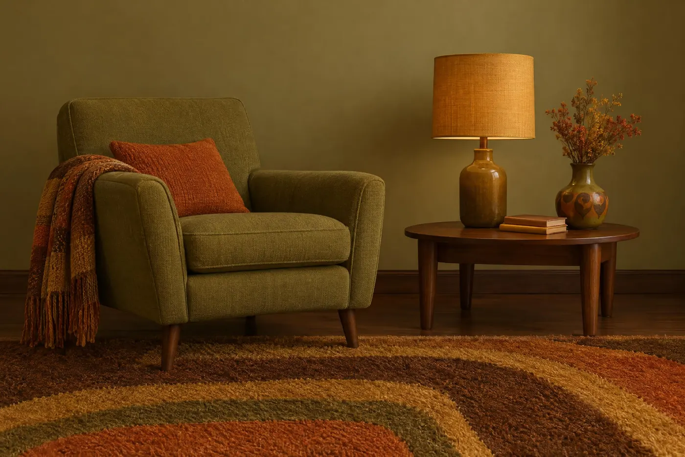
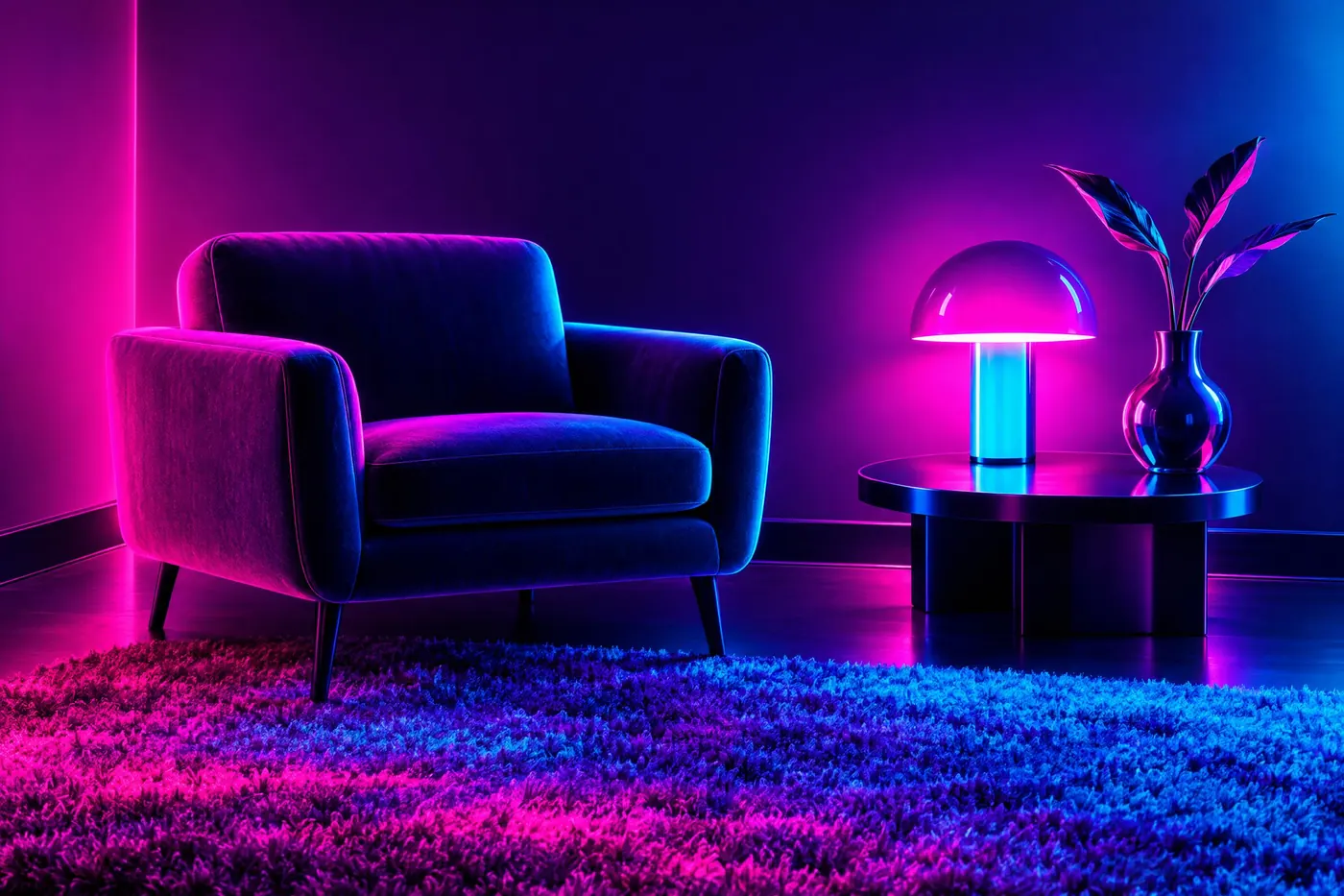
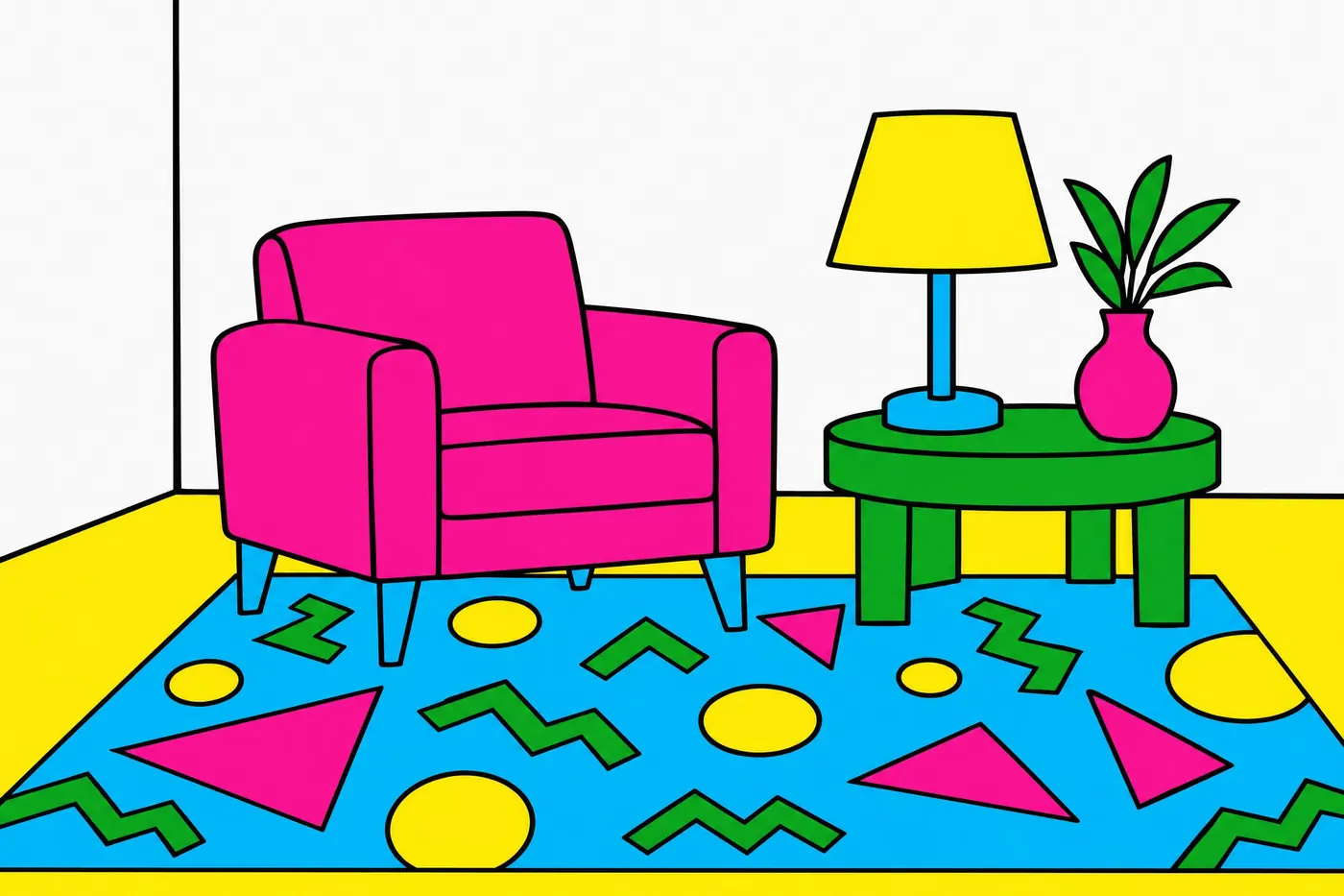
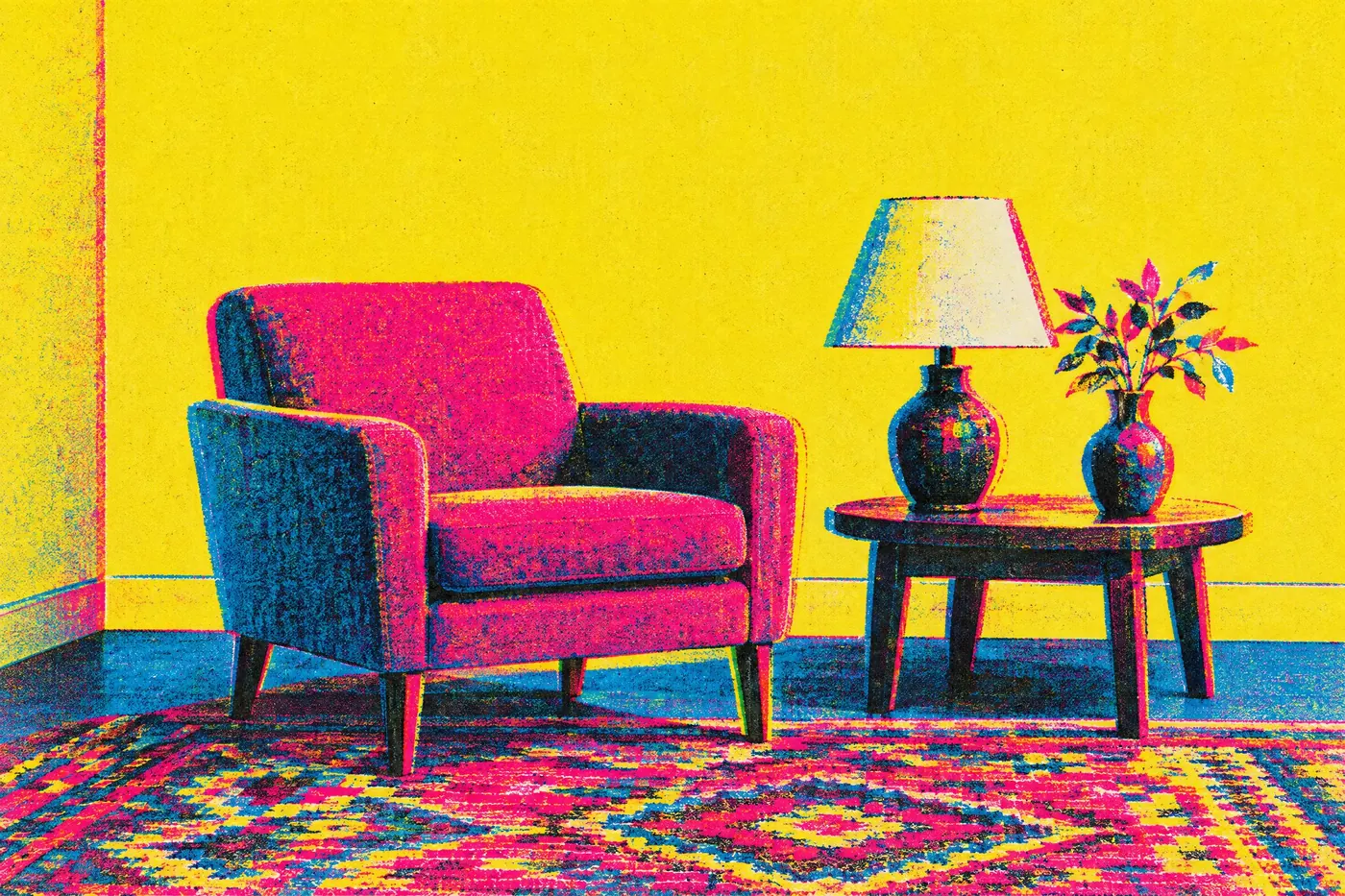
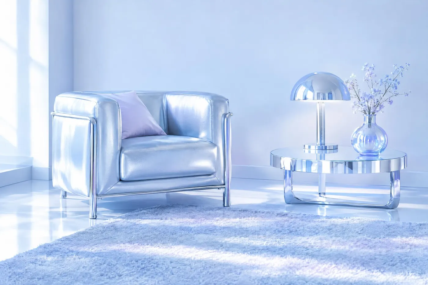
A period palette is the fastest way to put a picture in a decade. Nothing else in a prompt does the same job so cheaply: the same room in avocado and harvest gold and in chrome and ice blue is two different years, and a viewer reads the difference before they read anything else. Every palette here is a set somebody really used, limited by the pigment, the ink or the plastic of its time, and every one of them carries the wording that gets it out of a model.
Before the twentieth century
4Four palettes set by what a maker could get hold of. The list is short because the supply was.
The modern movements
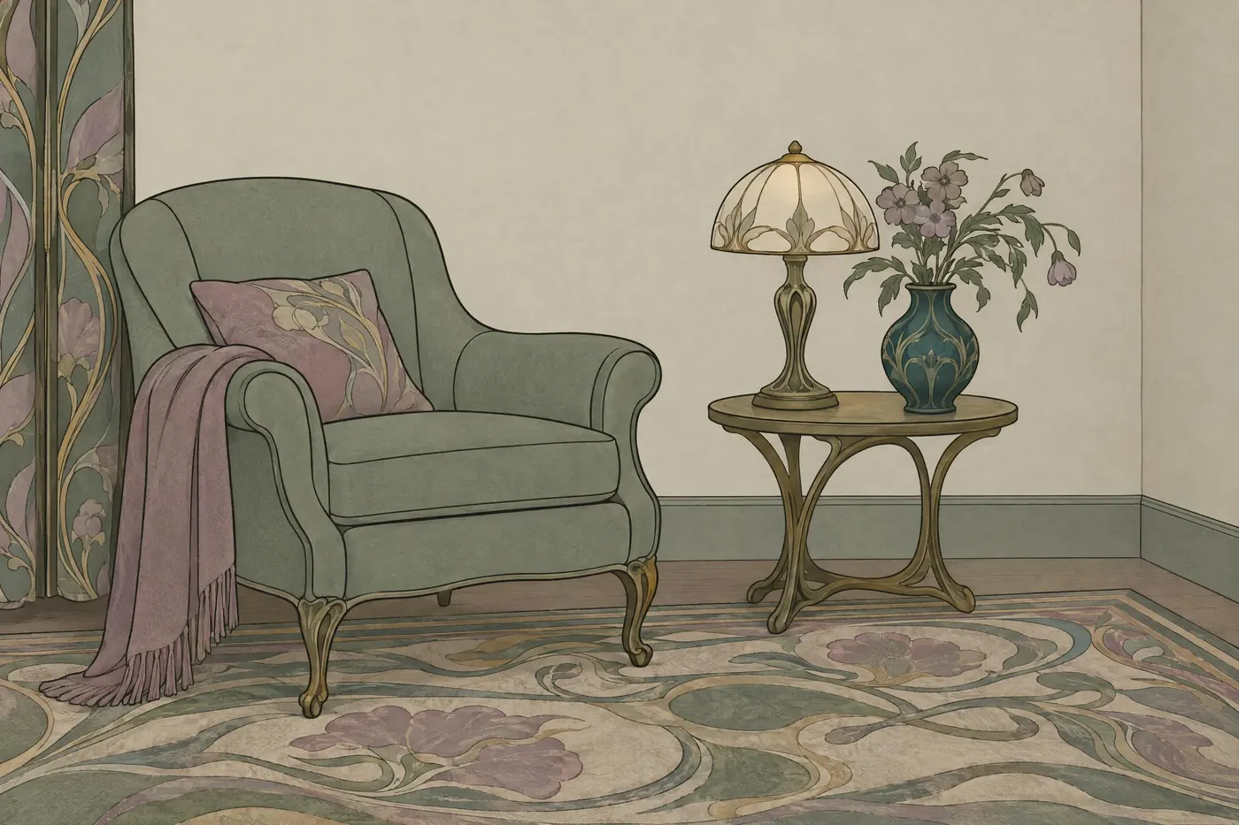
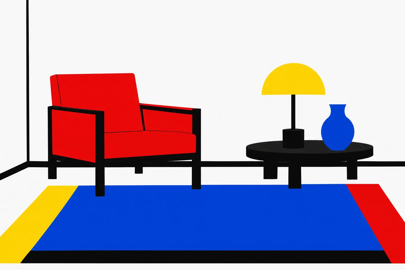
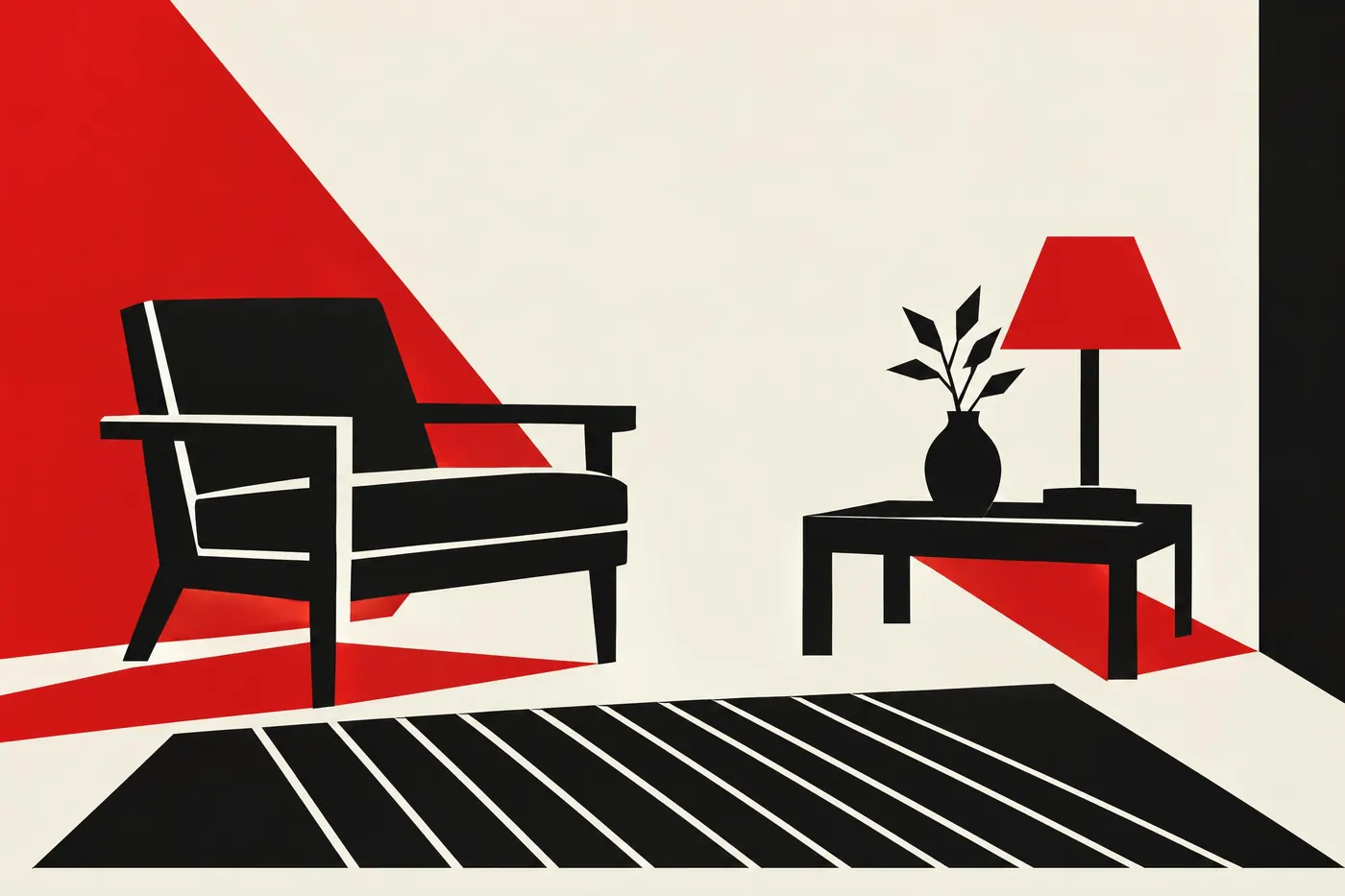
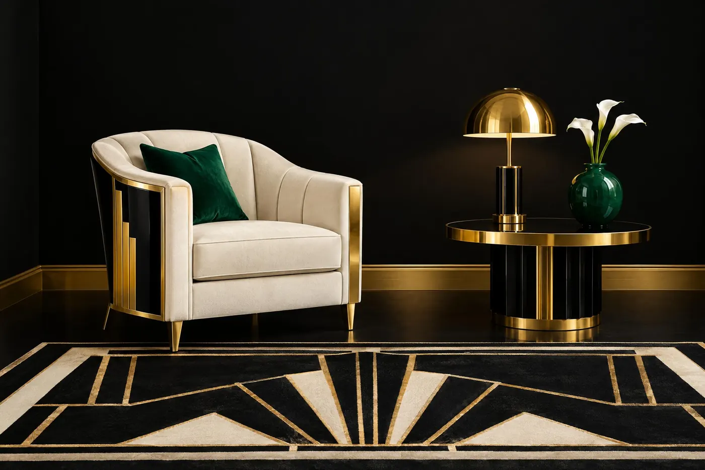
4Four palettes chosen on purpose, each one an argument about what colour is for.
The decades in colour
4Four palettes that date a picture to ten years. Each one belongs to the printing and the products of its decade.
The end of the century
3Three palettes from the twenty years when colour stopped being expensive and started being loud.
Run one of them
Copy a palette into a prompt and pay for that one run. No subscription.
Open an image model