Constructivist Red
- agitprop palette
- red and black
- Soviet poster colours
One red and one black on cheap paper, with no third colour allowed in.
Opens an image model with the palette in the prompt. The same words work on a video model.
- #111111
- #A50F15
- #D7261E
- #B7AFA3
- #EDE8DC
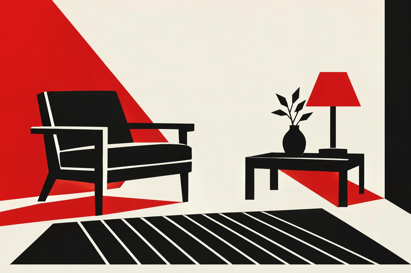
What it is for
Two inks was what a press could run quickly and cheaply, so the palette started as an economy and became a signature. It still reads as urgent because it reads as printed in a hurry.
Red against black is also the highest contrast available from one colour. The eye cannot ignore it, which is exactly what a poster on a wall needs.
How it works
Use one red, not two. A second red divides the emphasis and the whole effect depends on there being one.
Print on off-white. A pure white ground makes it look like a modern reproduction rather than paper.
Cut the shapes with hard diagonal edges. The palette and the geometry arrived together and each one looks wrong without the other.
When to use it
Use it for a poster, a manifesto, a book cover, a record sleeve, anything that has to be read from across a room.
Leave it alone for a subject that needs nuance. Two inks can state a position and cannot hold a conversation.
Told apart from its neighbours
Bauhaus primaries keeps three colours and stays neutral about all of them. This keeps one and points it at something.
Neutral plus one accent is the general case of the same move. Constructivist red fixes the accent as red, the neutral as black and the ground as paper.
Where it was used
Rodchenko built whole poster campaigns from one red, black and the paper, because that is what the press could do. El Lissitzky used the same two inks to argue geometry, and every protest sheet since has borrowed the pair.
- Rodchenko
- El Lissitzky
- Soviet film posters
The prompt
Run it as it stands, or drop the colour clause into a prompt you already have. It works in an image prompt and in a video prompt.
<subject>, constructivist palette of one strong red and black on off-white paper, flat unmodulated areas with hard diagonal edges, the red used for emphasis only and covering under a third of the frame, no second hue anywhere
What goes wrong
A blue or a yellow slips in. Say one red and black only, with no second hue anywhere.
The red floods the frame and stops being an accent. Say it covers under a third of the picture.
Leave out
a second hue, blue, gradients, soft edges
Watch for
The red has to stay scarce to stay loud. Give it a third of the picture at most.
Questions
Paint it
Pay for the one run. No subscription, and the price is on the model page before you sign in.