Nineties CMYK
- process colour palette
- four colour process
- rave flyer colours
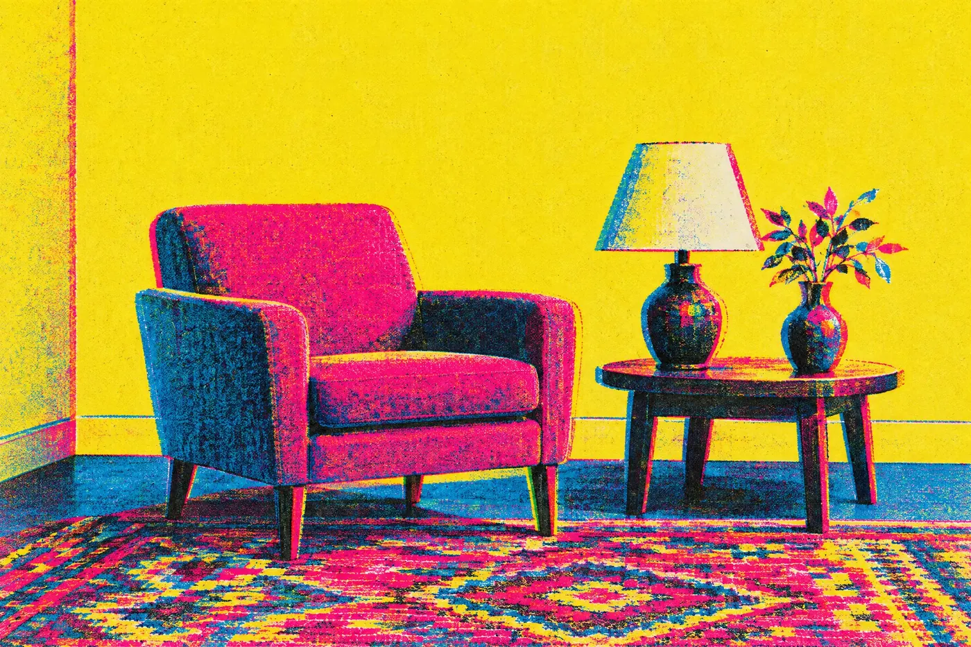
The four printing inks used raw and overprinted, with no colour correction.
Opens an image model with the palette in the prompt. The same words work on a video model.
- #1A1A1A
- #00AEEF
- #EC008C
- #FFF200
- #F7F7F5
What it is for
Desktop publishing arrived and put a printing press in front of people who had never set type. The obvious thing to do was use the four inks straight out of the box, and a decade of flyers came out of that.
Process cyan and process magenta are not colours anybody would mix by hand. They exist to be combined, so using them raw gives a picture a brightness that no chosen palette has.
How it works
Name the inks rather than the colours. Process cyan, process magenta, process yellow. Blue and pink give you something softer and wrong.
Let the inks overprint. Where cyan crosses magenta it goes violet, and showing that is what makes it read as print.
Add slight misregistration. A perfect stack of four plates looks like a screen, and this palette is about paper.
When to use it
Use it for flyers, zines, record sleeves, streetwear and anything that should look cheaply and quickly printed.
Leave it alone for a photographic subject that needs accurate skin. Raw process ink is unkind to a face.
Told apart from its neighbours
Eighties neon glows on black because it is light. This is ink on white paper, so the same loudness arrives by the opposite route.
Bauhaus primaries also uses three hues plus black, but they are red, yellow and blue and they never overprint. Here the mixing is the point.
Where it was used
Club flyers of the decade were printed four colour on the cheapest stock available, and the misregistration was not a choice. Wired put the same raw inks on a magazine deliberately in 1993 and made them look like the future.
- 1990s club flyers
- early desktop publishing
- Wired magazine (1993)
The prompt
Run it as it stands, or drop the colour clause into a prompt you already have. It works in an image prompt and in a video prompt.
<subject>, 1990s CMYK palette of process cyan, process magenta and process yellow with black, the inks used raw and overprinted so the mixes show, slight misregistration on flat white paper, no colour correction and no photographic colour
What goes wrong
The colours come back corrected and photographic. Say raw process inks with no colour correction.
The plates line up perfectly and it reads as a screen. Say slight misregistration on flat white paper.
Leave out
corrected colour, pastel, muted tones, photographic colour
Watch for
Raw process inks are louder than any screen colour. Say process cyan and process magenta, not blue and pink.
Questions
Paint it
Pay for the one run. No subscription, and the price is on the model page before you sign in.