Fifties Atomic
- mid-century palette
- atomic age colours
- 1950s diner palette
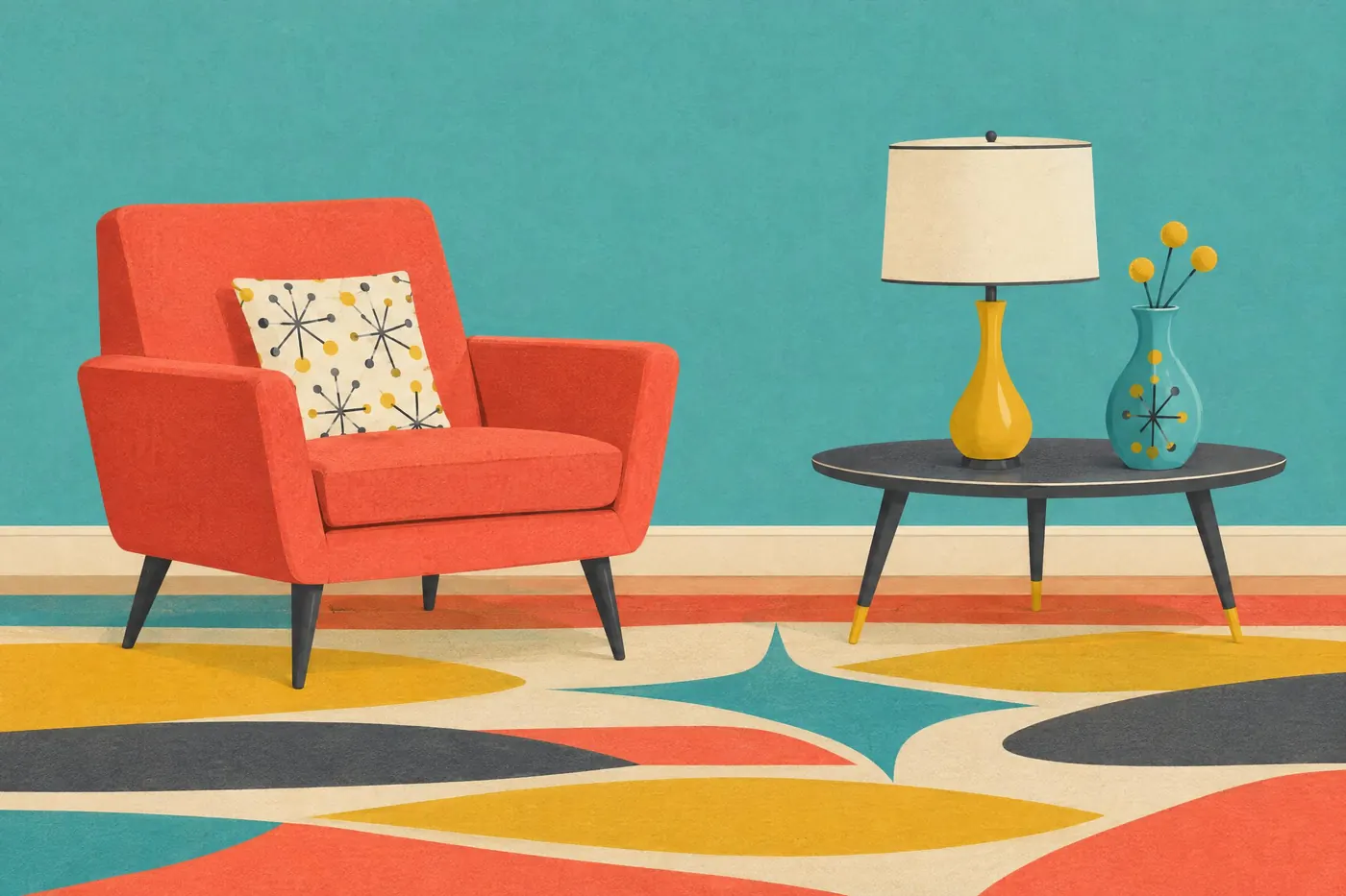
Turquoise and coral against charcoal and cream, with mustard doing the shouting.
Opens an image model with the palette in the prompt. The same words work on a video model.
- #3C3B38
- #3FAFA5
- #E9725B
- #E3B23C
- #F3EDE0
What it is for
The palette came out of new materials. Formica, vinyl and enamel could hold a colour that paint and wood never could, so the decade chose colours that showed off the surface.
It is optimistic without being loud. Turquoise and coral are both mid saturation, so the picture reads as cheerful rather than as a warning.
How it works
Pair turquoise with coral and keep both at mid saturation. Push either one to full strength and the decade moves forward ten years.
Use charcoal and cream as the structure. The bright colours need something quiet between them or they merge.
Add a slight ink texture. The palette is remembered from printed advertising, and a perfectly clean surface looks like a modern homage.
When to use it
Use it for food, appliances, travel, signage, packaging and anything that should feel optimistic and manufactured.
Leave it alone for a subject that needs depth. Everything in this palette sits on the same plane.
Told apart from its neighbours
Sixties pop takes the same cheerfulness to full saturation and removes the neutrals. That one vibrates; this one sits still.
Seventies earth keeps the mustard and drops the turquoise for avocado and brown. The two decades share one colour and nothing else.
Where it was used
Formica sold the palette as a kitchen and American diners bought it wholesale. Travel posters of the decade ran the same turquoise and coral because the four colour press could hold them cleanly and they photographed well in a magazine.
- Formica advertising
- American diners
- 1950s travel posters
The prompt
Run it as it stands, or drop the colour clause into a prompt you already have. It works in an image prompt and in a video prompt.
<subject>, 1950s atomic age palette of turquoise and coral with mustard yellow, charcoal grey and cream holding them apart, flat mid saturation with a slight printed ink texture, no neon and no earth tones
What goes wrong
The colours come back neon bright. Say flat mid saturation with no neon.
A brown or an olive appears and it turns into the 1970s. Say no earth tones anywhere.
Leave out
neon, earth tones, brown, purple
Watch for
Turquoise and coral are the pair that dates it. Drop either one and it reads as generic mid-century.
Questions
Paint it
Pay for the one run. No subscription, and the price is on the model page before you sign in.