Bauhaus Primaries
- modernist primaries
- De Stijl colours
- primary triad and neutrals
Red, yellow and blue at full strength, plus black and white, and nothing else.
Opens an image model with the palette in the prompt. The same words work on a video model.
- #1A1A1A
- #005BBB
- #D62828
- #F6C600
- #F5F3EE
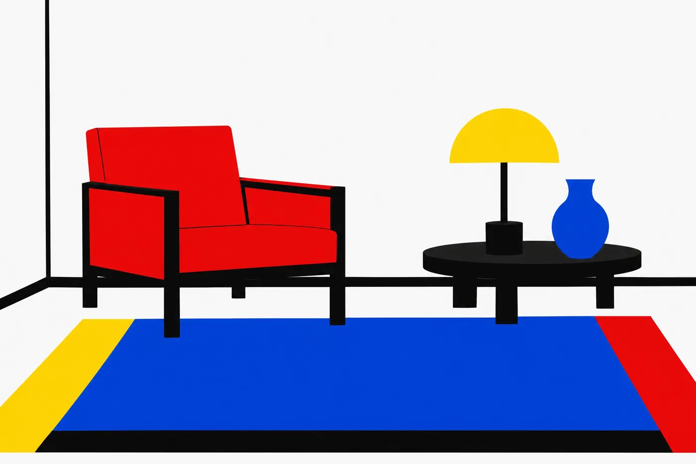
What it is for
The school taught that the three primaries were the only colours that could not be argued about. Everything else is a mixture and therefore a matter of taste, so a modernist palette starts and stops with red, yellow and blue.
Black and white are not colours in this system, they are structure. That is why the palette reads as a diagram even when the subject is not one.
How it works
Use the three primaries unmixed and at full strength. No tints, no shades, no pale blue and no dark red.
Let one primary take most of the coloured area and the other two appear in small blocks. Equal thirds of red, yellow and blue reads as a toy.
Keep the ground white and use black for the lines and the structure. The black is doing the drawing, not the colouring.
When to use it
Use it for anything geometric, educational, civic or modernist: a poster, a cover, a building, a chart, a title card.
Leave it alone for a subject that needs warmth or atmosphere. There is no mid tone in this palette to build either one with.
Told apart from its neighbours
A triadic scheme is the relationship, and it allows any three evenly spaced hues. This is one specific triad plus black and white, which is a stricter thing.
Constructivist red uses the same flat unmixed approach but cuts the palette to one red and black. It is a political version of the same argument.
Where it was used
Mondrian spent thirty years painting nothing else, and De Stijl restricted itself to exactly these five values as a rule rather than a preference. The Bauhaus taught them in its preliminary course, which is why the same five colours still mean design school a century later.
- Bauhaus Dessau
- De Stijl
- Mondrian
The prompt
Run it as it stands, or drop the colour clause into a prompt you already have. It works in an image prompt and in a video prompt.
<subject>, bauhaus palette of pure red, pure yellow and pure blue with black and white only, flat areas of unmixed colour at full saturation, white ground, no green and no orange, no tints and no shading
What goes wrong
A green or an orange appears where two colours meet. Say no secondary colour anywhere, only red, yellow and blue.
The primaries come back tinted or shaded. Say pure, flat and unmixed at full saturation.
Leave out
green, orange, purple, tints, shading, gradients
Watch for
A secondary colour is the giveaway. If green or orange appears, the palette has stopped being Bauhaus.
Questions
Paint it
Pay for the one run. No subscription, and the price is on the model page before you sign in.