Seventies Earth
- harvest gold palette
- avocado and orange
- 1970s kitchen colours
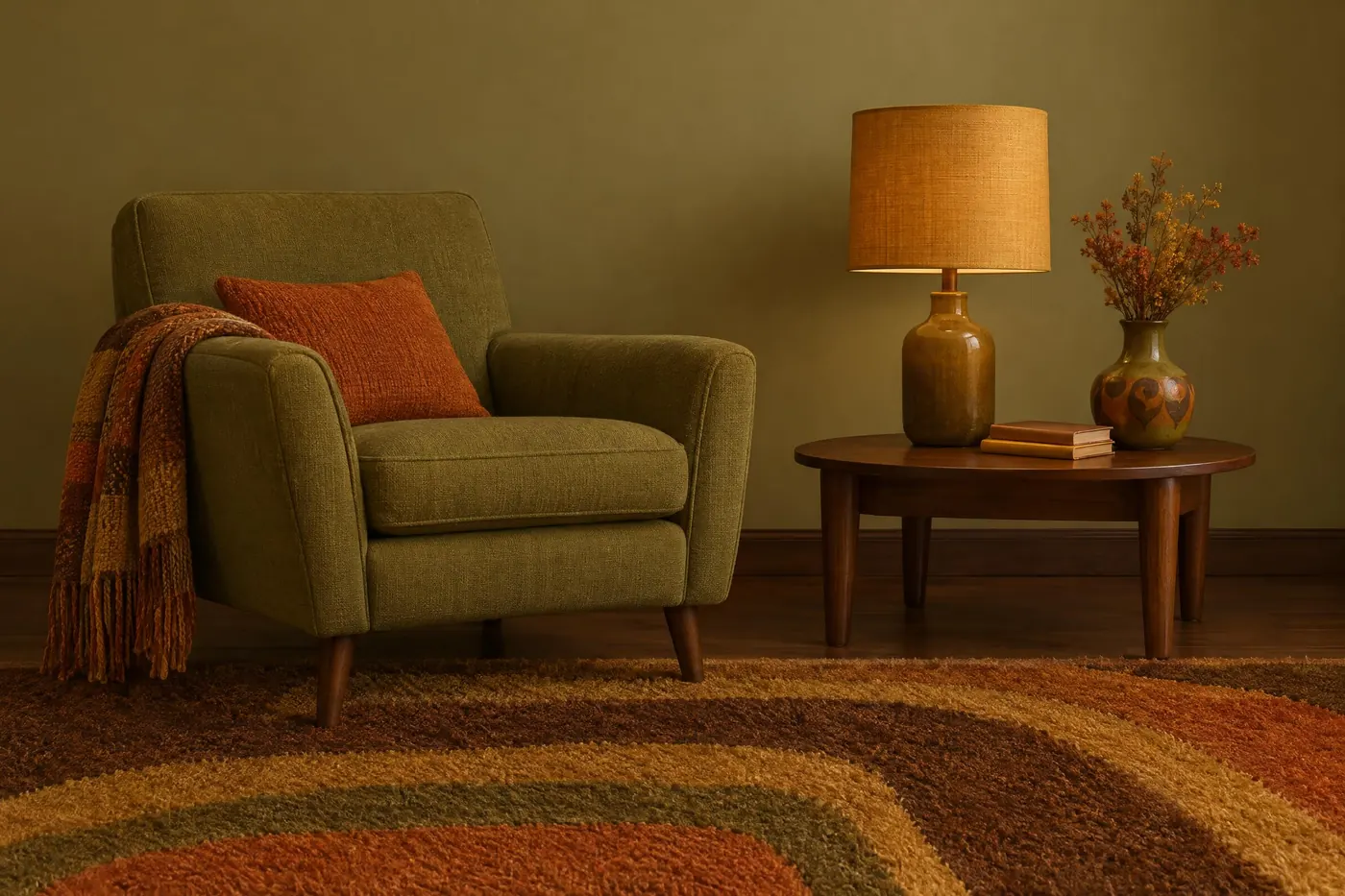
Avocado, harvest gold and burnt orange over brown, with every hue pulled toward earth.
Opens an image model with the palette in the prompt. The same words work on a video model.
- #3E2A1C
- #6B7A2E
- #B5551F
- #D69A2D
- #E6D9BE
What it is for
The decade turned away from the bright synthetic colour of the one before it and went looking for something that looked natural. Avocado, harvest gold and burnt orange are what that search produced, and they were on everything from a fridge to a carpet.
Because every hue is warm and dulled, the palette has almost no contrast of temperature. That is why a 1970s picture feels enclosed even outdoors.
How it works
Choose three warm hues from across the wheel and dull all of them: avocado, harvest gold, burnt orange.
Put them on dark brown rather than on black. Brown is the ground of the decade and black is not in the palette.
Allow exactly one light value, a warm cream, and keep it small. Everything else stays in the middle and the bottom of the range.
When to use it
Use it for interiors, food, music, film stills and anything that should feel like a room somebody lived in.
Leave it alone when the subject has to look clean or current. Warm and dulled reads as dated on purpose, which is often what you want and sometimes is not.
Told apart from its neighbours
Fifties atomic shares the mustard and nothing else. It keeps a cool turquoise, which this palette refuses.
Victorian parlour is also warm and dark, but it is dense and saturated. Seventies earth is flatter, lighter and duller.
Where it was used
Appliance makers sold avocado and harvest gold as premium finishes for most of the decade, so millions of kitchens shared one palette. Print advertising followed the products, and film production design still uses the pair as shorthand for 1974.
- 1970s kitchen appliances
- National Geographic covers
- Boogie Nights (1997)
The prompt
Run it as it stands, or drop the colour clause into a prompt you already have. It works in an image prompt and in a video prompt.
<subject>, 1970s earth palette of avocado green, harvest gold and burnt orange over dark brown, cream as the only light value, every colour warm and slightly dulled under soft even light, no cool blue and no pure white
What goes wrong
A cool blue or a clean white appears. Say every colour is warm and the only light value is cream.
The colours come back clean and bright. Say slightly dulled, under soft even light.
Leave out
cool blue, pure white, neon, pastel
Watch for
The whole palette is warm. One cool blue reads as a mistake from another decade.
Questions
Paint it
Pay for the one run. No subscription, and the price is on the model page before you sign in.