Rococo Pastel
- Louis XV palette
- eighteenth century pastel
- boudoir palette
Powder blue, rose and pistachio at half strength, held together by cream and gilt.
Opens an image model with the palette in the prompt. The same words work on a video model.
- #B8912F
- #A8C4D9
- #C9D6B5
- #E7B7C4
- #F0DCC4
- #F7F1E6
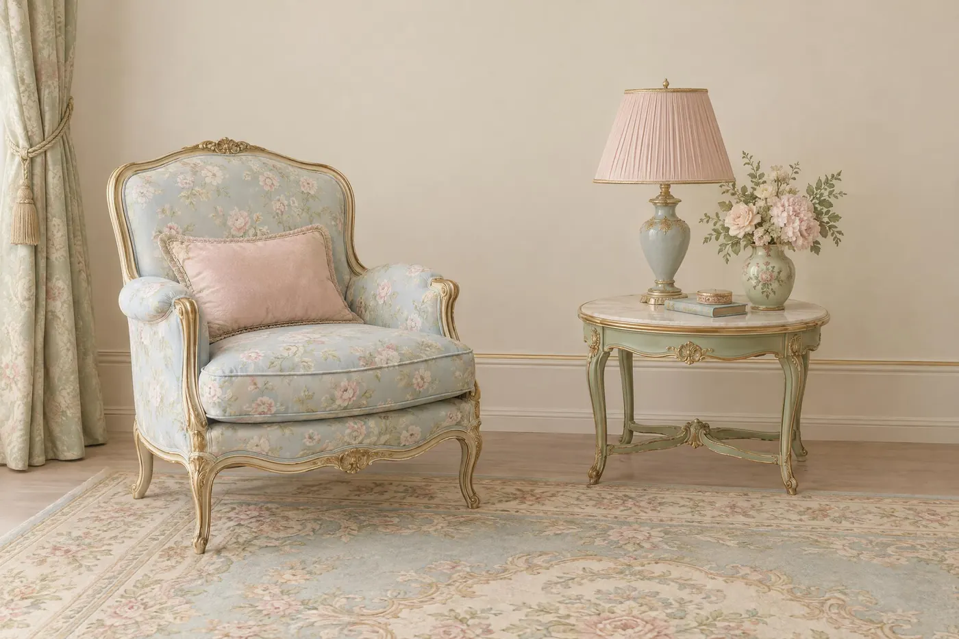
What it is for
A rococo palette has no bottom to it. Every value sits in the top third of the range, so the picture floats and nothing in it feels heavy. That was the whole point of the style and it is still the effect.
The colours are all mixed with white, which means none of them can dominate. It is the rare palette that holds four hues without any of them fighting.
How it works
Start from cream rather than white. Cream is the ground, and every pastel is judged against it.
Mix every hue toward white until it is about half strength. Powder blue, not blue. Rose, not pink. Pistachio, not green.
Use the gilt sparingly and keep it dull. Bright gold in a pastel palette reads as art deco, which is the opposite mood.
When to use it
Use it for anything decorative and light: packaging, a wedding invitation, a confectionery brand, an interior, a period costume shot.
Leave it alone when the subject needs weight or seriousness. A palette with no dark value cannot carry either.
Told apart from its neighbours
Art nouveau sage is also muted, but it is greyed rather than whitened, so it sits in the middle of the range instead of the top.
An analogous scheme limits itself to neighbouring hues. Rococo takes hues from all over the wheel and makes them agree by lightening every one.
Where it was used
Fragonard painted whole gardens with no value darker than a mid grey, which is why his pictures look like weather rather than places. Sevres porcelain sold the same palette as an object, and film costume departments have used it as shorthand for the French court ever since.
- Fragonard
- Sevres porcelain
- Marie Antoinette (2006)
The prompt
Run it as it stands, or drop the colour clause into a prompt you already have. It works in an image prompt and in a video prompt.
<subject>, rococo pastel palette of powder blue, rose pink and pistachio green all at low saturation, cream everywhere between them and dull gilt gold on the edges, soft even light with no strong dark, no pure white and no black
What goes wrong
A black outline or a hard shadow appears and the whole palette collapses. Say no black anywhere and soft even light.
The pastels come back at full strength. Say every hue is mixed with white to about half saturation.
Leave out
black, pure white, saturated colour, hard shadow
Watch for
There is no dark value in this palette. The moment black appears it stops being rococo.
Questions
Paint it
Pay for the one run. No subscription, and the price is on the model page before you sign in.