Analogous
- neighbouring colours
- adjacent harmony
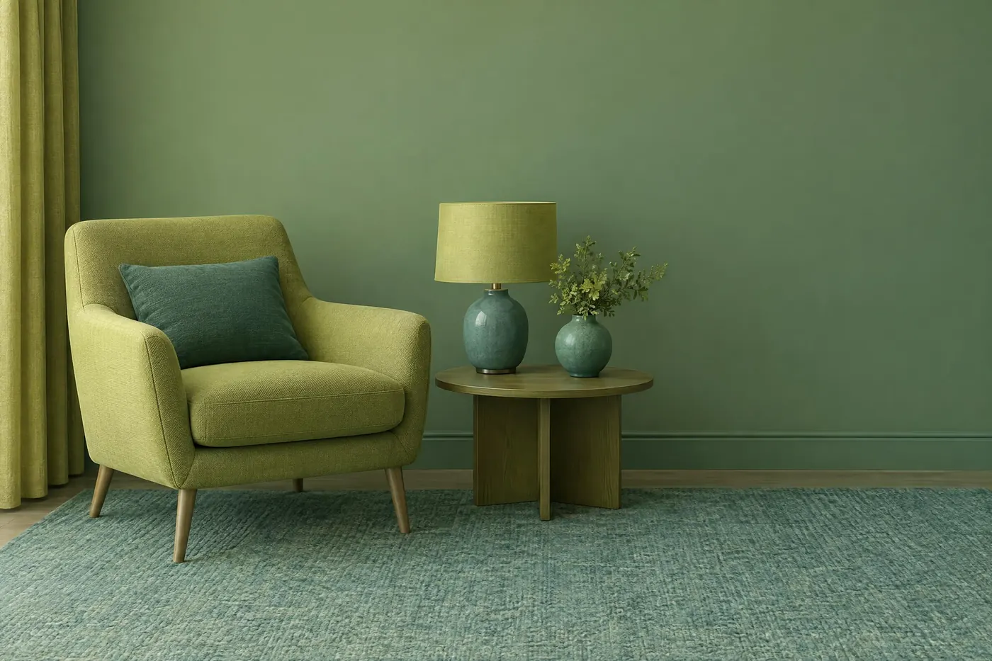
Three or four neighbours on the wheel, with no opposition anywhere.
Opens an image model with the palette in the prompt. The same words work on a video model.
- #C9C043
- #7FA650
- #3E8A6E
- #2A6B70
- #F2EFE2
What it is for
Neighbours on the wheel share pigment, so they agree with each other automatically. That is why analogous schemes feel calm even when the colours themselves are strong.
It is the scheme that most resembles how light actually behaves. A real scene lit by one source tends to land in one region of the wheel, which is why this reads as natural rather than designed.
How it works
Take three neighbours, or at most four. Any more and you have gone round enough of the wheel to pick up an opposition by accident.
Pick one to dominate, one to support and one to appear only in small amounts. Equal thirds read as indecision.
Because no hue opposes another, the picture has no contrast unless you build it. Separate the three by value: make one of them clearly the lightest and one clearly the darkest.
When to use it
Use it for calm and for nature: landscape, wellness, food, interiors, a slow piece of film, anything that should feel like one place at one time of day.
Leave it alone when something has to stand out. An analogous scheme has no mechanism for emphasis.
Told apart from its neighbours
Monochromatic uses one hue at several values. Analogous uses several hues that happen to get along, which gives it more life at the same level of calm.
A limited palette is a count, not a relationship: three arbitrary colours strictly enforced. Analogous requires the three to be neighbours.
Where it was used
Impressionist landscape painting runs on it, because a field at one time of day genuinely does sit in one part of the wheel. Nordic interior photography borrowed the same restraint a century later, and most wellness branding borrowed it from there.
- Impressionist landscape
- Nordic interiors
- wellness branding
The prompt
Run it as it stands, or drop the colour clause into a prompt you already have. It works in an image prompt and in a video prompt.
<subject>, analogous palette of yellow-green, green and blue-green only, three adjacent hues with no opposite and no accent, even saturation across all three, one of them clearly dominant
What goes wrong
An accent in the opposite colour appears, usually a small warm spot in a cool scheme. Say no opposite hue and no accent colour at all.
The three colours come back at the same value and the picture goes flat. Say one hue is clearly the lightest and one clearly the darkest.
Leave out
a complementary accent, an opposite hue, hard contrast
Watch for
With no contrast of hue left, contrast has to come from value. Make one of them clearly lighter.
Questions
Paint it
Pay for the one run. No subscription, and the price is on the model page before you sign in.
Next to it in relationships on the wheel