Complementary
- opposite colours
- two colour contrast
Two colours from opposite sides of the wheel, and nothing else.
Opens an image model with the palette in the prompt. The same words work on a video model.
- #1D4E89
- #3C7AB8
- #F2F0EA
- #F2A65A
- #C4601D
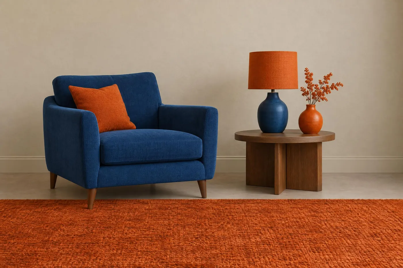
What it is for
Opposites push against each other harder than any other pair, so a complementary scheme gives the most contrast available from two colours. Nothing recedes and nothing blends.
It is also the easiest scheme for a viewer to read at a distance, which is why it survives on shirts, flags and packaging when subtler schemes turn to mush.
How it works
Pick one pair and hold it: blue and orange, red and green, yellow and purple. Two hues is the whole rule.
Split the amounts unevenly. Fifty-fifty is where complementary schemes go wrong, because neither colour can win and the eye has nowhere to rest. A four-to-one split reads as deliberate.
Keep both at the same saturation. One clean colour beside one dull one stops reading as a pair and starts reading as a mistake.
When to use it
Use it when the picture has to work small or far away: a poster, a logo, a thumbnail, a kit, a book cover.
Leave it alone when you want calm. Complementary is loud by construction, and no amount of muting fixes that without losing the scheme.
Told apart from its neighbours
Split-complementary swaps the single opposite for the two colours either side of it. Same contrast, much less shouting, and it is the safer choice nine times out of ten.
A warm and cool split divides the frame by temperature rather than by hue, so it can hold six colours. Complementary holds two.
Where it was used
Teal and orange became the default film grade of the 2000s for exactly this reason: skin sits on the orange side of the wheel, so throwing the shadows to teal separates a person from their background with no extra light. Penguin's tri-band covers ran the same trick in print from 1935.
- Teal and orange film grading
- sports team kits
- Penguin Books
The prompt
Run it as it stands, or drop the colour clause into a prompt you already have. It works in an image prompt and in a video prompt.
<subject>, complementary palette of deep blue and burnt orange only, the two at roughly equal weight against a neutral ground, no third hue anywhere, saturation held even between them
What goes wrong
A third colour creeps in, usually a green or a neutral that has gone slightly warm. Say two hues only and name both, then say no third hue anywhere.
The two come back at fifty-fifty and cancel. Say which one dominates and roughly how much of the picture the other one gets.
Leave out
a third hue, analogous neighbours, muddy mixtures of the pair
Watch for
Equal amounts of both fight. Give one of them about a fifth of the picture and let the other hold the rest.
Questions
Paint it
Pay for the one run. No subscription, and the price is on the model page before you sign in.
Next to it in relationships on the wheel