Warm and Cool Split
- temperature split
- warm cool contrast
The picture divided by temperature rather than by hue. Warm light, cool shadow.
Opens an image model with the palette in the prompt. The same words work on a video model.
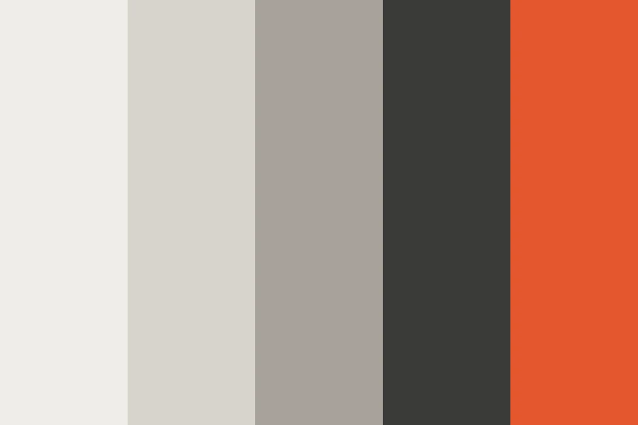
- #F2994A
- #E8C39E
- #F2F0EA
- #5B7C99
- #2C3E50
What it is for
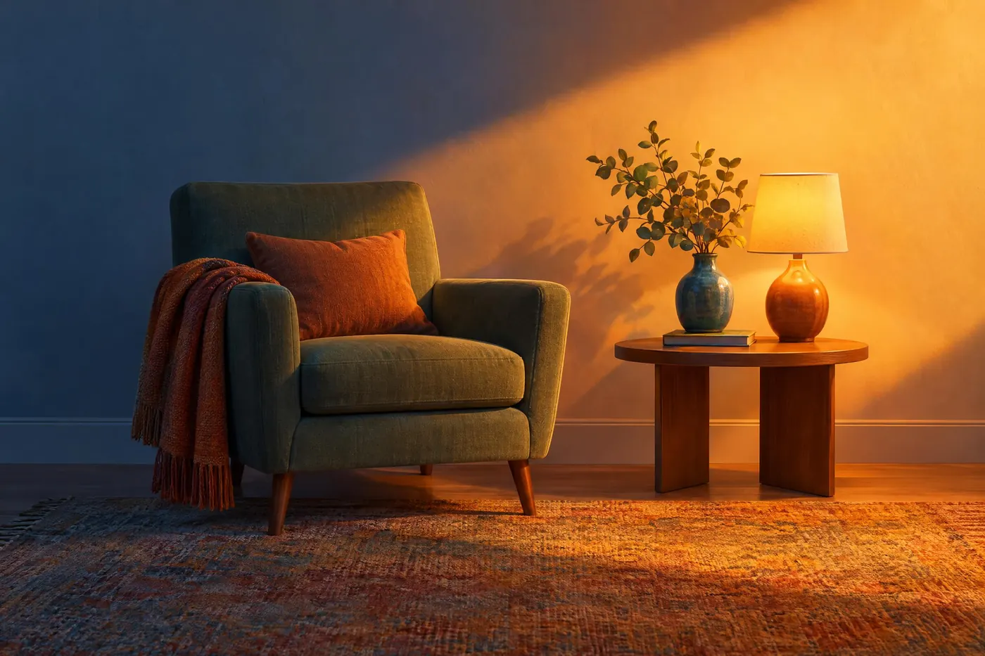
Real light does this by itself. Sunlight is warm and the sky filling the shadows is cool, so a picture built this way reads as observed rather than invented.
It also lets a scheme hold six or seven colours without falling apart, because the organising idea is temperature rather than hue. That is more freedom than any wheel relationship gives.
How it works
Decide the temperature of the light, then make the shadows the opposite. Warm key with cool fill is the usual pairing, and the reverse works for moonlight.
Let the division follow the light rather than the objects. A red jacket in shadow goes cool. Colouring by object is the mistake that makes this look like a filter.
Allow several hues on each side. This is the difference between a temperature split and a complementary pair: warm can be amber, coral and gold at once.
When to use it
Use it for anything lit: a portrait, an interior, a sunset exterior, a film frame, a product shot, a scene at a window.
Leave it alone for flat graphic work. There is no light in a Bauhaus poster for the temperature to follow.
Told apart from its neighbours
Complementary pairs two hues. This pairs two temperatures, which can carry many hues on each side and so reads as light rather than as design.
Teal and orange grading is this scheme reduced to exactly two colours and applied after the fact. This is the general case.
Where it was used
Rembrandt lit almost everything this way, with a warm key and the cool of the room filling the rest. Modern film grading rediscovered it as teal and orange, which is the same observation with the subtlety removed.
- Rembrandt
- sunset interiors
- most film grading
The prompt
Run it as it stands, or drop the colour clause into a prompt you already have. It works in an image prompt and in a video prompt.
<subject>, warm and cool split, every lit surface in warm amber and every shadow in cool blue-grey, the division following the light rather than the objects, several hues allowed on each side, no neutral shadows
What goes wrong
The shadows come back neutral grey, which is the default and kills the scheme. Say the shadows are cool blue-grey and never neutral.
The colour follows the objects rather than the light. Say the division follows the light, so an object in shadow takes the shadow temperature whatever colour it is.
Leave out
neutral grey shadows, warm shadows, cool highlights, a single hue pair
Watch for
It follows the light, not the objects. A warm object in shadow still goes cool.
Questions
Paint it
Pay for the one run. No subscription, and the price is on the model page before you sign in.