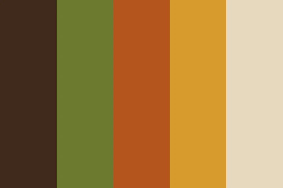
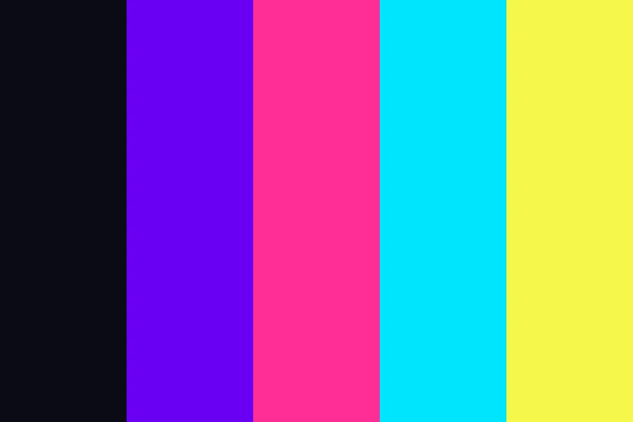
Sixties Pop
- mod palette
- pop art colours
- 1960s poster colours
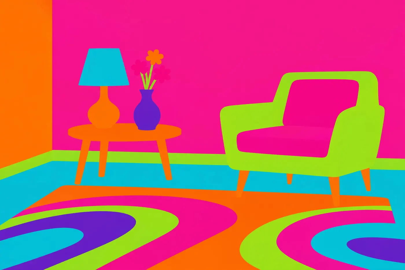
Hot pink, orange and lime at full strength, flat, with nothing to calm them down.
Opens an image model with the palette in the prompt. The same words work on a video model.
- #5B2A86
- #E6007E
- #F7671F
- #C6D92C
- #00A99D
- #F7F2E7
What it is for
Screenprinting got cheap and fluorescent ink arrived at the same time, so a poster could carry colours no painter had been able to buy. The decade used all of them at once.
Colours at full saturation next to each other appear to move. That optical buzz is the effect the period was chasing, and it only happens when no neutral is allowed in to break it up.
How it works
Take three hues from far apart on the wheel and run all three at full strength. Hot pink, orange and lime is the classic set.
Refuse the neutral. No grey, no black outline, no white space doing the work. The colours have to touch.
Keep every area flat. Shading pulls the saturation down and the vibration stops.
When to use it
Use it for music, festivals, posters, packaging and anything aimed at somebody young and in a hurry.
Leave it alone for long reading or fine detail. The same vibration that makes it work makes it tiring within seconds.
Told apart from its neighbours
Eighties neon glows against black. Sixties pop has no black in it at all, and the brightness comes from the colours touching rather than from a dark ground.
Memphis clash also refuses harmony, but it keeps white space and a black outline. This one fills the frame.
Where it was used
Peter Max sold millions of prints in this palette, and the Yellow Submarine animators built a whole film from it. Carnaby Street shop fronts ran the same colours because fluorescent screenprinting ink had just become affordable.
- Peter Max posters
- Yellow Submarine (1968)
- Carnaby Street
The prompt
Run it as it stands, or drop the colour clause into a prompt you already have. It works in an image prompt and in a video prompt.
<subject>, 1960s pop palette of hot pink, orange and lime green at full saturation with turquoise and violet, flat areas of solid colour with no shading, the colours placed so they vibrate against each other, no neutral ground and no grey
What goes wrong
A grey or a white ground appears and the buzz dies. Say no neutral ground anywhere.
The colours come back shaded and dulled. Say flat areas of solid colour at full saturation.
Leave out
neutrals, pastel, shading, grey
Watch for
There is no resting place in this palette. Adding a grey ground turns it into a 1990s layout.
Questions
Paint it
Pay for the one run. No subscription, and the price is on the model page before you sign in.