Memphis Clash
- Memphis Group palette
- postmodern clash
- 1980s Milan colours
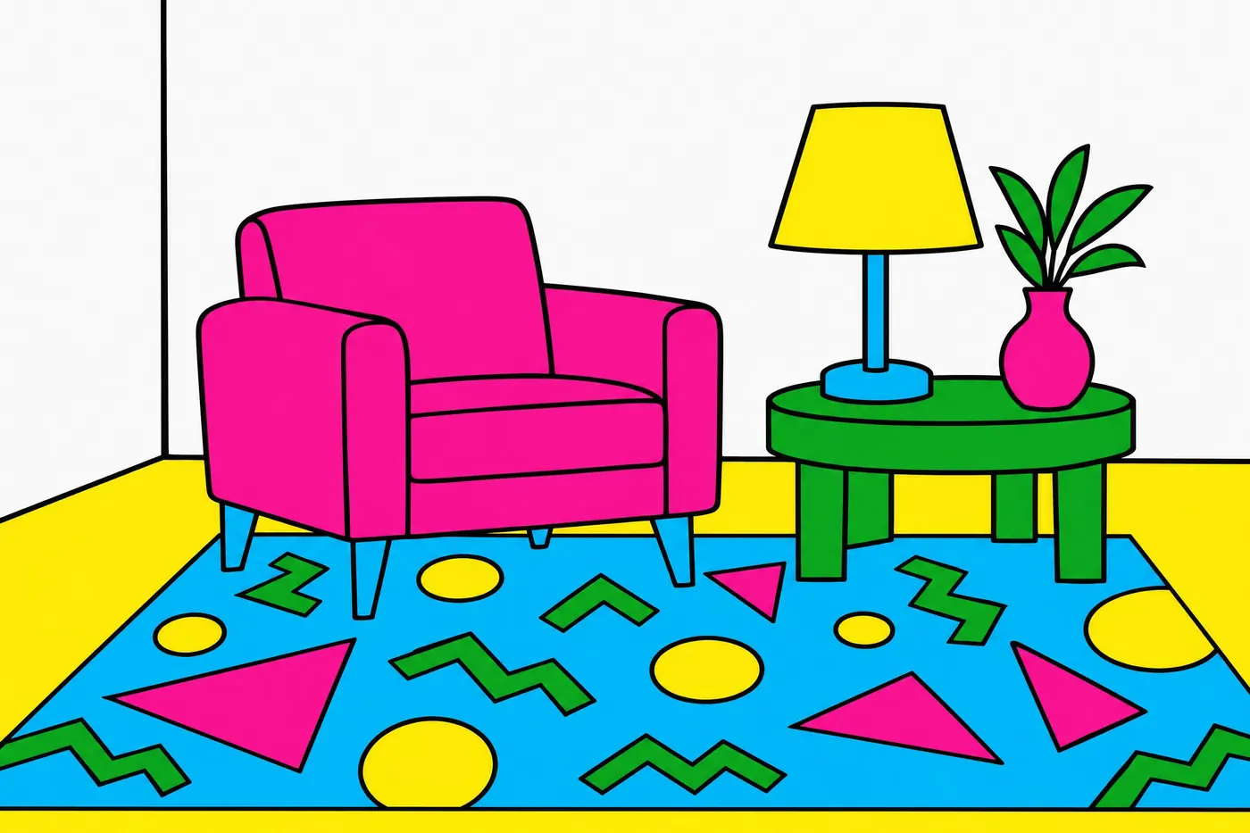
Four bright colours chosen not to go together, on white, with black doing the drawing.
Opens an image model with the palette in the prompt. The same words work on a video model.
- #141414
- #F2409A
- #F7D117
- #3FBF6F
- #2BB0E0
- #F5F2EB
What it is for
The group was formed to argue against good taste, and the palette is the argument. Four hues picked so that no two of them agree is a deliberate rejection of every harmony scheme there is.
It works because the white ground and the black line hold the chaos in place. Without them the same four colours are simply a mess.
How it works
Choose four bright hues that break every rule: hot pink beside grass green beside cyan beside yellow.
Keep the ground white and leave real space between the shapes. The clash needs room or it turns to noise.
Outline everything in black. The line is what makes it read as designed rather than accidental.
When to use it
Use it for anything playful and contemporary: an event, a brand for young people, packaging, a pattern, a title card.
Leave it alone for anything that has to look considered or calm. This palette has one volume.
Told apart from its neighbours
Sixties pop fills the frame and lets the colours vibrate against each other. Memphis keeps white space and a black outline, so it clashes without buzzing.
A triadic scheme picks three hues that are evenly spaced and therefore balanced. Memphis picks four on purpose so that they are not.
Where it was used
The Memphis Group put the palette on furniture in 1981 and it was on television graphics within three years. Swatch built a watch business on it, and it returns to fashion about once a decade.
- Memphis Group furniture
- Swatch watches
- late 1980s title sequences
The prompt
Run it as it stands, or drop the colour clause into a prompt you already have. It works in an image prompt and in a video prompt.
<subject>, memphis palette of hot pink, cyan, bright yellow and grass green on white, the four colours deliberately clashing with no harmony between them, flat solid areas outlined in black, no gradient and no muted colour
What goes wrong
The colours come back harmonised into something tasteful. Say the four clash deliberately with no harmony between them.
The frame fills up and the white space disappears. Say white ground with real space between the shapes.
Leave out
harmony, muted colour, gradients, pastel
Watch for
The clash is the rule. Asking for colours that work together removes the only thing that makes it Memphis.
Questions
Paint it
Pay for the one run. No subscription, and the price is on the model page before you sign in.