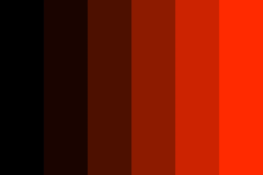
High Contrast
- accessible contrast
- AAA contrast
- maximum legibility
A near-black ground with white, yellow and cyan on it, every pair well past 7 to 1.
Opens an image model with the palette in the prompt. The same words work on a video model.
- #0B0B0B
- #FFFFFF
- #FFE500
- #6FE8FF
- #00429D
What it is for
This is the only palette in the catalogue with a pass mark. Every other one is a matter of judgement. This one is measured: the Web Content Accessibility Guidelines put a number on the difference in lightness between two colours, and 7 to 1 is the level they call AAA for normal text.
The readers it serves are not a small group. Low vision, glare on a phone in sunlight, a tired projector and a third generation photocopy all take contrast away. A picture that starts at 7 to 1 survives all four.
How it works
Work in pairs, never in a list. The white on the near-black here reaches about 19.7 to 1. The yellow on the near-black reaches 15.4 to 1 and the cyan 13.7 to 1. The white on the deep blue reaches 9.3 to 1 and the yellow on it 7.3 to 1.
Drop the middle of the range. Mid greys are what pull a pair under the mark, so a high contrast set has a dark end, a light end and almost nothing between them.
Never let a hue carry the meaning alone. A shape, a label or a position has to say the same thing the colour says, or the message is gone for a reader who cannot separate the two hues.
When to use it
Use it for signage, a warning, a slide read from the back of a room, a public information sheet, or anything that has to work on a phone outdoors.
Leave it alone when you want atmosphere. This palette has no quiet setting, and a picture that runs at maximum contrast everywhere gives the eye nowhere to rest.
Told apart from its neighbours
Achromatic also runs from dark to light, but it promises nothing about a number. This palette is chosen against a measured threshold and checked.
Colour Blind Safe answers a different question. It keeps hues apart for a reader who cannot see one of them. High contrast keeps lightness apart for a reader who cannot resolve fine detail.
Where it was used
Road signs, fire exits and aircraft safety cards have run on this palette since long before the web put a number on it. The 7 to 1 figure is the AAA level in the Web Content Accessibility Guidelines. 4.5 to 1 is the AA level for normal text, and 3 to 1 is the floor for large text and for the edge of a control.
- Road signage
- Aircraft safety cards
- Public information design
The prompt
Run it as it stands, or drop the colour clause into a prompt you already have. It works in an image prompt and in a video prompt.
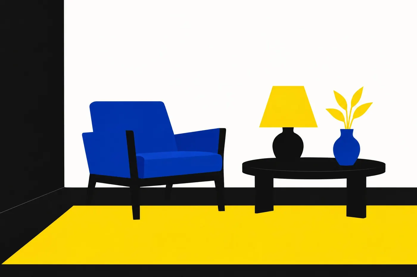
<subject>, high contrast palette of near-black, pure white and a hard yellow with one deep blue, every colour placed only against its opposite in lightness, no mid greys, no pastel tints, flat areas with hard edges
What goes wrong
The model returns the right hues at the wrong lightness, usually a softened yellow on a mid grey. Say near-black and pure white, and say no mid greys.
Thin lines and small text arrive in the accent colour. A ratio is measured on the colour and not the size, but a hairline still disappears. Say flat areas with hard edges.
Leave out
mid greys, pastel tints, hairline outlines, gradients between the colours
Watch for
Contrast belongs to a pair, not to a colour. A yellow that passes on black fails on white.
Questions
Paint it
Pay for the one run. No subscription, and the price is on the model page before you sign in.