Night Safe Red
- red light palette
- dark adaptation red
- cockpit red
Deep reds on pure black, so a reader keeps their dark adapted eyes.
Opens an image model with the palette in the prompt. The same words work on a video model.
- #000000
- #1A0500
- #4D1000
- #8C1B00
- #CC2200
- #FF2A00
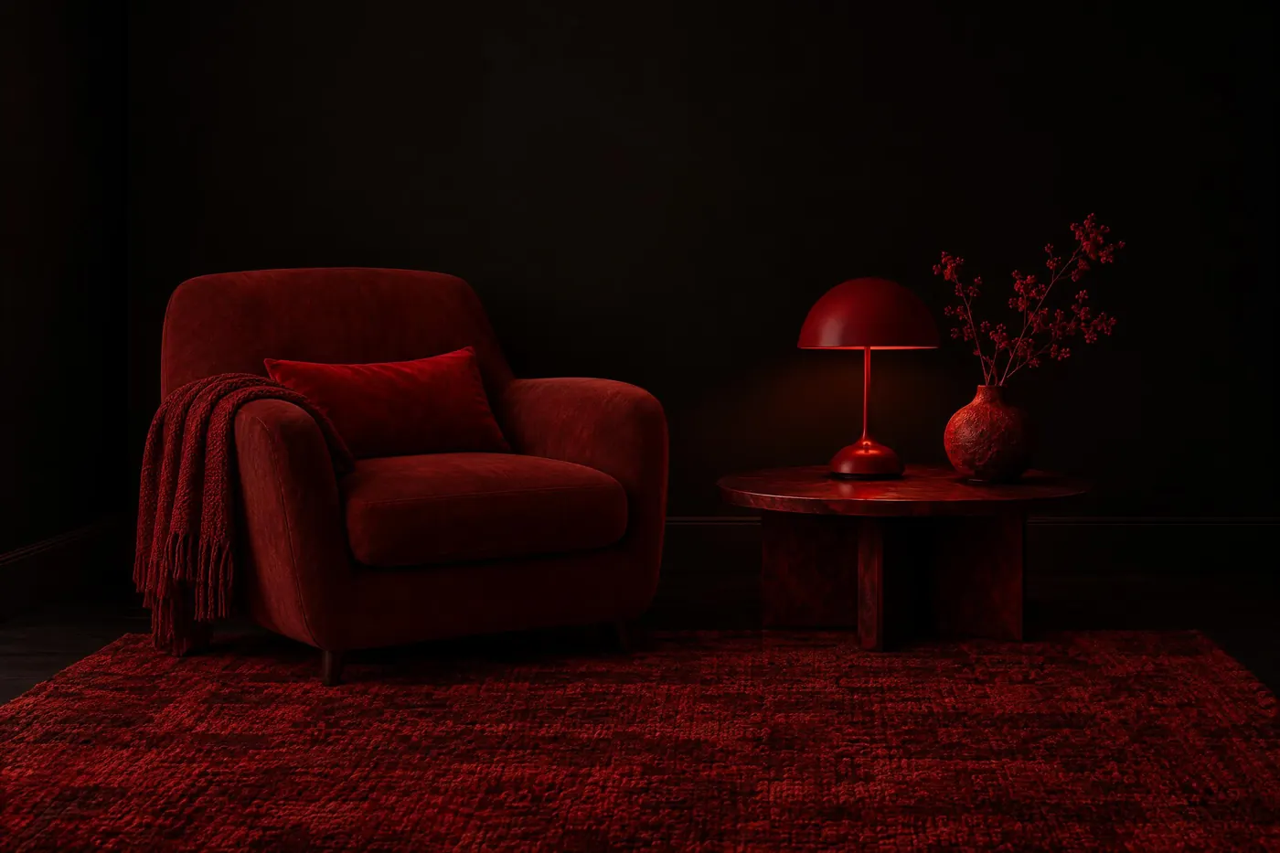
What it is for
The eye takes twenty to thirty minutes to adapt to darkness, and one glance at a white screen undoes all of it. Deep red light sits at the far end of the visible range, where the cells that carry night vision respond least, so a red display costs the reader far less of that adaptation.
This is the one palette here chosen against a cost rather than for a gain. It is harder to read than almost anything else on this shelf, and it is used anyway, because the alternative is a reader who cannot see out of the window for half an hour.
How it works
Put everything on pure black and let the black hold most of the frame. Lit area is what costs the reader, so less of it is the whole method.
Build the set from one red at several strengths. The brightest red here reaches about 5.6 to 1 against the black, which passes AA for normal text and does not reach AAA. That is the honest ceiling of this palette.
Set the type larger than you would elsewhere, and keep the strokes thick. Size is how this palette buys back what the low contrast takes.
When to use it
Use it for anything read at night by somebody who then has to look into the dark: an observatory, a cockpit, a bridge, a map on a night walk, a phone at three in the morning.
Leave it alone in daylight and leave it alone for anything a general audience has to read quickly. Outside the dark it is simply a hard palette to read.
Told apart from its neighbours
Dark Interface also runs on a near-black ground, but it uses an off-white text and a cool accent, and both of those wreck dark adaptation. The two palettes solve different problems in the same room.
Monochromatic is one hue at many strengths for its own sake. This palette picks the one hue for a physical reason, and no other hue will do the job.
Where it was used
Observatories, aircraft cockpits, ship bridges and submarines have run on red instrument light for most of a century. Consumer software borrowed the idea late: a red night mode is now a common option in astronomy and navigation apps.
- Observatory control rooms
- Aircraft cockpits
- Ship bridges
The prompt
Run it as it stands, or drop the colour clause into a prompt you already have. It works in an image prompt and in a video prompt.
<subject>, night safe palette of deep reds on pure black, every element a shade of red from dull ember to bright crimson, no white, no blue and no green anywhere, the black holding most of the frame
What goes wrong
A white highlight or a grey edge creeps in and undoes the point. Say no white anywhere, and name pure black as the ground.
The reds drift to pink or to orange. Pink carries a blue component and orange is already halfway to yellow. Say deep red and say no other hue.
Leave out
white, blue, green, bright highlights, any hue that is not a red
Watch for
Red on black is a trade. It protects night vision and it costs legibility, so set the text large.
Questions
Paint it
Pay for the one run. No subscription, and the price is on the model page before you sign in.