Desert Sand
- arid palette
- dune colours
- sun bleached earth
Pale sand and warm clay, held down by grey green scrub and a bleached sky.
Opens an image model with the palette in the prompt. The same words work on a video model.
- #EFE0BE
- #D9B37C
- #BE8A55
- #8B6742
- #A3A98D
- #CFE0E6
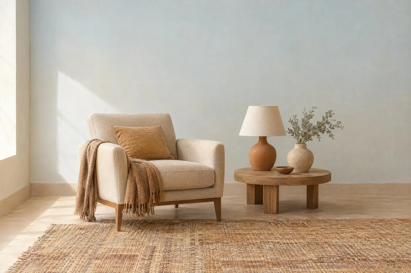
What it is for
Desert colour is what light does when there is no water in the air. Everything is one or two steps lighter than you expect, contrast is low, and the few cool notes are dusty rather than clean.
That combination reads as heat without anybody drawing the sun. It is the cheapest way to make a picture feel dry.
How it works
Build the set from three warm earths and stop: pale sand, warm ochre and a clay brown. Those three do almost all the work.
Add one grey green for the scrub. It is the only cool thing in a desert and it stops the palette turning into a single beige.
Lighten the sky. A desert sky is pale and slightly grey at the horizon, and a clean blue breaks the set immediately.
When to use it
Use it for anything about heat, distance, dust or patience: outdoor gear, a western, ceramics, a travel piece, a slow product shot.
Leave it alone when the subject needs to feel fresh or clean. Desert colour is dusty by construction and cannot be scrubbed up.
Told apart from its neighbours
Terracotta is the fired version of the same earths. It is redder, more saturated and belongs to an object rather than to a landscape.
Raw Linen holds the same lightness but has no ochre in it. If the picture is warm and pale but not at all orange, that is linen, not desert.
Where it was used
Adobe building gives the palette back exactly, because the walls are made of the ground they stand on. Outdoor clothing catalogues have used it for decades for the same reason: it makes a product look like it belongs outside.
- adobe architecture
- Sonoran field guides
- outdoor brand catalogues
The prompt
Run it as it stands, or drop the colour clause into a prompt you already have. It works in an image prompt and in a video prompt.
<subject>, desert palette of pale sand, warm ochre and dry clay brown, with grey green scrub as the only cool note and a bleached pale blue above, low saturation, strong light, no deep shadow
What goes wrong
A photograph of a desert comes back instead of the subject. The palette is the colour set, not the place. Keep your own subject at the front of the clause and let the colours describe it.
The sky returns a clean deep blue and the whole thing turns into a holiday picture. Say the sky is bleached and pale, with no saturation in it.
Green creeps in as vegetation. Say the only green is a dusty grey green scrub, and say there is no lush green anywhere.
Leave out
lush green, deep blue sky, wet surfaces, heavy shadow
Watch for
The sky is the part that goes wrong. Desert sky is bleached, not blue, and saying so keeps the whole picture dry.
Questions
Paint it
Pay for the one run. No subscription, and the price is on the model page before you sign in.
Next to it in landscape