Pastel Symmetry
- storybook pastel
- flat pastel
- confectionery palette
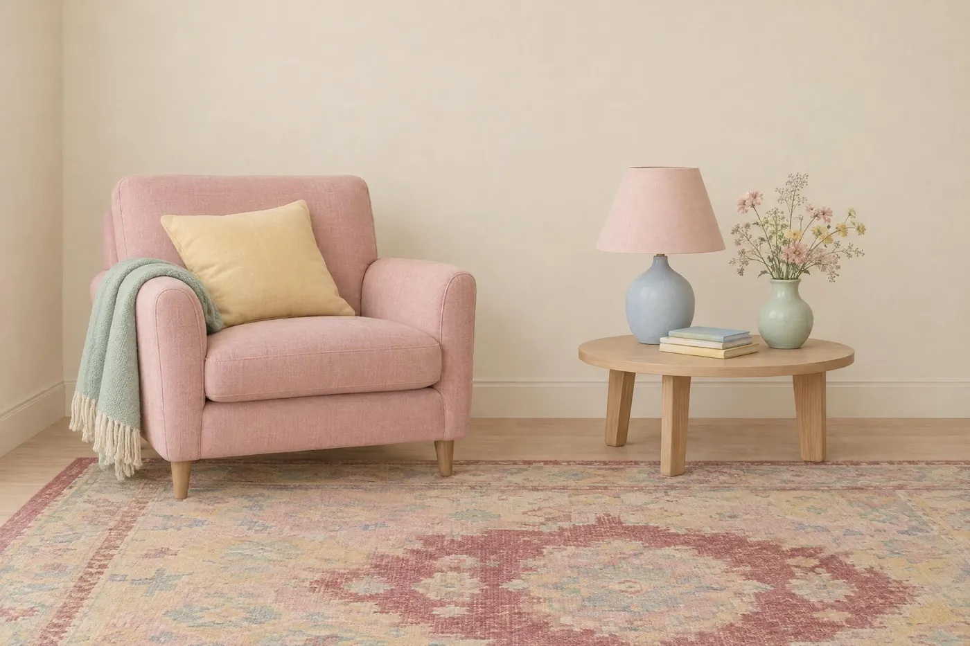
Chalky pastels in flat even light, with one muted deep colour to anchor them.
Opens an image model with the palette in the prompt. The same words work on a video model.
- #E3A7B3
- #F2D98D
- #B9D6C4
- #9FBCD4
- #F5EDDF
- #A8443E
What it is for
Pastels have almost no value contrast, so nothing in the frame fights for attention. That is what lets a symmetrical composition read as calm rather than as empty.
The single deep colour is what stops it floating away. One dark note gives the eye a floor and the pastels above it stop looking like a wash.
How it works
Dust every colour. A pastel here has a little grey in it, as though it were mixed with chalk or printed on old board.
Light it flat. Strong shadow puts depth into a palette that was chosen to be shallow, and the whole effect goes with it.
Add exactly one deep muted colour, usually a brick red or a dark green, and use it on a small area. Two anchors and the palette has a normal contrast range again.
When to use it
Use it for anything storybook, nostalgic or deadpan: a title card, a set, an illustrated poster, a hotel, a menu, a children's book.
Leave it alone for anything urgent. There is no contrast in it to make something matter.
Told apart from its neighbours
Bubblegum Pop uses the same colour family bright and glossy. This one dusts them and adds a dark anchor, which changes the reading completely.
An analogous scheme keeps its hues neighbouring. Here the hues are spread right across the wheel and it is the low saturation that holds them together.
Where it was used
American independent cinema of the 2000s made it a house style, borrowed from mid century book covers and from hand tinted postcards. The symmetry came with it, which is why the palette and the centred frame are now read as one idea.
- The Grand Budapest Hotel (2014)
- Moonrise Kingdom (2012)
- The Royal Tenenbaums (2001)
The prompt
Run it as it stands, or drop the colour clause into a prompt you already have. It works in an image prompt and in a video prompt.
<subject>, a palette of dusty pastel pink, butter yellow, mint and powder blue with one muted deep red to anchor them, flat even light with no strong shadow, every colour slightly chalky rather than bright, cream ground
What goes wrong
The colours come back bright and clean. Say they are chalky and slightly dusty rather than saturated.
Deep shadows appear and the picture gains depth it should not have. Say the light is flat and even with no strong shadow.
Leave out
candy saturation, strong shadows, black, a cool grey cast
Watch for
Chalky, not bright. A pastel that comes back clean and glossy reads as plastic instead of as painted board.
Questions
Paint it
Pay for the one run. No subscription, and the price is on the model page before you sign in.