Red and Green Glow
- warm red and bottle green
- golden red and green
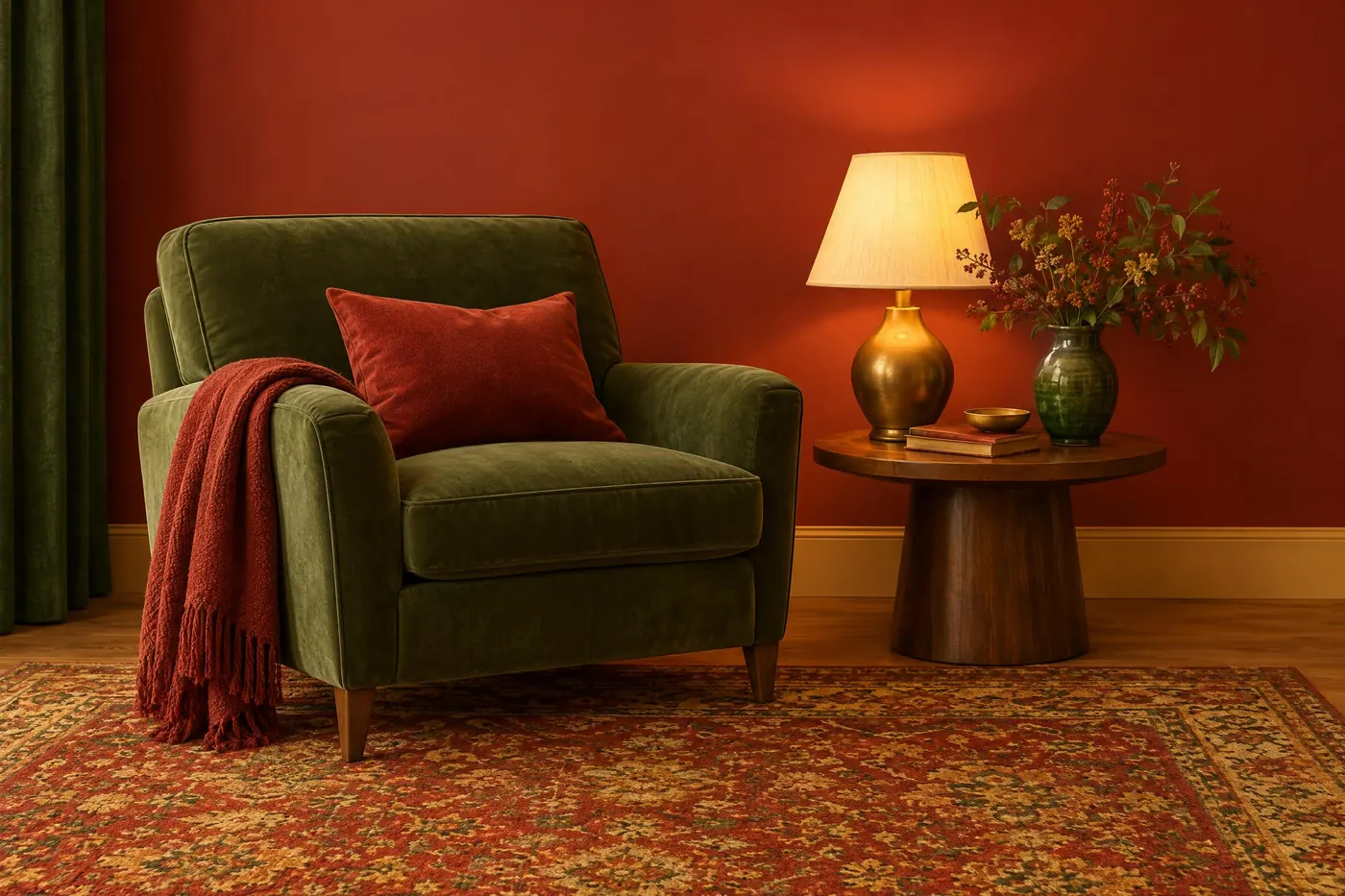
Warm red and bottle green held together by gold, with every surface kept warm.
Opens an image model with the palette in the prompt. The same words work on a video model.
- #9E1B1B
- #C8542A
- #E8C06A
- #F2E6CC
- #2F5D3A
- #1E3B28
What it is for
Red and green are opposites, so the pair should fight. Warming both of them and running gold between them takes the fight out without taking the contrast out, which is why the result reads as generous rather than loud.
It also flatters skin. Everything in the frame is warm, so a face never sits against a cold surface and never has to be lit separately.
How it works
Warm the green. A bottle green with yellow in it belongs to the same family as the red. A cool green does not and will read as a mistake.
Put gold between them: brass, honey, wheat, amber glass. It is the third colour that makes the pair legal.
Keep the contrast soft. Saturation high and contrast low is the combination that gives the glow. Adding deep black shadow makes it a different palette.
When to use it
Use it for food, for warmth, for nostalgia, for an interior at night, for a story about a neighbourhood or a kitchen.
Leave it alone for anything cold, clinical or modern. There is no cool note available anywhere in the scheme.
Told apart from its neighbours
A plain complementary palette of red and green keeps both hues neutral and lets them clash. This one warms both and inserts gold, which is the whole difference.
Sitcom Brights is also warm and also dulled, but it is lit flat. This palette needs a soft glow and some falloff.
Where it was used
French cinema of the late 1990s used it on whole films, and advertising took it straight afterwards for anything to do with food. It survives because it is the only way to run two opposites and still look friendly.
- Amelie (2001)
- Delicatessen (1991)
- Chocolat (2000)
The prompt
Run it as it stands, or drop the colour clause into a prompt you already have. It works in an image prompt and in a video prompt.
<subject>, a palette of warm red and bottle green with honey gold between them, every surface kept warm including the greens, cream in the light areas, saturation pushed high and the contrast kept soft, no cool blue anywhere
What goes wrong
A cool blue appears, usually in a window or a shadow. Say no cool blue anywhere and that the shadows are warm.
The red and green come back neutral and the picture looks like a holiday card. Say both hues are warmed and that honey gold sits between them.
Leave out
cool blue, neutral grey, cold shadows, a fourth hue
Watch for
Red and green turn festive the moment the gold drops out. The gold is what holds the pair together.
Questions
Paint it
Pay for the one run. No subscription, and the price is on the model page before you sign in.