Mid-century Modern Graphic
- 1950s modern
- Alvin Lustig style
Flat cut shapes, a warm muted palette, and printed texture over the top.
Opens an image model with the prompt in it. The price is on the page before you sign in.
What it is for
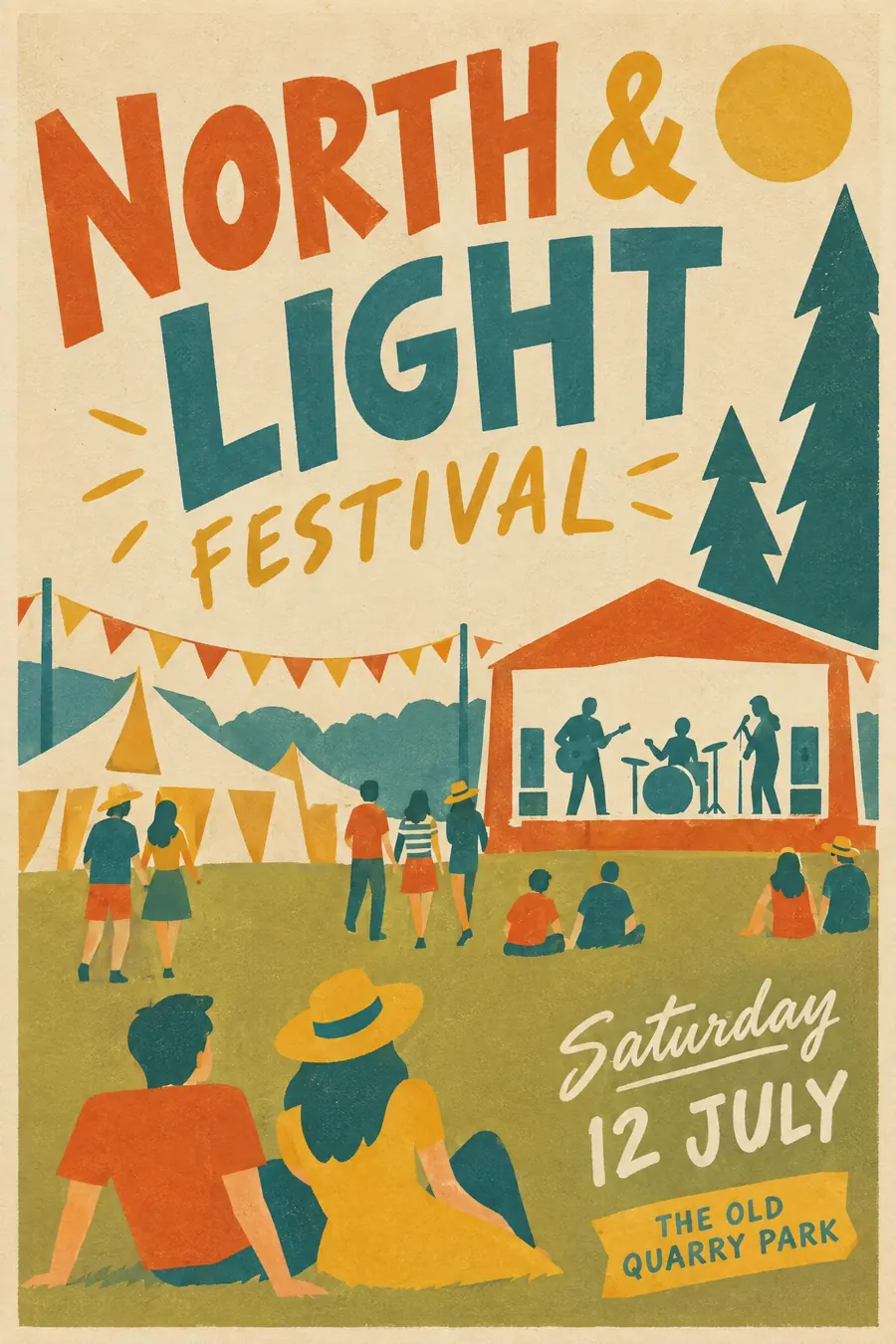
Mid-century modern is warm geometry. It uses the same simplification as Swiss Style but keeps a human hand in the cutting, so it reads as friendly rather than official.
The aged paper and misprint texture do a lot of the liking. People read it as nostalgic and trustworthy before they read it at all.
How it works
Cut the shapes rather than draw them. Every form should look like it could have been made with scissors, with slightly imperfect edges.
Overprint: let two flat colours overlap and make a darker third. Add a light grain or offset texture across everything.
Palette is warm and dusty: mustard, burnt orange, teal, olive, on cream or oatmeal. Figures are simplified to a shape, a line and a dot, with no facial detail. Mix a friendly sans with a light script for one line only.
When to use it
Use it for a farmers market, a jazz night, a school fair, a craft beer launch, a garden party, a family event that wants to look designed.
Leave it alone when you need urgency or scale. It is a quiet style and it does not shout.
Told apart from its neighbours
Contemporary flat illustration is the modern descendant: same simplification, but clean vector edges, brighter colours and no print texture.
Screenprint pop is louder, with fewer colours, harder registration errors and much bigger areas of flat ink.
Festival of Britain is the British 1951 branch, with more line drawing and a specific optimism about science.
Where it was used
Alvin Lustig's New Directions book jackets in the 1940s and 1950s built the vocabulary, Paul Rand carried it into corporate work at IBM and Westinghouse, and Charley Harper turned the same flat geometry into wildlife illustration that is still reprinted.
- Alvin Lustig
- Paul Rand
- Charley Harper
The prompt
Replace the blanks with your own event, keep the rest. Then run it on an image model.
poster for <event>, mid-century modern graphic style 1950s, flat cut-paper shapes with a slight overprint texture, warm muted palette of mustard burnt orange teal and cream on aged paper, stylised simplified figures with no facial detail, hand-lettered friendly sans mixed with a light script, loose asymmetric layout, <date, time and place> in a small hand-set block
What goes wrong
The model returns clean modern vector illustration. Ask for overprint texture, imperfect cut edges and aged paper.
The other failure is the palette turning bright. Say warm muted mustard, burnt orange and teal, nothing saturated.
Leave out
gloss, gradients, photographic realism, neon colour
Watch for
The texture is what makes it read as printed rather than as a modern flat illustration.
Questions
Print it
Pay for the one run. No subscription, and the price is on the model page before you sign in.