Art Deco
- Jazz Age style
- 1930s deco
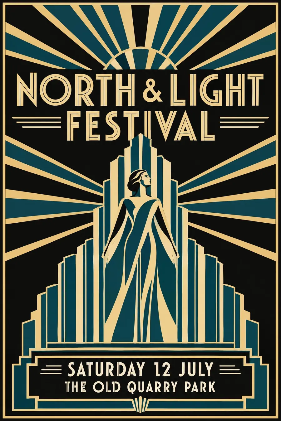
Stepped forms, a sunburst, and gold on black with everything symmetrical.
Opens an image model with the prompt in it. The price is on the page before you sign in.
What it is for
Deco is the style of an event that thinks well of itself. The symmetry reads as ceremony and the gold reads as money, which is why it has never left hotel lobbies and awards nights.
It also flatters a short title. The stepped composition builds a plinth for four or five words and makes them look monumental.
How it works
Build up the middle. Stepped forms, a fan or a sunburst behind the headline, and strict left-right symmetry around a central axis.
The palette is small and rich: black, cream, a flat gold, and one jewel accent such as deep teal or coral. The gold is flat ochre, not a metallic gradient.
The type is geometric all-caps, wide and confident, often with a thin inline rule cut through each letter. Figures are streamlined and faceless, more silhouette than portrait.
When to use it
Use it for a gala, a jazz night, an awards evening, a hotel, a cocktail launch, a period film season.
Leave it alone for anything informal or anything with many detail lines. The centred symmetry has nowhere to put a list.
Told apart from its neighbours
Streamline Moderne is the late, aerodynamic end of the same decade: horizontal speed lines, curved corners and chrome instead of stepped verticals and gold.
Golden Age travel posters often use Deco shapes, but the subject is a place and the palette opens up. Deco proper stays tight and dark.
Where it was used
A M Cassandre set the standard with Normandie in 1935, a ship's bow built out of symmetry and stepped shadow. Paul Colin's Revue Negre bills did the same for Paris nightlife, and the Chrysler Building put the stepped fan into the skyline in 1930.
- Cassandre
- Chrysler Building
- Paul Colin
The prompt
Replace the blanks with your own event, keep the rest. Then run it on an image model.
poster for <event>, Art Deco 1930s style, symmetrical stepped tower composition, sunburst fan radiating behind the title, flat gold cream and deep teal on black, bold geometric all-caps with thin inline rules, stylised streamlined figure, <date, time and place> centred in a ruled panel at the base
What goes wrong
The model returns a gold gradient and a plastic sheen. Ask for flat ochre gold, no metallic shading, no gradient.
The second failure is a busy sheet. Deco needs one central motif and a lot of black around it, so name the single motif and say the background stays plain.
Leave out
hand-drawn naivety, pastel craft colours, grunge texture, asymmetry
Watch for
Symmetry does most of the work. Knock it off centre and the glamour goes with it.
Questions
Print it
Pay for the one run. No subscription, and the price is on the model page before you sign in.
Next to it in geometry takes over