Wayfinding
- signage style
- transport graphics
- pictogram system
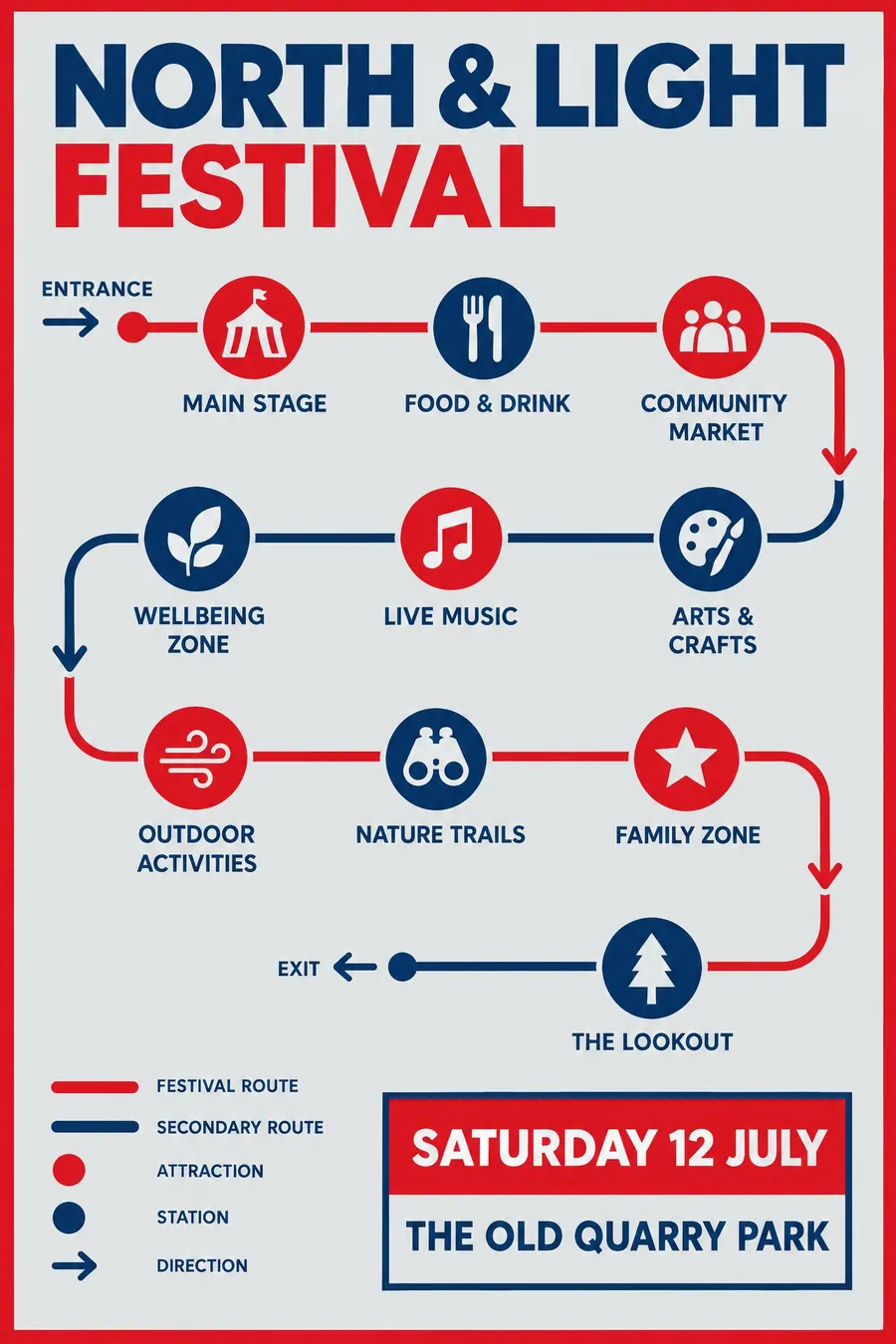
Looks like a transport sign: icons, arrows, colour-coded routes and a clear rule system.
Opens an image model with the prompt in it. The price is on the page before you sign in.
What it is for
A signage poster tells you the event is organised. It reads as a plan rather than an advert, which is a genuine relief on an event with many things happening at once.
It also solves a real problem. Six attractions in six icons on a route line is faster to read than six bullet points, and it survives being seen from four metres away.
How it works
Draw the event as a diagram. A route line with dots, or a simple plan with zones, and each attraction as a labelled stop.
Build one pictogram set: same stroke weight, same corner radius, same circle around each. Consistency is the entire effect.
Palette is institutional and flat: a signal colour, a navy, white, light grey. Type is a humanist sans, two weights only, and every label aligns to the same baseline grid.
When to use it
Use it for a festival with a site map, a multi-venue day, an open day, a trail, a sports event, anything with places and times.
Leave it alone for a single simple event. A route diagram with one stop on it looks silly.
Told apart from its neighbours
Swiss Style is the parent and stays abstract. Wayfinding adds the icons and arrows that a physical place needs.
A modern icon system uses the same pictograms but arranges them as a grid rather than as a route, and usually belongs to an app rather than a station.
- Swiss Style
- Modern Icon System
- NASA Worm Modernist
Where it was used
Harry Beck's 1933 London Underground diagram is the founding document, Otl Aicher's pictograms for the 1972 Munich Olympics made the icon set a design object in its own right, and Massimo Vignelli's 1972 New York subway map argued the same case in America.
- Harry Beck
- Otl Aicher
- Massimo Vignelli
The prompt
Replace the blanks with your own event, keep the rest. Then run it on an image model.
poster for <event>, wayfinding signage style, layout drawn as a route diagram with coloured lines and station dots, consistent stroke-weight pictograms in circles for each attraction, directional arrows, flat institutional palette of signal red navy and white on light grey, Johnston-style humanist sans in two weights, <date, time and place> in a rectangular information panel
What goes wrong
The model returns illustrated icons with varying line weights. Say one consistent stroke weight for every pictogram, each inside a circle of the same size.
The second failure is decorative type. Ask for a humanist sans in two weights and nothing else, aligned to a baseline grid.
Leave out
illustration, texture, shadows, decorative type, more than four colours
Watch for
Every icon must share one stroke weight. Mixed weights break the illusion of a system.
Questions
Print it
Pay for the one run. No subscription, and the price is on the model page before you sign in.