Bauhaus
- Modernist poster
- Bauhaus geometric
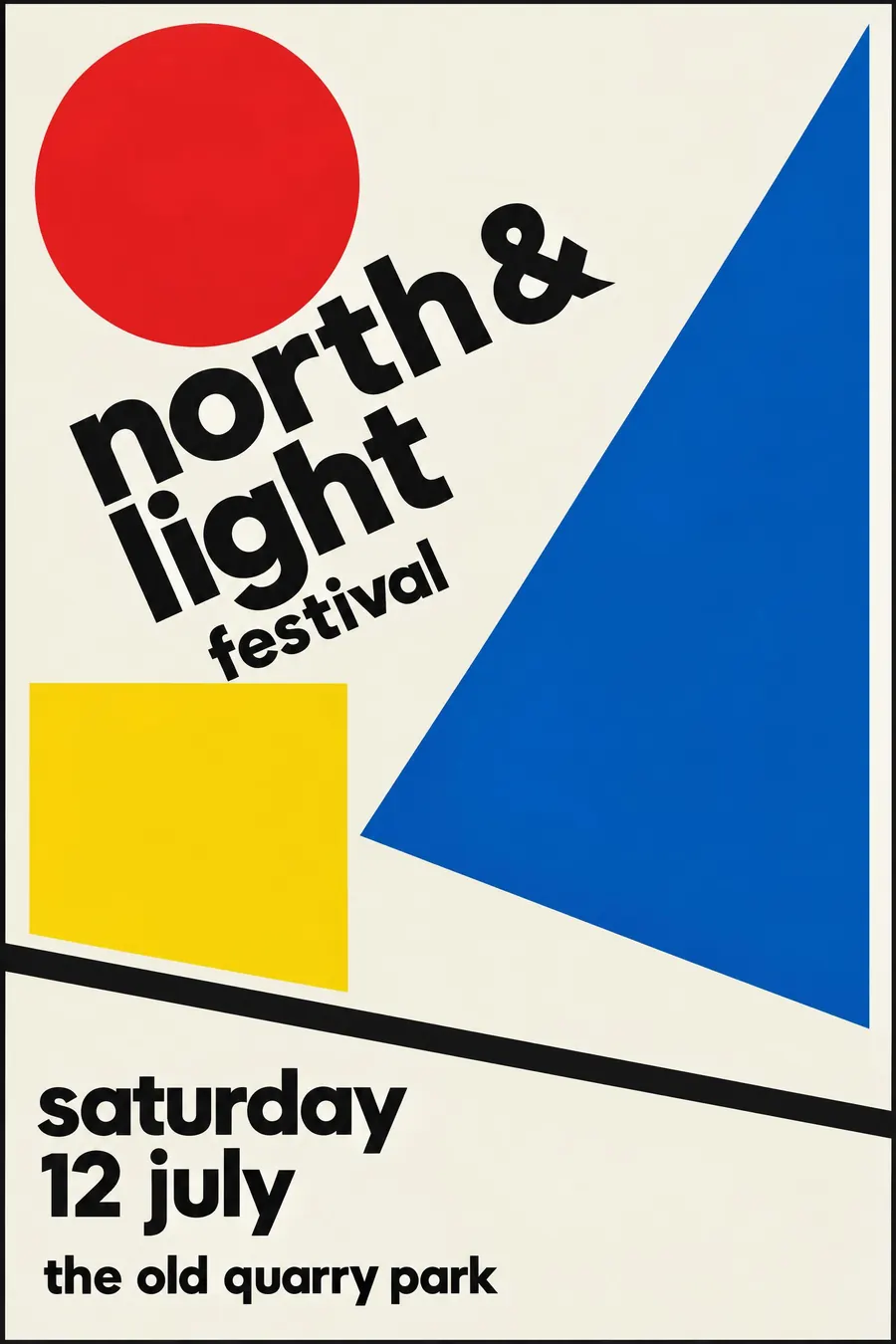
Circle, square and triangle in primary colours, arranged off centre.
Opens an image model with the prompt in it. The price is on the page before you sign in.
What it is for
Bauhaus reads as design rather than decoration, so a local event in this style is immediately mistaken for something curated. That is the whole reason it works on a village fete.
The shapes also carry meaning cheaply. A circle can be a sun, a ball, a plate or a drum, and the reader supplies the rest.
How it works
Build from three shapes only: circle, square, triangle. Overlap them and let the overlap make a fourth colour.
Break the symmetry. Put the weight in one corner, run a diagonal through the sheet, and leave a clear diagonal of empty space opposite it.
Type is a geometric sans, often all lowercase, set in two sizes and nothing between. A thick rule divides the title from the detail. Primary red, yellow and blue, black, and an off-white paper.
When to use it
Use it for anything that wants to stand out from a wall of soft craft posters: a fete, a school fair, a music night, a design talk, a market.
Leave it alone when the subject is warm and personal. Pure geometry has no way to be affectionate.
Told apart from its neighbours
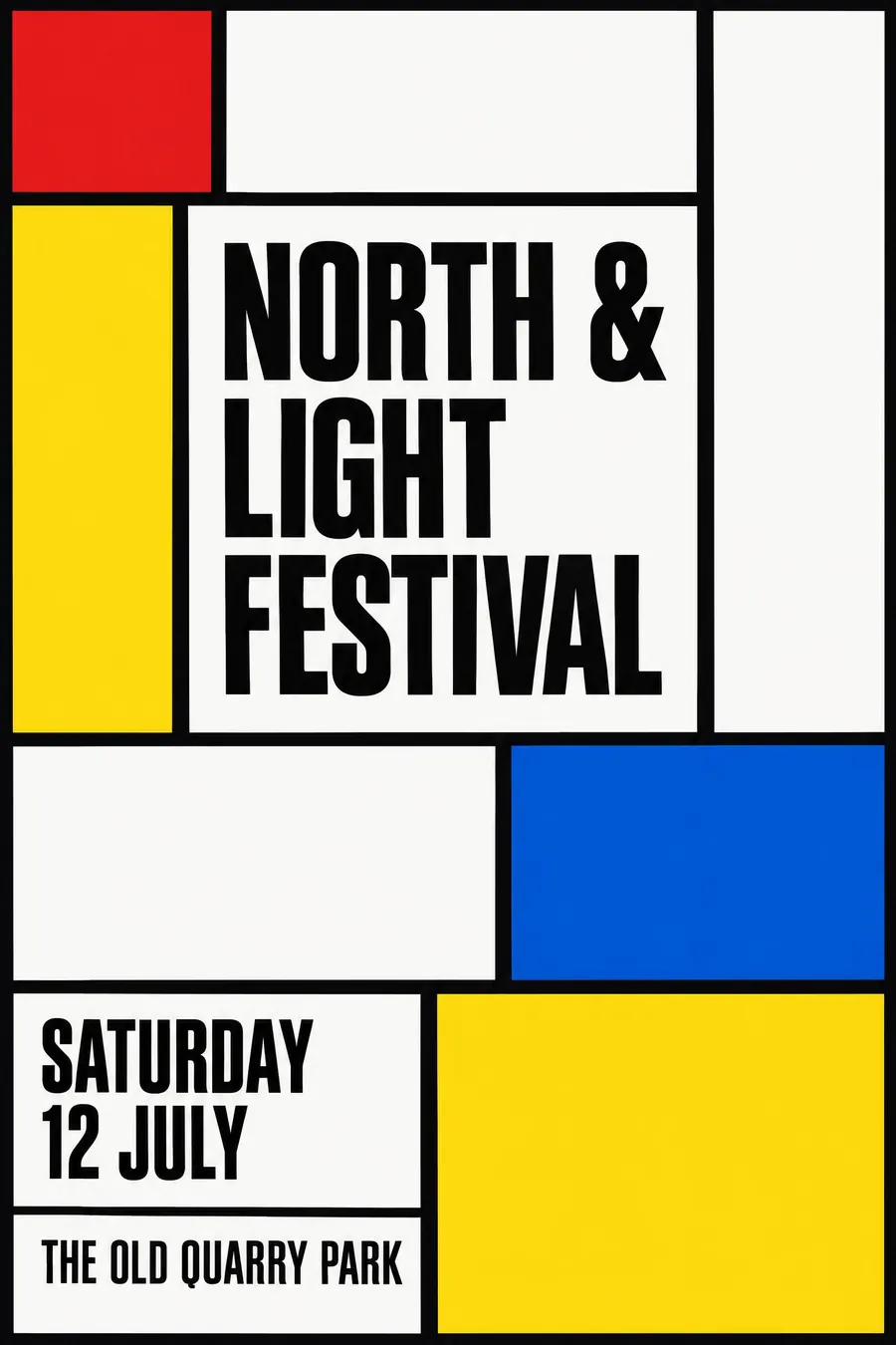
De Stijl allows only rectangles, black rules and primaries, with no diagonal at all. If there is a triangle or a circle, it is Bauhaus.
Constructivism uses the same shapes but weaponises them: hard diagonals, photomontage and red and black. Bauhaus is calmer and teaches rather than shouts.
Swiss Style comes later and drops the shapes for a grid, photography and Helvetica.
Where it was used
Herbert Bayer designed the type and the exhibition sheets at Dessau, Joost Schmidt's 1923 Bauhaus exhibition poster set the template, and Laszlo Moholy-Nagy pushed the same geometry into photograms and book covers.
- Herbert Bayer
- Laszlo Moholy-Nagy
- Joost Schmidt
The prompt
Replace the blanks with your own event, keep the rest. Then run it on an image model.
poster for <event>, Bauhaus modernist style, composition built from a circle a square and a triangle, flat primary red yellow and blue with black on off-white, strong diagonal axis, asymmetric layout with clear hierarchy, lowercase geometric sans set in two sizes, thick rule separating the blocks, <date, time and place> in the lower left
What goes wrong
The model returns a symmetrical arrangement of shapes with nothing happening. Ask for an asymmetric layout with a strong diagonal axis and the weight in one corner.
The second failure is too many colours. Say flat primary red, yellow and blue, plus black on off-white, and nothing else.
Leave out
ornament, texture, gradients, illustration, serif type
Watch for
Asymmetry is the point. A centred Bauhaus poster is just a shape on a page.
Questions
Print it
Pay for the one run. No subscription, and the price is on the model page before you sign in.
Next to it in geometry takes over