Streamline Moderne
- Moderne
- aerodynamic style
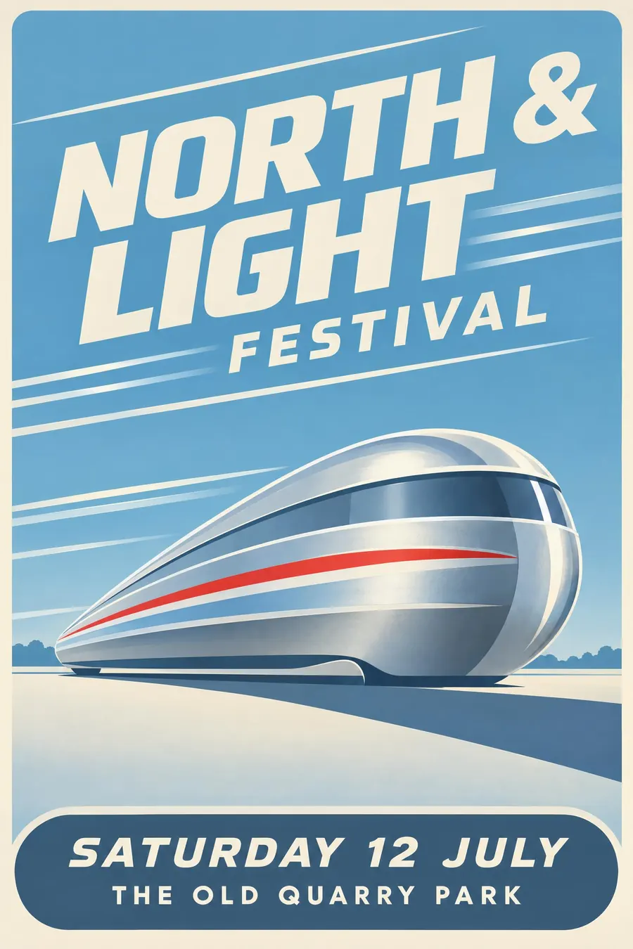
Horizontal speed lines, rounded corners and chrome, all leaning forward.
Opens an image model with the prompt in it. The price is on the page before you sign in.
What it is for
Moderne sells the future as speed. Everything is drawn as if wind has already shaped it, so the poster promises that the thing advertised is faster and newer than what you have.
It is also the friendliest of the deco family. Rounded corners read as approachable where stepped verticals read as formal.
How it works
Draw the horizontal. Three parallel speed lines behind an object do more than any amount of detail on the object itself.
Round every corner and taper the shapes into a teardrop. The silhouette should look like it was made in a wind tunnel.
Palette is cool: chrome grey, pale sky blue, cream, one red accent. The type is a wide geometric sans, often leaning a few degrees forward, sometimes with its own speed lines trailing off the last letter.
When to use it
Use it for transport, a motor show, a diner, a retro product launch, a sports day, anything about going somewhere.
Leave it alone for a still subject. Speed lines behind a cake stall read as a joke.
Told apart from its neighbours
Art Deco steps upward and reaches for gold. Moderne slides sideways and reaches for chrome.
Mid-century modern graphic comes twenty years later and swaps the rendered chrome for flat cut shapes and texture. If nothing gleams, you are past Moderne.
Where it was used
Raymond Loewy applied it to everything from the Coldspot refrigerator in 1935 to the Pennsylvania Railroad S1 locomotive, and the Chrysler Airflow put it on the road in 1934. American diners and Greyhound stations kept the look alive long after the movement ended.
- Raymond Loewy
- Chrysler Airflow
- Coldspot refrigerator
The prompt
Replace the blanks with your own event, keep the rest. Then run it on an image model.
poster for <event>, Streamline Moderne style, strong horizontal speed lines, rounded corner forms and a teardrop silhouette, chrome and pale blue with cream and a single red accent, wide geometric sans in a slight forward lean, low horizon and a long shadow, <date, time and place> in a rounded band at the base
What goes wrong
The model returns Art Deco because the two are neighbours. Say horizontal speed lines, rounded corners, no stepped forms and no gold.
The other failure is heavy photographic chrome. Ask for flat graphic chrome, two or three greys, rather than a rendered metal surface.
Leave out
stepped vertical forms, gold, ornament, sharp corners
Watch for
It only works if something looks like it is moving. Without the speed lines it is just soft deco.
Questions
Print it
Pay for the one run. No subscription, and the price is on the model page before you sign in.
Next to it in geometry takes over