Brutalist Graphic Design
- web brutalism
- anti-design
Raw default type, heavy black blocks and layout that refuses to be pleasant.
Opens an image model with the prompt in it. The price is on the page before you sign in.
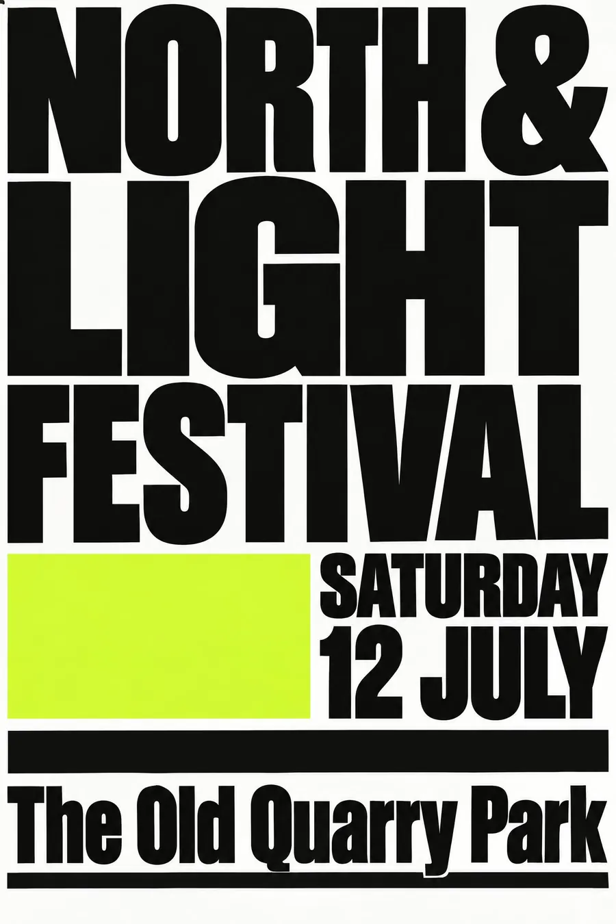
What it is for
Brutalism gets attention by refusing the thing every other poster on the wall is doing. Surrounded by soft pastel fetes, a sheet of enormous black type wins.
It also signals that the event is not trying to sell you anything, which is why galleries, club nights and student shows keep reaching for it.
How it works
Make the type enormous. The headline should touch both edges and be cropped if it does not fit.
Use a default typeface, Helvetica or Times or the system sans, with no styling. Heavy black rules and solid filled blocks do the structure.
White background, black type, one crude fluorescent accent. Margins are uneven on purpose and the spacing is awkward. No image, or one photocopied one.
When to use it
Use it for a gallery, a club night, a protest meeting, an experimental gig, a student show, a zine launch.
Leave it alone for a family event or anything that needs to feel welcoming. The style is hostile and it does not soften.
Told apart from its neighbours
Swiss Style is the opposite discipline with the same tools: same typeface, but balanced, gridded and calm.
Grunge adds dirt and texture. Brutalism stays clean and just refuses to be nice.
New Wave breaks the grid artfully. Brutalism ignores that a grid exists.
Where it was used
Richard Turley's Bloomberg Businessweek covers from 2011 put the look on newsstands, the brutalistwebsites.com collection named the web version in 2014, and Balenciaga has run campaign after campaign built from nothing but oversized default type.
- Balenciaga campaigns
- Bloomberg Businessweek under Richard Turley
- brutalistwebsites.com
The prompt
Replace the blanks with your own event, keep the rest. Then run it on an image model.
poster for <event>, brutalist graphic design, raw unstyled layout, enormous heavy black type filling the sheet edge to edge, default system typeface, thick black rules and solid blocks, harsh white background with one crude fluorescent colour, deliberately awkward spacing and uneven margins, no images or one low-quality photocopied photograph, <date, time and place> in plain underlined text
What goes wrong
The model returns a tasteful minimal poster. Say the type is enormous and cropped by the edges, the margins are uneven, and the spacing is awkward on purpose.
The second failure is a nice accent colour. Ask for one crude fluorescent, such as fluorescent green or orange, against pure white and black.
Leave out
gradients, rounded corners, shadows, decoration, balanced margins
Watch for
Ugly on purpose, not ugly by accident. The type has to be enormous or it just looks unfinished.
Questions
Print it
Pay for the one run. No subscription, and the price is on the model page before you sign in.
Next to it in the revolt against the grid