Push Pin Studios
- Milton Glaser style
- Push Pin eclectic
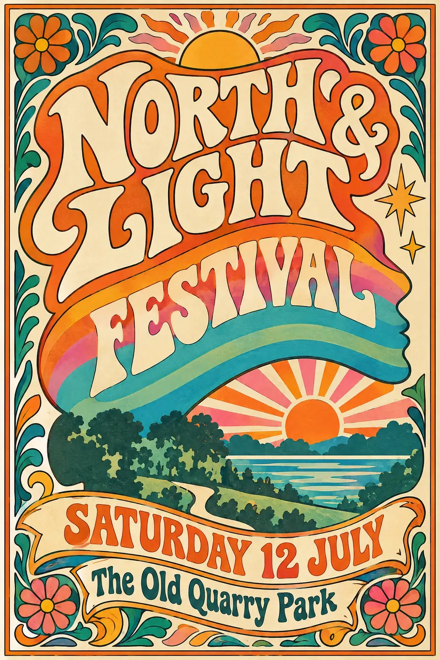
Flat decorative illustration in a borrowed historical style, with drawn lettering to match.
Opens an image model with the prompt in it. The price is on the page before you sign in.
What it is for
Push Pin put illustration back on the poster after twenty years of grids and photographs, and it did it by raiding history rather than inventing a new style.
The result is warm and witty in a way the Swiss school could not be. It reads as made by a person with a sense of humour.
How it works
Draw flat with a confident outline. No modelling, no shading, and colour that sits inside the line like a woodcut.
Borrow one historical style and modernise it: Art Nouveau curls, Victorian wood type, Persian miniature, whatever fits the subject. The borrowing is the method.
Letter the headline by hand so it fills a shape rather than sits on a line. Palette is warm and 1960s: orange, hot pink, turquoise, cream. A rainbow band inside a silhouette is the signature move.
When to use it
Use it for a music night, a bookshop, a theatre, a festival, a food event, anything that wants personality rather than polish.
Leave it alone when the poster is mostly a timetable. Drawn lettering and a list do not mix.
Told apart from its neighbours
Psychedelic sixties posters melt the type until it is barely readable. Push Pin keeps the lettering legible and decorative.
Pop art takes its imagery from advertising and prints it in flat commercial dots. Push Pin takes its imagery from art history and draws it by hand.
Where it was used
Milton Glaser, Seymour Chwast, Reynold Ruffins and Edward Sorel founded Push Pin Studios in 1954. Glaser's 1966 Dylan poster, a black silhouette with rainbow hair borrowed from Marcel Duchamp, is the sheet everybody knows, and the Push Pin Graphic carried the rest.
- Milton Glaser
- Seymour Chwast
- the Dylan poster
The prompt
Replace the blanks with your own event, keep the rest. Then run it on an image model.
poster for <event>, Push Pin Studios style, flat decorative illustration with a bold outline, historical ornament borrowed and updated, rainbow gradient bands inside a silhouette, warm 1960s palette of orange pink turquoise and cream, custom drawn display lettering that fills its own shape, playful asymmetric layout, <date, time and place> in a drawn ribbon
What goes wrong
The model returns generic 1960s psychedelia. Say flat decorative illustration with a bold clean outline and legible drawn lettering, not melted type.
The other failure is stock typography. Ask for custom drawn display lettering shaped to fit its own space.
Leave out
photographic realism, minimalism, corporate sans type, grid alignment
Watch for
The lettering must be drawn for this poster. Set type in a Push Pin illustration is the giveaway.
Questions
Print it
Pay for the one run. No subscription, and the price is on the model page before you sign in.
Next to it in the revolt against the grid