Psychedelic Seventies Corporate
- 70s corporate
- rainbow stripe era
- bubble logo style
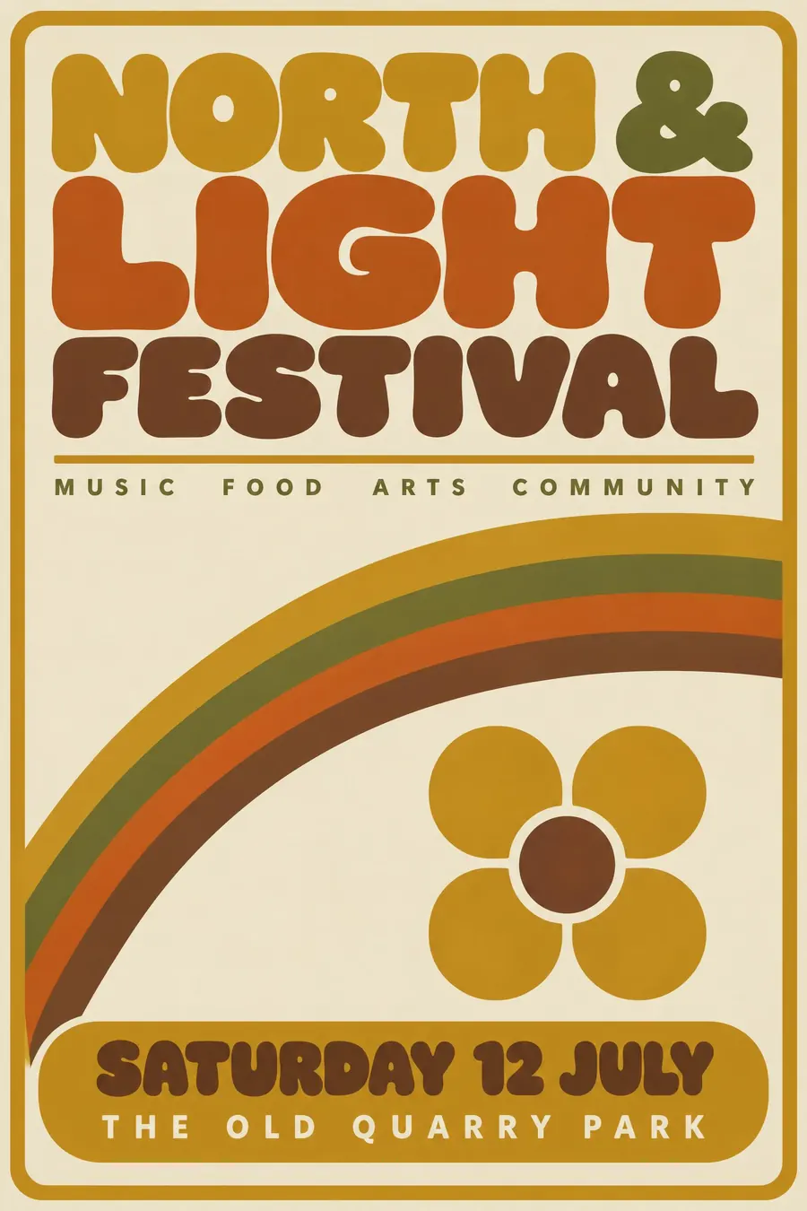
Rainbow stripe arcs, bulbous bubble type and an earth-tone palette from a brochure.
Opens an image model with the prompt in it. The price is on the page before you sign in.
What it is for
This is the decade where corporate identity went soft. Everything rounded, everything striped, and an earth-tone palette that has come all the way back round to fashionable.
It is also unusually warm for a corporate style, which makes it work on events that would be crushed by Swiss restraint.
How it works
Sweep one rainbow stripe arc of four graduated bands across the sheet. That arc is the period signature.
Draw the title in bulbous rounded lettering with tightly closed counters, so the letters look inflated.
Earth tones only: harvest gold, avocado, burnt orange, brown. Flat colour with no shading, a simple geometric symbol built from repeated rounded shapes, and a widely tracked small sans subtitle.
When to use it
Use it for a 70s night, a community centre event, a bowling club, a retro product launch, a food festival, a coffee morning, a sports day.
Leave it alone when you want to look current. The palette dates it hard, which is usually the point.
Told apart from its neighbours
Push Pin is hand-drawn and eclectic. This is corporate and systematic.
Memphis is the 1980s reaction, with clashing pastels and sharp shapes instead of rounded earth tones.
The NASA worm is the sober federal end of the same decade, with no rainbow anywhere.
Where it was used
Airline liveries, bank marks and oil company identities all went this way between 1968 and 1980. Saul Bass's corporate work, including the 1972 United Airlines tulip and the Bell System mark, is the most disciplined version of it.
- 1970s airline liveries
- Saul Bass corporate marks
- bank and oil identities
The prompt
Replace the blanks with your own event, keep the rest. Then run it on an image model.
poster for <event>, 1970s corporate identity style, a rainbow stripe arc of four graduated bands sweeping across the sheet, bulbous rounded bubble lettering with tightly closed counters, earth-tone palette of harvest gold avocado burnt orange and brown, a simple geometric symbol built from repeated rounded shapes, flat colour with no shading, a thin rule under the title, wide tracking on a small sans subtitle, <date, time and place> in a rounded box
What goes wrong
The model returns modern flat design in warm colours. Ask for bulbous rounded lettering with tightly closed counters and a four-band rainbow stripe arc.
The second failure is a cool palette. Say harvest gold, avocado, burnt orange and brown only.
Leave out
sharp corners, cool colour, ornament, photographic texture, thin letterforms
Watch for
The counters are nearly closed. Open, airy letterforms are not the 1970s.
Questions
Print it
Pay for the one run. No subscription, and the price is on the model page before you sign in.