Contemporary Flat Illustration
- corporate memphis
- modern vector
- flat design
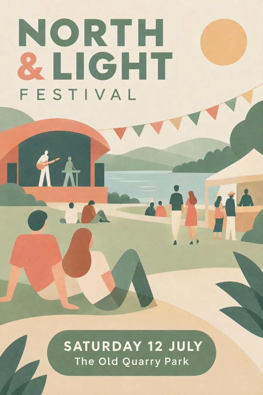
Clean vector shapes, a soft modern palette, and figures simplified past anatomy.
Opens an image model with the prompt in it. The price is on the page before you sign in.
What it is for
Flat illustration is competent, cheap and universally readable, which is why it is everywhere. It will never embarrass an event.
It is also the style the generic output is closest to, so it is worth knowing well enough to recognise and avoid when you want something else.
How it works
Clean geometric shapes with perfectly smooth vector edges and no outlines. Overlap shapes and use transparency to make a third tone.
Simplify the figures past anatomy: long limbs, rounded joints, no facial features, mid-gesture.
Soft modern palette of muted coral, sage and warm sand with one deeper accent. Add a subtle grain over the flat colour, keep plenty of white space, and set a friendly geometric sans in two weights.
When to use it
Use it for a conference, a health service campaign, a community programme, a school event, a workshop, a product launch.
Leave it alone when you need to stand out. This is the look everything already has, which is the one reason not to use it.
Told apart from its neighbours
Mid-century modern uses the same simplification with print texture, overprint and a warmer palette.
Cut paper has irregular scissor edges and paper shadows. This has perfect vector edges.
Low poly is lit and three dimensional. This is flat and unlit.
Where it was used
Google's material illustration and Facebook's Alegria set from 2017 pushed the style everywhere, and it became the default for startup marketing, public sector campaigns and app onboarding within about three years.
- startup marketing sites
- Alegria illustration set
- public sector campaigns
The prompt
Replace the blanks with your own event, keep the rest. Then run it on an image model.
poster for <event>, contemporary flat vector illustration, clean geometric shapes with perfectly smooth edges and no outlines, simplified figures with long limbs and no facial features, a soft modern palette of muted coral sage and warm sand with one deeper accent, subtle grain texture over the flat colour, overlapping shapes using transparency to make a third tone, plenty of white space, a friendly geometric sans in two weights, <date, time and place> in a rounded panel
What goes wrong
The model adds outlines. Say clean geometric shapes with no outlines, using transparency where shapes overlap.
The second failure is a flat plastic finish. Ask for a subtle grain texture over the flat colour.
Leave out
outlines, gradients, photographic elements, texture-heavy surfaces, clutter
Watch for
It is the current default, so it is the one style here that will not make you stand out.
Questions
Print it
Pay for the one run. No subscription, and the price is on the model page before you sign in.