Designers Republic
- tDR
- Sheffield style
- pseudo-corporate graphics
Fake corporate marks, warning symbols, numbers and Japanese text, all with no meaning.
Opens an image model with the prompt in it. The price is on the page before you sign in.
What it is for
The Designers Republic took the visual language of corporations and used it for nothing, which is both a joke and a genuinely good way to fill a sheet with texture.
It also anticipated how the internet would look: dense, coded, over-labelled and slightly hostile.
How it works
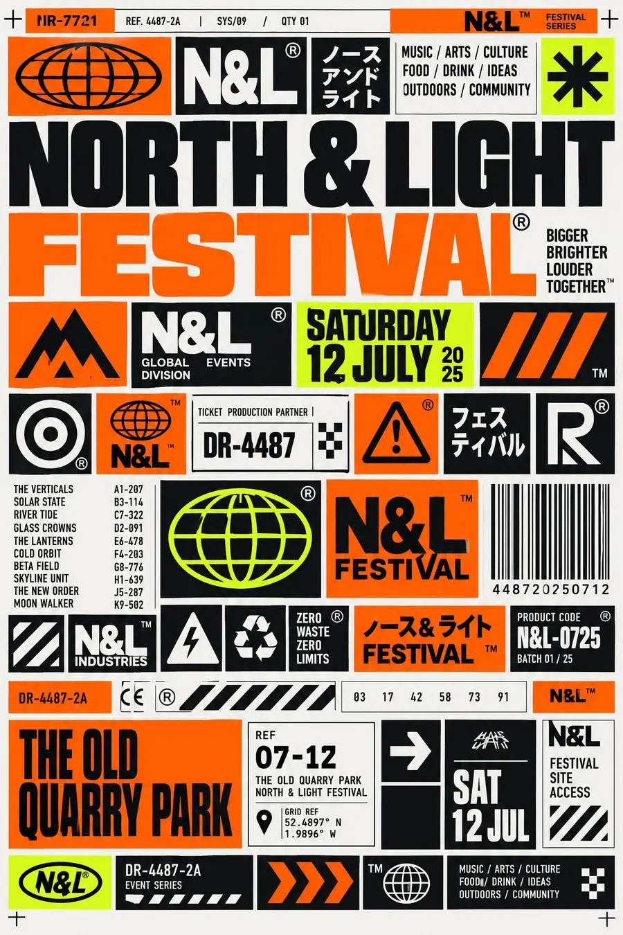
Invent the furniture: corporate logos, warning triangles, registered trademark marks, product codes, barcodes. None of it means anything.
Pack the grid to the edges. Elements at several sizes, thin rules and crop marks between them, with no empty space.
Hard flat colour, usually orange, black and white with one acid accent. Condensed uppercase sans repeated at several sizes, with fragments of Japanese katakana for texture.
When to use it
Use it for an electronic music night, a games event, a design talk, a record launch, a club, a tech meetup.
Leave it alone for a general audience. It reads as noise unless the viewer is in on it.
Told apart from its neighbours
New Wave typography breaks the Swiss grid with spacing and rules. tDR keeps the grid and fills it with fake corporate debris.
Y2K chrome is glossy and optimistic. tDR is flat and sardonic.
Brutalism strips everything away. tDR adds everything.
Where it was used
Ian Anderson founded the studio in Sheffield in 1986. It designed for Warp Records, Pop Will Eat Itself and the WipEout games from 1995, whose in-game brands were the purest version of the fake-corporate idea.
- Warp Records sleeves
- WipEout
- Pop Will Eat Itself artwork
The prompt
Replace the blanks with your own event, keep the rest. Then run it on an image model.
poster for <event>, Designers Republic style, dense layout of invented corporate logos warning symbols and registered trademark marks that mean nothing, numbers and product codes used as decoration, fragments of Japanese katakana, hard flat colour in orange black and white with one acid accent, tight grid with elements packed to the edges, condensed uppercase sans repeated at several sizes, thin rules and crop marks, a fake barcode, <date, time and place> in a numbered reference block
What goes wrong
The model returns real recognisable icons. Say the symbols and logos are invented and mean nothing at all.
The second failure is empty space. Ask for a tight grid packed to the edges with elements at several sizes.
Leave out
warmth, illustration, empty space, handmade texture, serif type
Watch for
The symbols must mean nothing. Real icons that explain something break the joke.
Questions
Print it
Pay for the one run. No subscription, and the price is on the model page before you sign in.