NASA Worm Modernist
- NASA Graphics Standards
- worm logotype
- federal design
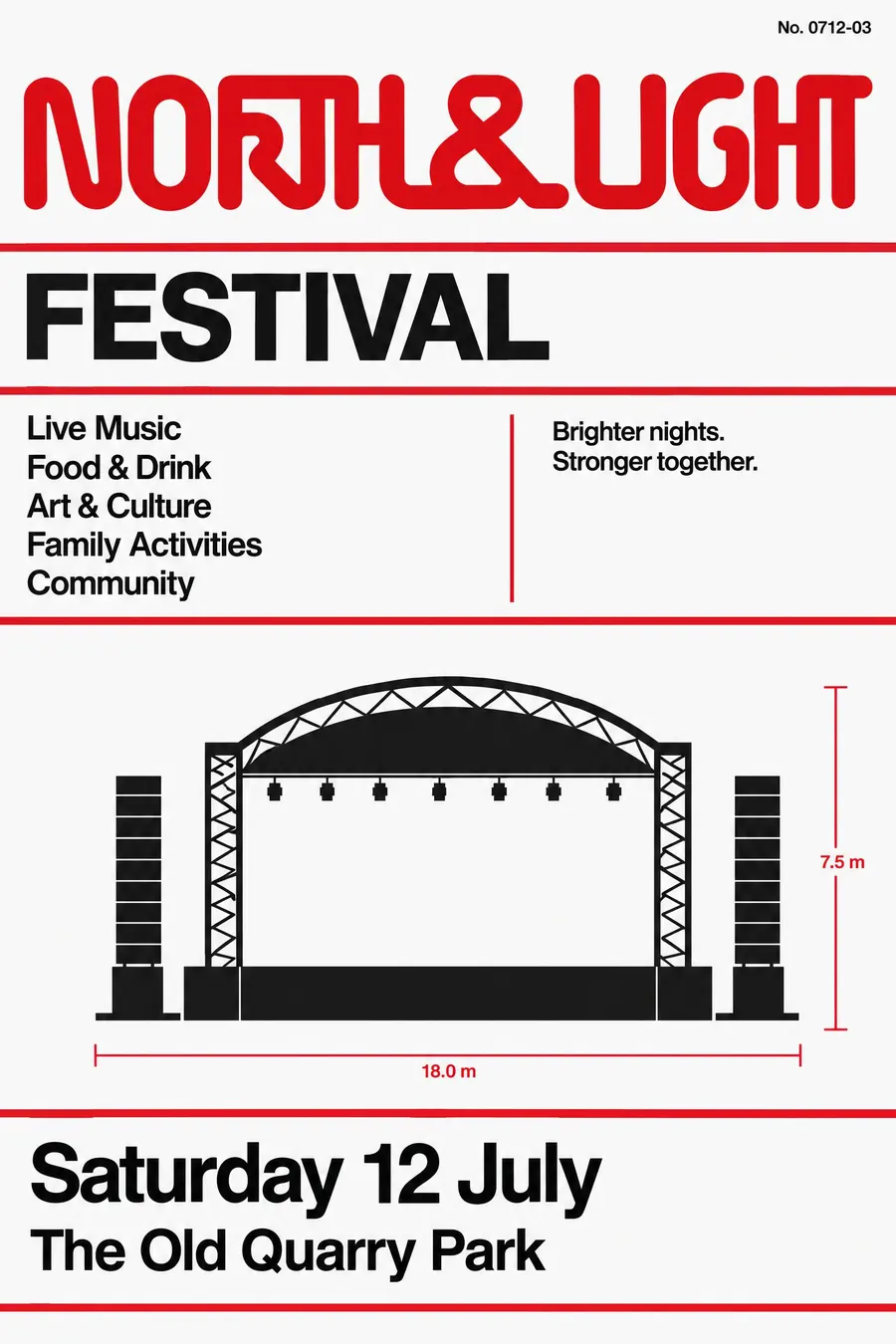
One continuous rounded logotype, a strict grid, and a red stripe holding it together.
Opens an image model with the prompt in it. The price is on the page before you sign in.
What it is for
The worm is one of the most loved pieces of institutional design ever made, and the manual that carried it is a design object in its own right.
Borrowing it gives an event a feeling of competence and public purpose that is very hard to build any other way.
How it works
Draw the wordmark as one continuous rounded tube with the crossbars removed from the letters, so the name reads as a single stroke.
Set everything on a strict modular grid, with wide horizontal rules dividing the sheet into bands.
Flat red and black on white and nothing else. Helvetica flush left in two sizes, a flat technical diagram or silhouette, and a small numbered reference code in a corner.
When to use it
Use it for a science event, a launch, a makerspace, an engineering talk, a school science fair, a design event, a running club.
Leave it alone when the subject is soft. The style is institutional and dry on purpose.
Told apart from its neighbours
Swiss Style is the parent. The worm style is the American federal application of it, with a custom logotype doing the identity work.
Wayfinding adds pictograms and route diagrams for a physical place.
Monochrome plus an accent is the same restraint without the grid or the logotype.
- Swiss Style
- Wayfinding
- Monochrome + Single Accent
Where it was used
Richard Danne and Bruce Blackburn designed the worm in 1975 as part of the Federal Design Improvement Program. NASA retired it in 1992, the Graphics Standards Manual was crowdfunded back into print in 2015, and the worm returned to a rocket in 2020.
- Richard Danne and Bruce Blackburn
- NASA 1975 to 1992
- the Federal Design Improvement Program
The prompt
Replace the blanks with your own event, keep the rest. Then run it on an image model.
poster for <event>, NASA Graphics Standards Manual style, a custom continuous rounded logotype drawn as one unbroken tube with the crossbars removed, strict modular grid with everything aligned to it, flat red and black on white with no third colour, wide horizontal rules dividing the sheet into bands, a simple flat diagram or technical silhouette, Helvetica set flush left in two sizes, a small numbered reference code in the corner, <date, time and place> in a ruled band
What goes wrong
The model returns ordinary rounded type. Ask for a custom logotype drawn as one unbroken continuous tube with the crossbars removed.
The second failure is extra colour. Say flat red and black on white, with no third colour anywhere.
Leave out
gradients, ornament, illustration, serif type, more than two colours
Watch for
The logotype must be one continuous stroke. Ordinary rounded type is not the worm.
Questions
Print it
Pay for the one run. No subscription, and the price is on the model page before you sign in.