
Print and reproduction looks
Eleven printing processes, and the wording that gets what each one does to ink.
These are not styles anybody designed. They are what a machine does to an image: how many inks it can lay down, how badly they line up, what texture the paper leaves behind. Ask for a process rather than a look and the poster gets a physical quality that no amount of styling adds, because the imperfections come from somewhere.
Ink laid down badly on purpose
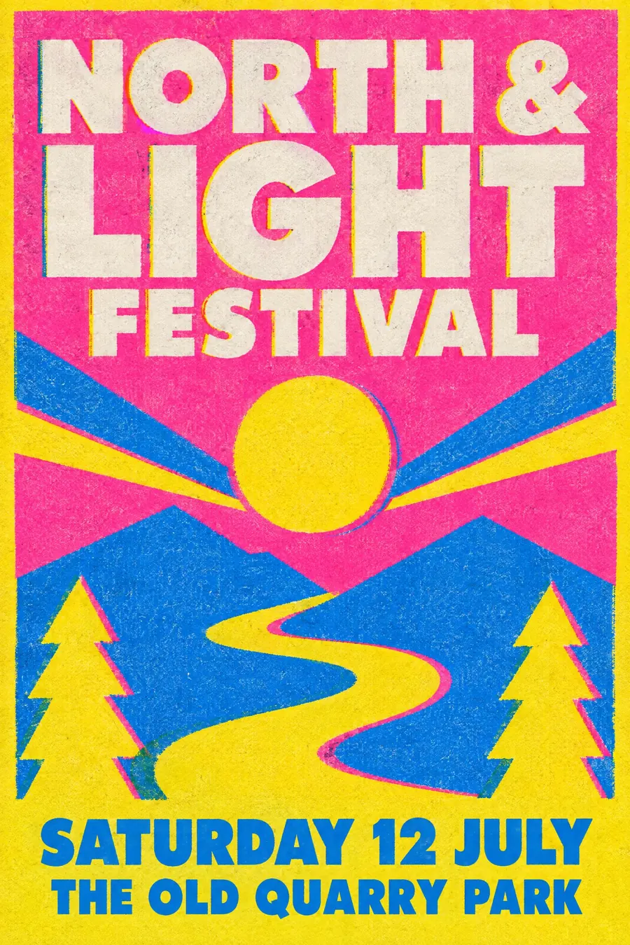
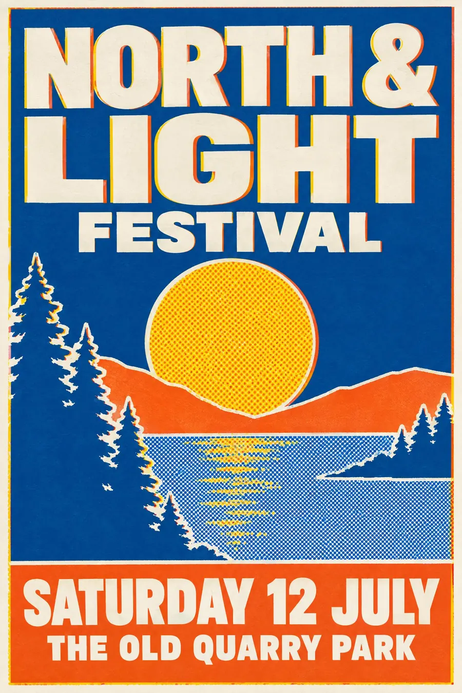
4Cheap duplicators and few inks. Misregistration, grain and visible dots are the whole appeal.
Pressed, bitten and exposed
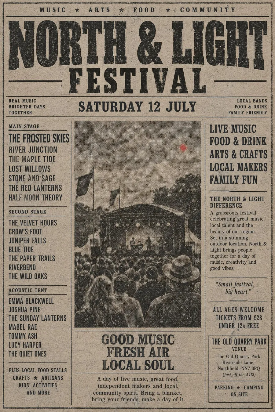
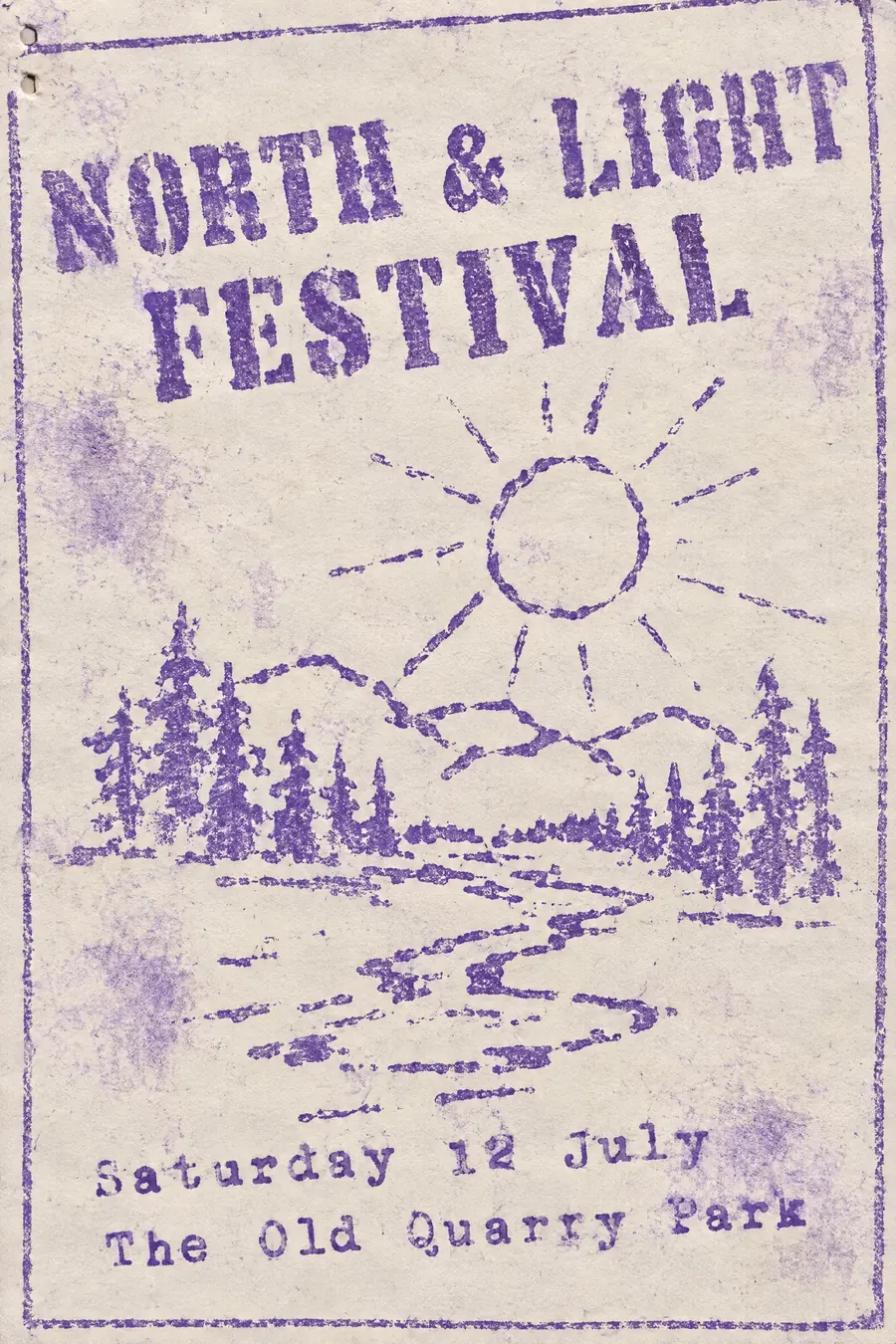
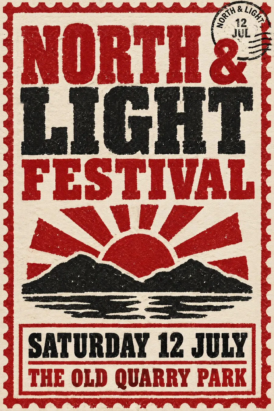
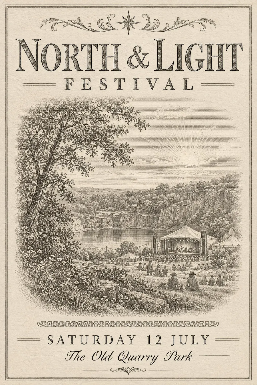
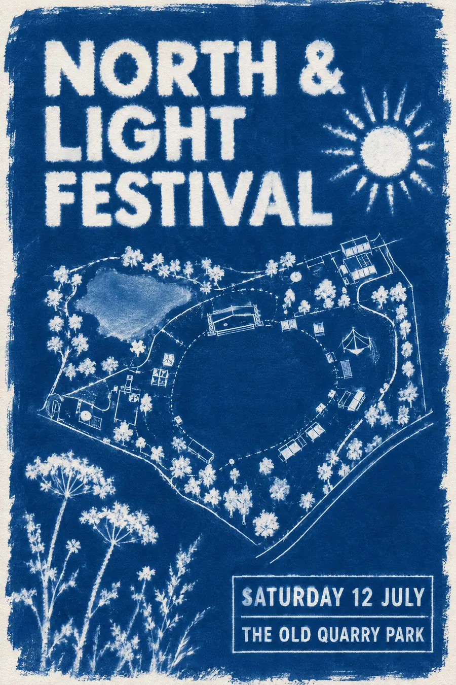
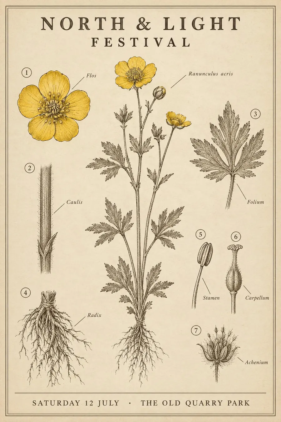
3Processes that leave a physical mark: type pushed into paper, lines bitten into metal, and paper turned blue by the sun.
Few inks, drawn by hand
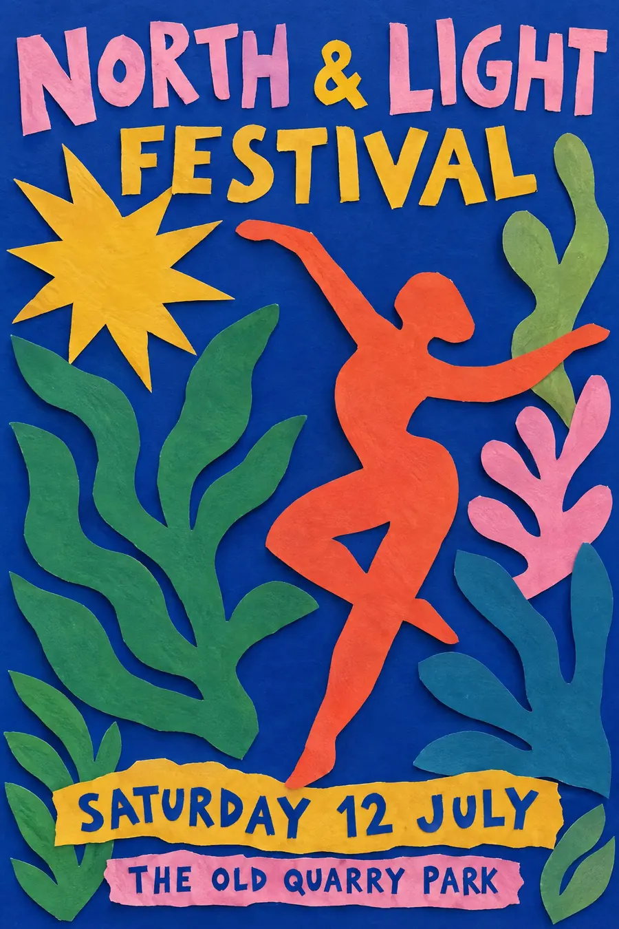
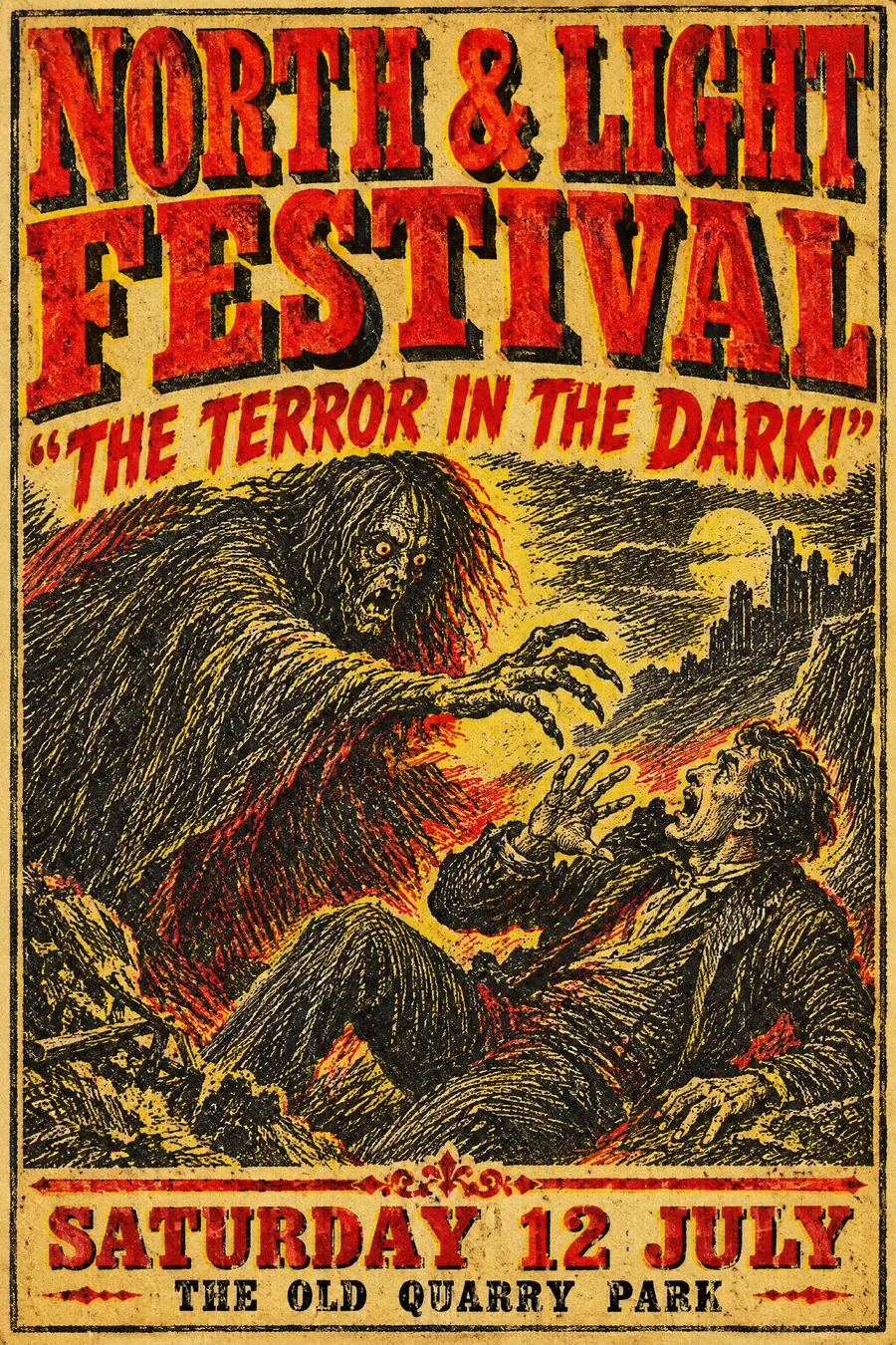
4Where the constraint is not the machine but the decision: scissors instead of a pen, one accent colour, or a single lurid scene.
Make one of them
Copy a prompt into an image model and pay for that one run. No subscription.
Open an image model