Mimeograph
- ditto
- spirit duplicator
- purple copy
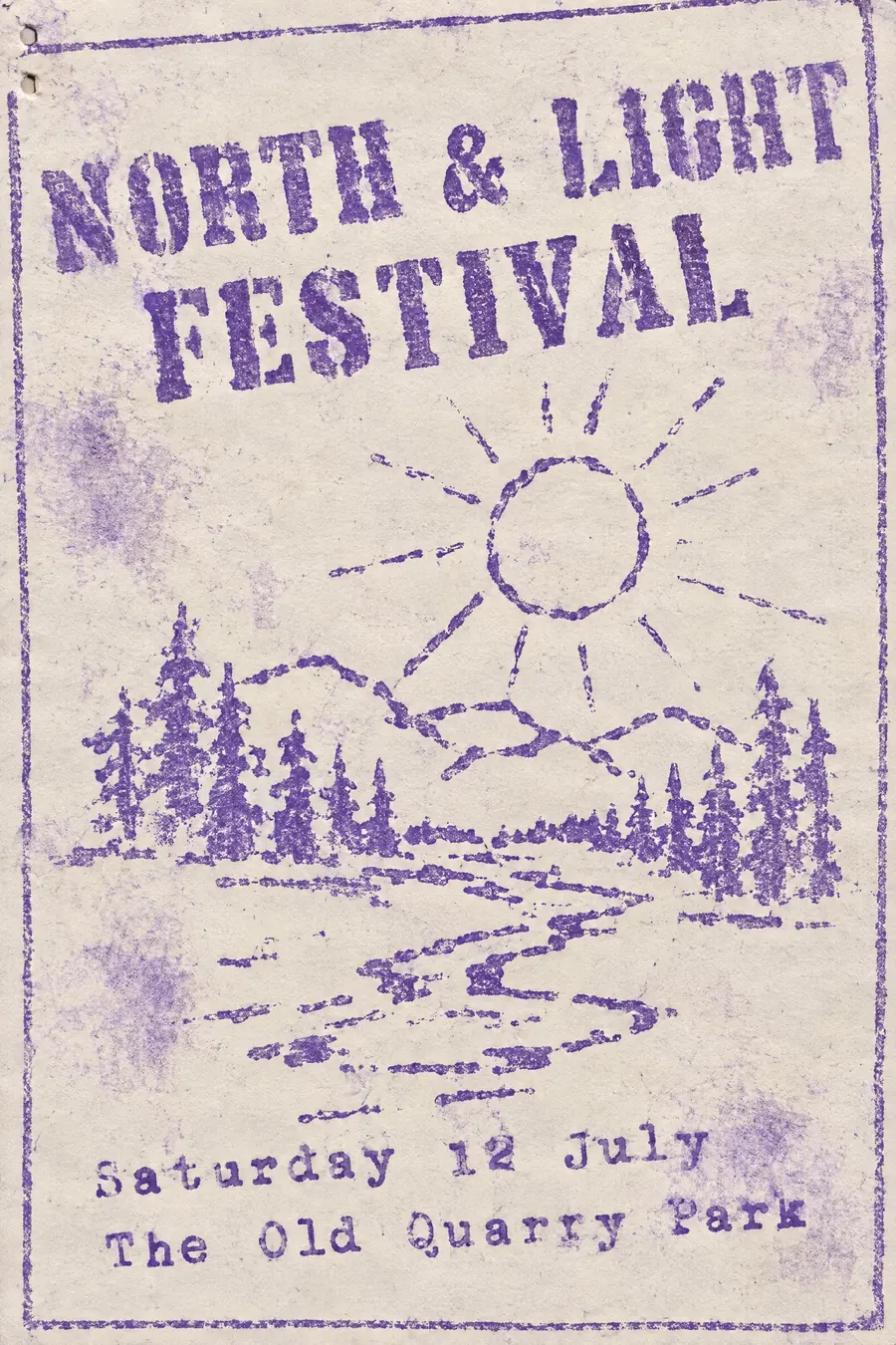
Faint purple ink on cheap paper, blotchy, with letters that have started to fill in.
Opens an image model with the prompt in it. The price is on the page before you sign in.
What it is for
Mimeograph is the smell of a 1970s classroom and it is the only style here that people remember physically rather than visually.
It also reads as grassroots. Before photocopiers, this is how small groups printed anything, so it carries the whole history of newsletters, church bulletins and underground press.
How it works
Use faint purple aniline ink on cheap off-white paper, with uneven coverage: pale patches where the drum ran dry, darker blotches elsewhere.
Type is typewriter, cut into a stencil, so heavy characters punch through and fill in, and the letters sit slightly unevenly on the line.
Illustration is crude line work drawn straight onto the stencil, with lines that break. Skew the whole sheet a degree or two and add staple holes in one corner.
When to use it
Use it for a village newsletter event, a school reunion, a poetry reading, a folk club, a local history talk, a community meeting.
Leave it alone when you need contrast at a distance. Mimeograph is faint by nature.
Told apart from its neighbours
Photocopied punk fanzine is black, high contrast and aggressive. Mimeograph is purple, faint and gentle.
Risograph is the modern descendant of the same idea but bright, deliberate and multi-coloured.
Newsprint is grey and uses halftone. Mimeograph cannot reproduce a photograph at all.
Where it was used
School worksheets through the 1960s and 1970s are the shared memory. The same machines printed the American underground press, science fiction fanzines from the 1930s onward, and most church and union newsletters before the photocopier arrived.
- school worksheets
- 1960s underground newsletters
- early fanzines
The prompt
Replace the blanks with your own event, keep the rest. Then run it on an image model.
poster for <event>, mimeograph spirit duplicator print, faint purple aniline ink on cheap off-white paper, uneven coverage with pale patches and darker blotches, stencilled typewriter lettering with characters that have punched through and filled in, crude hand-drawn stencil illustration with broken lines, slight skew across the whole sheet, staple holes in one corner, <date, time and place> typed in a fixed-width face
What goes wrong
The model returns a clean black and white flyer. Ask for faint purple aniline ink with pale patches and darker blotches on cheap off-white paper.
The second failure is a photograph. Say there are no photographs, only crude stencil line drawing with broken lines.
Leave out
colour, crisp edges, photographs, even ink coverage, modern type
Watch for
The ink is purple, not blue or black. That colour is the single thing people recognise.
Questions
Print it
Pay for the one run. No subscription, and the price is on the model page before you sign in.