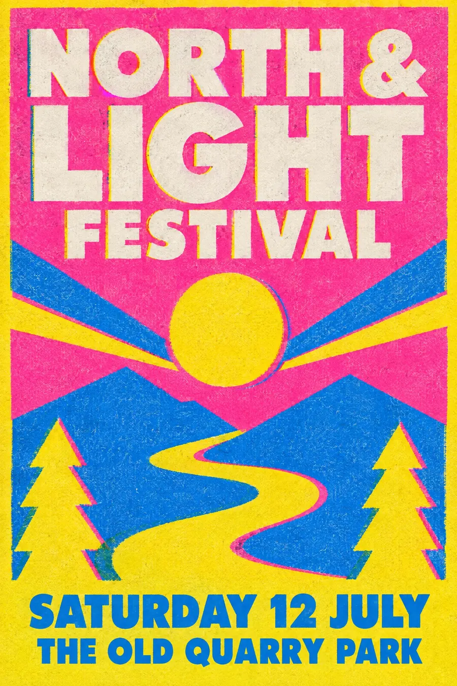
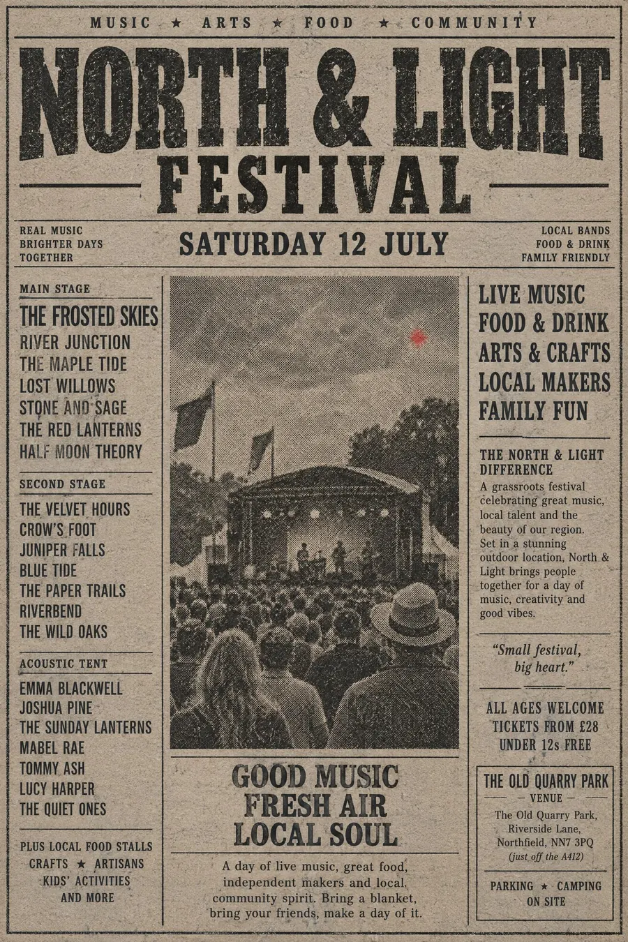
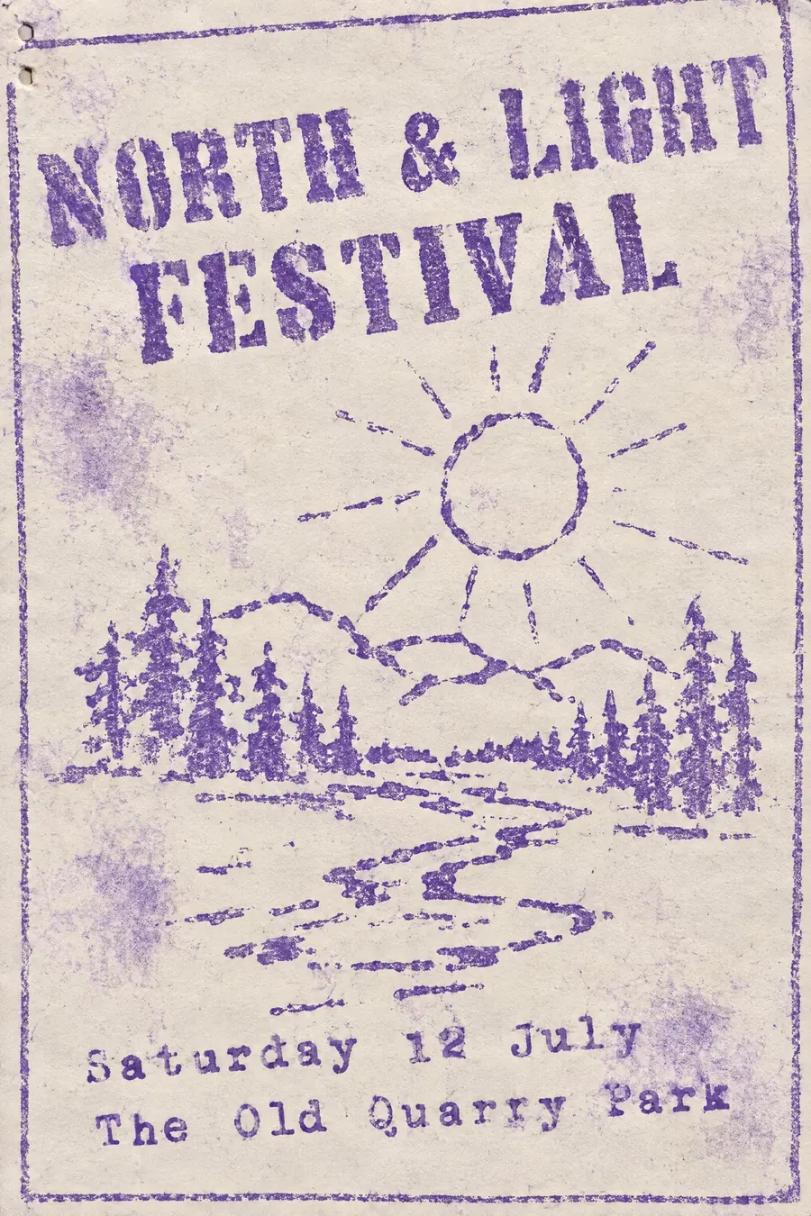
Screenprint Pop
- silkscreen
- serigraph
- gig poster print
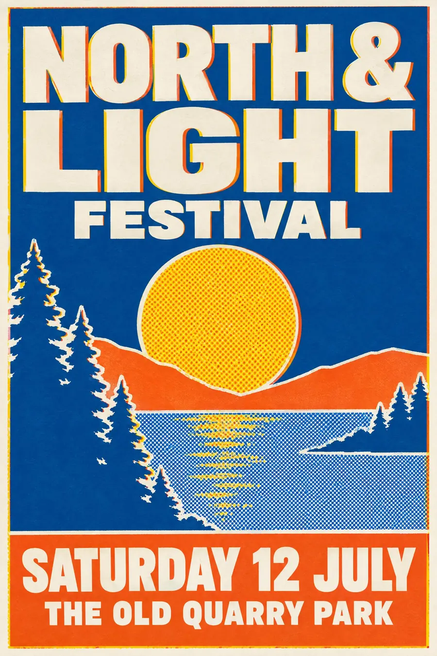
Thick opaque ink in big flat areas, with hard edges and one layer slightly out.
Opens an image model with the prompt in it. The price is on the page before you sign in.
What it is for
Screenprint is the poster process. Thick flat ink reads as a physical object from across the street in a way that digital print never does.
It also forces good decisions. Four colours means every colour has to earn its place, and that constraint is usually why screenprinted posters look better.
How it works
Separate into four flat spot colours, each a large solid area. No blends anywhere: gradients become halftone dot patterns.
Give the ink weight. It should look like it is sitting on the paper surface, with slightly raised edges and full opacity, including light colours over dark.
Print one layer a hair out of register so a sliver of the colour beneath shows. Add a trapped white keyline around the main shapes and set the display lettering in solid ink.
When to use it
Use it for a gig, a festival, a beer launch, a print fair, a film screening, a sports event.
Leave it alone when you need photographic subtlety, or when the design needs more than about five colours.
Told apart from its neighbours
Risograph is thin, grainy and soaked in. Screenprint is thick, opaque and sits proud.
Pop art is an imagery style that often used screenprint. The process and the movement are not the same thing.
Mid-century graphic work is usually lithographed and softer, with overprint rather than opacity.
Where it was used
Warhol made the silkscreen an art medium from 1962. Hatch Show Print had been doing the letterpress equivalent since 1879, and the modern gig poster scene, from Frank Kozik onward, is built entirely on the four-colour screen.
- Andy Warhol
- Hatch Show Print
- modern gig posters
The prompt
Replace the blanks with your own event, keep the rest. Then run it on an image model.
poster for <event>, screenprint silkscreen poster, four flat spot colours in large solid areas with thick opaque ink sitting on top of the paper, hard crisp edges, one layer printed slightly out of register showing a sliver of the colour beneath, halftone dots used instead of any gradient, a visible trapped white keyline, heavy display lettering in solid ink, <date, time and place> reversed out of a solid block
What goes wrong
The model returns a gradient. Say all gradients are halftone dot patterns and every colour is a flat solid area.
The second failure is thin transparent colour. Ask for thick opaque ink sitting on top of the paper, fully covering what is underneath.
Leave out
gradients, soft edges, photographic shading, more than five colours
Watch for
Ink sits on top of the paper. If the colour looks soaked in, you have described riso instead.
Questions
Print it
Pay for the one run. No subscription, and the price is on the model page before you sign in.