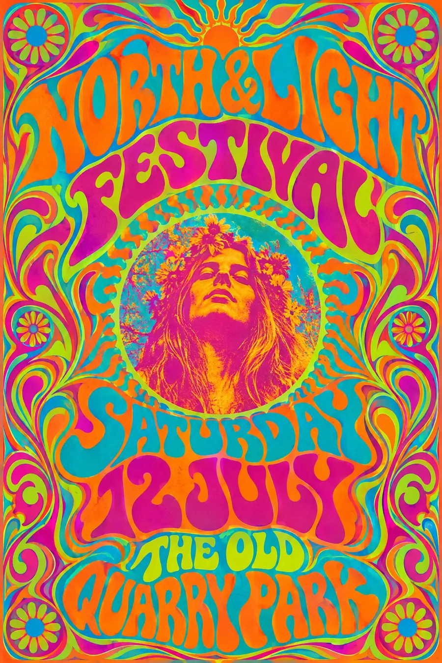
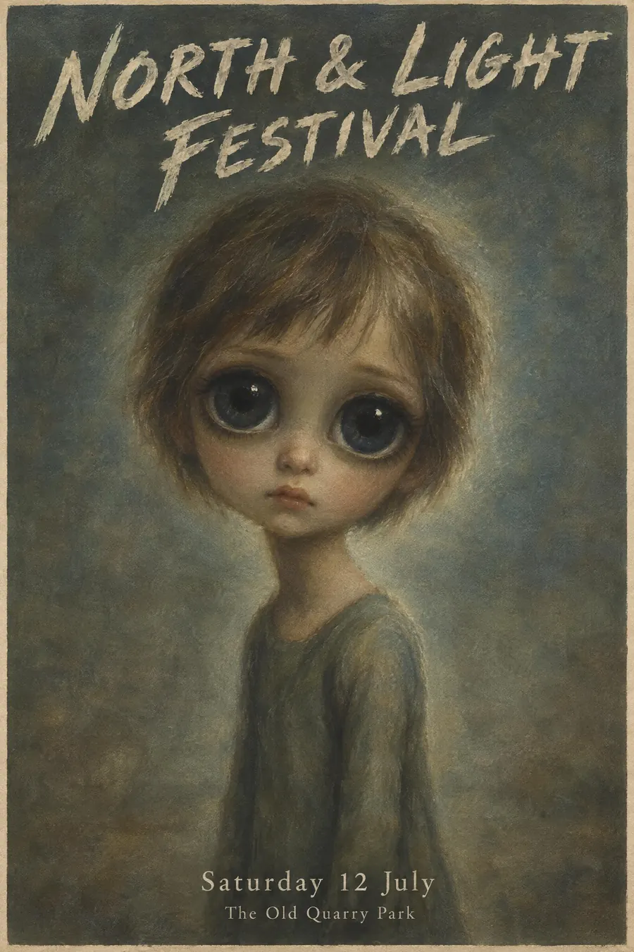
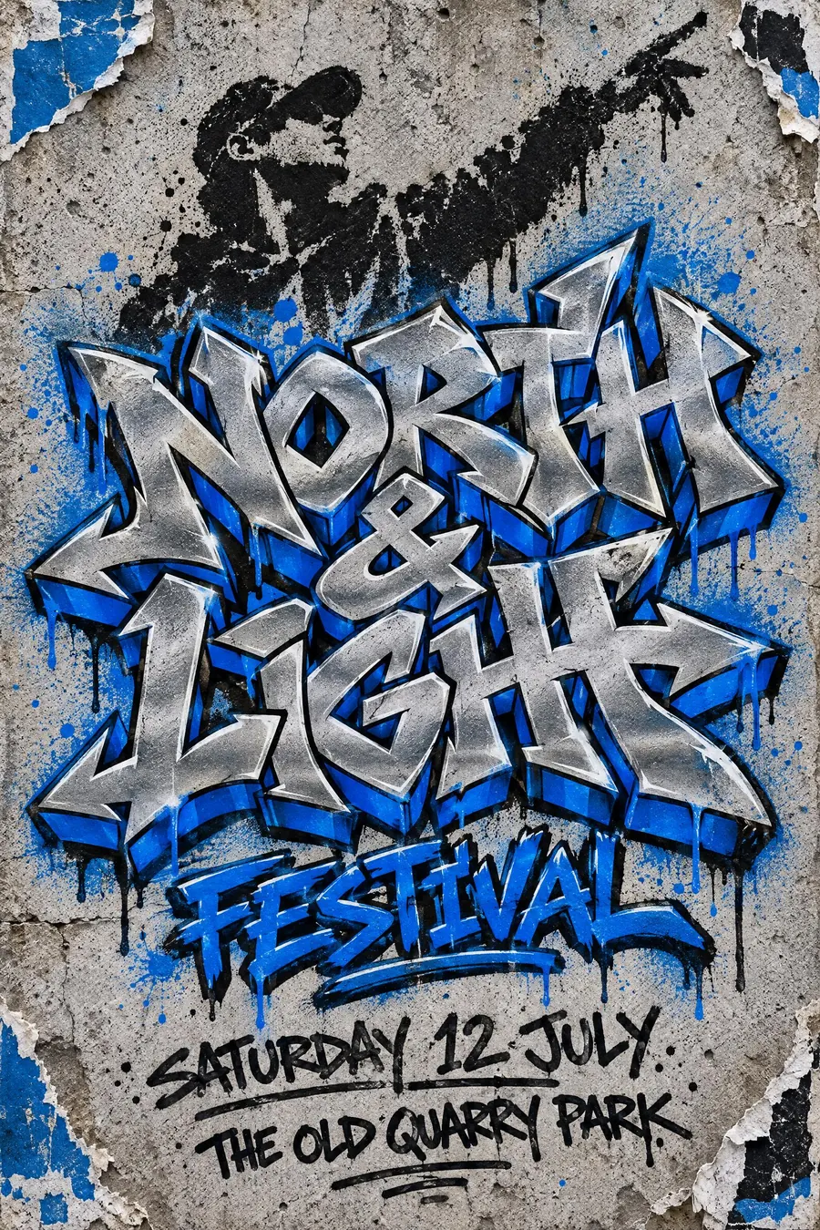
Pop Art
- Lichtenstein style
- Warhol style
- comic book pop
Commercial imagery blown up: Ben-Day dots, thick black outlines and flat primaries.
Opens an image model with the prompt in it. The price is on the page before you sign in.
What it is for
Pop art already looks like advertising, so it takes to a poster with no translation at all. That is why it has never stopped being used.
It is also cheerful and loud without being childish, which is a narrow gap that few styles fit.
How it works
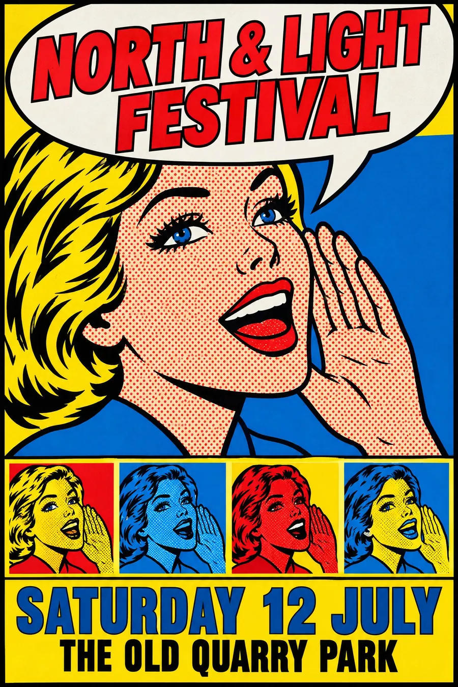
Enlarge the Ben-Day dots until they are clearly visible as dots. This is the single strongest signal of the style.
Outline everything in thick black, fill with flat primaries, and put a solid colour block behind the subject.
Use a speech balloon or a caption box for the words, in bold condensed comic capitals. Repeating the same image in four different colourways is the Warhol move and works well for a lineup.
When to use it
Use it for a comic fair, a 60s night, a pop-up shop, a food event, a fundraiser, a student night, a gallery show.
Leave it alone for a solemn subject. Pop art treats everything as a product.
Told apart from its neighbours
Screenprint pop is the printing method rather than the imagery: flat ink, misregistration, no dots necessarily.
Halftone newsprint is the same dot at lower quality, in grey, on cheap paper.
Memphis shares the loudness but has no recognisable imagery at all.
Where it was used
Roy Lichtenstein enlarged comic panels from 1961, dots and all. Warhol's repeated silkscreen grids, from Marilyn in 1962 onward, are the other half. Eduardo Paolozzi had been making the collage version in Britain since 1947.
- Roy Lichtenstein
- Andy Warhol
- Eduardo Paolozzi
The prompt
Replace the blanks with your own event, keep the rest. Then run it on an image model.
poster for <event>, Pop Art style, enlarged commercial imagery with visible Ben-Day halftone dots, thick black comic outlines, flat primary red yellow and blue with a colour block behind the subject, a speech balloon carrying the headline, repeated silkscreen panels in different colourways, bold condensed comic capitals, <date, time and place> in a yellow caption box with a black rule
What goes wrong
The model returns a clean vector illustration. Ask for visible enlarged Ben-Day halftone dots and thick black comic outlines.
The second failure is a subtle palette. Say flat primary red, yellow and blue with a solid colour block behind the subject.
Leave out
subtlety, texture, gradients, realistic shading, muted colour
Watch for
The dots must be large enough to see. Fine halftone reads as ordinary print, not as Pop.
Questions
Print it
Pay for the one run. No subscription, and the price is on the model page before you sign in.
Next to it in pop and the street