Cubist Exhibition Poster
- Cubism
- analytic cubism poster
One subject broken into facets and shown from several angles at once.
Opens an image model with the prompt in it. The price is on the page before you sign in.
What it is for
Cubism is the most recognised difficult style there is. A reader knows immediately that the event has something cultural about it, even if they cannot name the movement.
It also lets one subject carry the whole sheet. A guitar, a face and a bottle are enough.
How it works
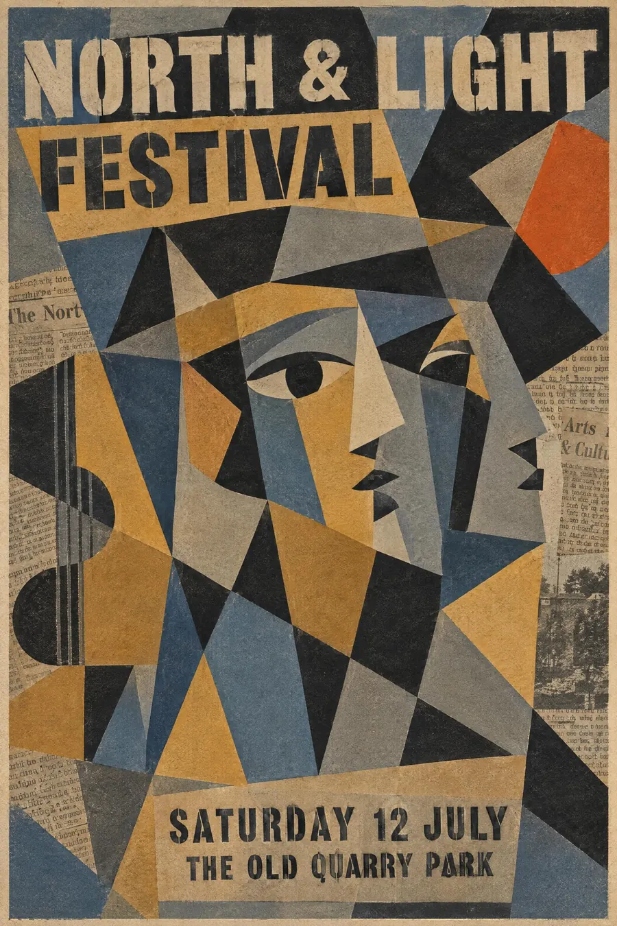
Take one simple subject and break it into flat overlapping planes, showing front and side at the same time.
Keep the space shallow and ambiguous: no horizon, no perspective, and it should be unclear which plane is in front.
Palette is muted ochre, grey, slate blue and black, with one warm accent. Add stencilled capitals and fragments of newspaper, which the Cubists glued on themselves.
When to use it
Use it for a gallery, a jazz night, a wine event, a chamber concert, a literary festival, a film season.
Leave it alone for a children's event or anything that must read from a distance. Fragmentation is slow.
Told apart from its neighbours
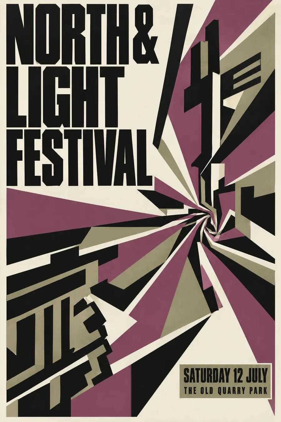
Vorticism uses hard straight wedges and no recognisable subject. Cubism always has a subject you can eventually find.
Orphism is Cubism with the colour turned up to full saturation and circles added.
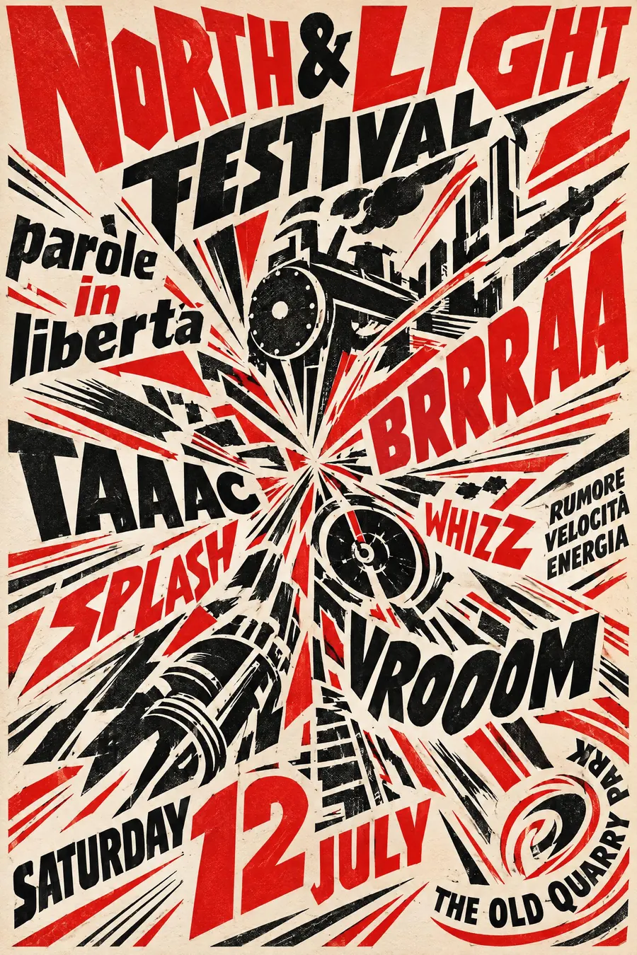
Futurism fragments to show motion. Cubism fragments to show several viewpoints at rest.
Where it was used
Picasso and Braque worked the analytic phase out together between 1908 and 1912, then started gluing newspaper on in the synthetic phase. Juan Gris brought the colour and the clearer structure, and midcentury exhibition posters borrowed all three.
- Picasso
- Georges Braque
- Juan Gris
The prompt
Replace the blanks with your own event, keep the rest. Then run it on an image model.
poster for <event>, 1940s poster for a Cubist exhibition, the subject fragmented into flat overlapping facets seen from several angles at once, shallow ambiguous space with no perspective, muted palette of ochre grey slate blue and black with one warm accent, stencilled block capitals integrated into the facets, fragments of newspaper texture, <date, time and place> set in a rectangular facet at the base
What goes wrong
The model returns a shattered-glass effect over a photograph. Ask for flat overlapping facets in a shallow ambiguous space with no perspective.
The second failure is bright colour. Say muted ochre, grey and slate blue with only one warm accent.
Leave out
linear perspective, realistic proportion, bright saturated colour, depth of field
Watch for
The facets must overlap ambiguously. Neat shattered-glass shapes read as a filter, not as Cubism.
Questions
Print it
Pay for the one run. No subscription, and the price is on the model page before you sign in.
Next to it in the avant-garde shouts