Op Art
- optical art
- Bridget Riley style
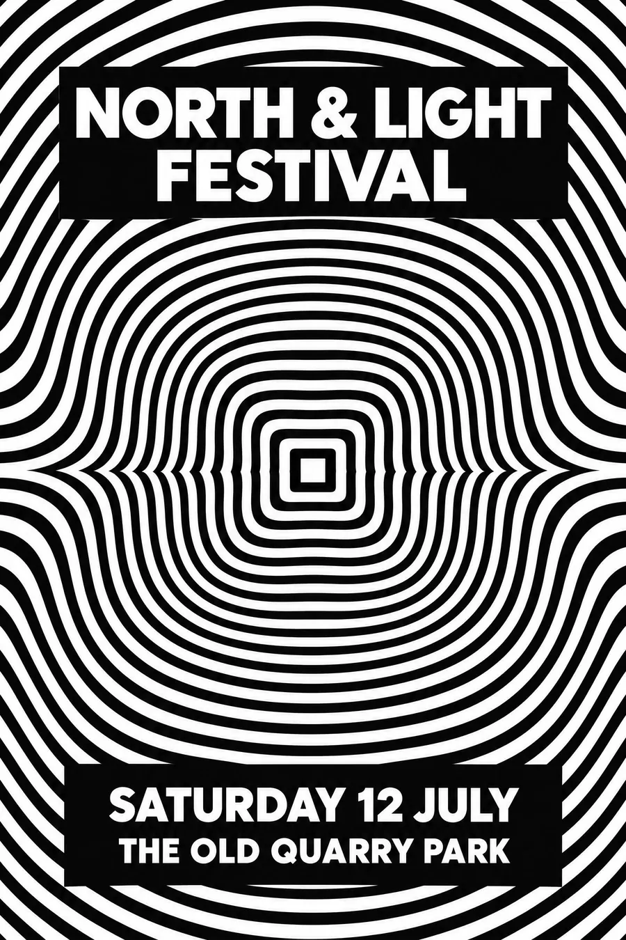
Black and white patterns precise enough to make the flat sheet appear to move.
Opens an image model with the prompt in it. The price is on the page before you sign in.
What it is for
Op art is the only style here that physically affects the viewer. The pattern moves when you look at it, which stops people in a way that colour never does.
It also photographs and scales extremely well, because it is pure contrast with no detail to lose.
How it works
Take a regular pattern, stripes or a square grid, and distort it smoothly toward one or two centres. The distortion is what creates the movement.
Precision is everything. The lines must be mathematically even, with no hand wobble and no soft edges.
Pure black on pure white, or one saturated accent. Reverse the type out of a solid panel that interrupts the pattern, because nothing is readable on top of it.
When to use it
Use it for a club night, a gallery, a 60s night, a science festival, a record label, a dance performance.
Leave it alone for a long information list, and be careful with audiences who find flicker uncomfortable.
Told apart from its neighbours
Concrete Art builds from a rule but aims for calm. Op art builds from a rule and aims to disturb.
Psychedelic posters warp type and colour by hand for a hallucinatory feel. Op art is cold and precise.
Orphism uses saturated colour rather than contrast to imply movement.
Where it was used
Bridget Riley's black and white paintings from 1961 onward are the definitive version, and Victor Vasarely had been building the vocabulary in France since the 1930s. The Responsive Eye at MoMA in 1965 named the movement and put it on dresses within a year.
- Bridget Riley
- Victor Vasarely
- the Responsive Eye exhibition
The prompt
Replace the blanks with your own event, keep the rest. Then run it on an image model.
poster for <event>, Op Art optical illusion, precise repeating black and white pattern that appears to ripple and bulge, concentric distorted stripes or a grid of squares warping toward a centre, pure black on pure white with optionally one saturated accent, hard mathematical precision with no hand-drawn wobble, type reversed out of the pattern in a clean rectangle, <date, time and place> in a solid panel that interrupts the pattern
What goes wrong
The model returns a soft wavy pattern. Ask for mathematically precise lines with hard edges and no hand-drawn wobble.
The second failure is text placed on the pattern. Say the type is reversed out of a solid rectangle that interrupts the pattern.
Leave out
soft edges, texture, illustration, muted colour, imprecision
Watch for
The type needs a solid panel to sit in. Words on top of the pattern are unreadable.
Questions
Print it
Pay for the one run. No subscription, and the price is on the model page before you sign in.