Belle Epoque Lithograph
- Cheret style
- Parisian poster
- 1890s lithograph
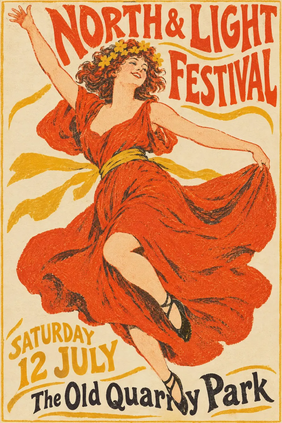
A joyful figure mid-movement, flat lithographic colour, and the title hand-drawn around her.
Opens an image model with the prompt in it. The price is on the page before you sign in.
What it is for
This is the moment the poster became an advertising medium. Cheret worked out that one big figure having a good time sells a night out, and nobody has improved on it.
The crayon texture keeps it warm. It is flat colour that still looks handmade, which is a combination most modern styles cannot manage.
How it works
One figure, large, caught mid-step, mid-dance or mid-laugh, filling most of the sheet. Limbs cropped by the edge are fine.
Colour is flat but textured: lithographic crayon grain, spatter and visible stone tooth. Three or four inks and the paper.
Lettering is hand drawn, loose, and wraps around the figure rather than sitting in a box. The background stays plain, often a single flat colour.
When to use it
Use it for a cabaret, a dance, a circus, a drinks launch, a summer ball, a fundraiser with performance in it.
Leave it alone for a serious or technical subject. The style is relentlessly cheerful.
Told apart from its neighbours
Art Nouveau is the ornamental branch of the same decade, with the whiplash line and the floral arch. Belle Epoque is looser and more commercial.
Golden Age travel posters are thirty years later, with airbrushed flat colour and a place rather than a person.
Toulouse-Lautrec sits between the two, flatter and more graphic than Cheret.
Where it was used
Jules Cheret printed over a thousand of these from 1866 and the dancing women became known as Cherettes. Toulouse-Lautrec's Moulin Rouge: La Goulue of 1891 took the same format and flattened it further, and the Paris streets of the 1890s were the gallery.
- Jules Cheret
- Toulouse-Lautrec
- Moulin Rouge bills
The prompt
Replace the blanks with your own event, keep the rest. Then run it on an image model.
poster for <event>, Belle Epoque colour lithograph 1890s, one joyful figure caught mid-movement filling most of the sheet, flat lithographic colour with crayon texture and visible stone grain, limited palette of vermilion mustard black and cream, loose hand-drawn display lettering wrapping around the figure, simple flat background, <date, time and place> hand-lettered along the base
What goes wrong
The model returns a detailed painted illustration. Ask for flat lithographic colour with crayon texture and visible stone grain, only three or four inks.
The second failure is a static pose. Say the figure is caught mid-movement, with limbs cropped by the edge of the sheet.
Leave out
photographic detail, digital gradients, dense pattern, modern typefaces
Watch for
The figure has to be moving. A standing portrait turns it into a period illustration.
Questions
Print it
Pay for the one run. No subscription, and the price is on the model page before you sign in.
Next to it in before the break