Futurist
- Futurism
- parole in liberta
Words thrown across the sheet at speed, with force lines and no baseline.
Opens an image model with the prompt in it. The price is on the page before you sign in.
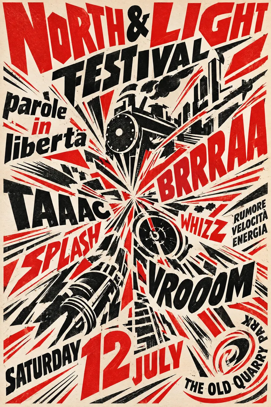
What it is for
Futurism wanted print to sound like a machine. Words are placed by force rather than by grid, so the sheet reads as noise made visible.
That makes it very good at energy and very bad at information, which is exactly the trade you sometimes want on a gig poster.
How it works
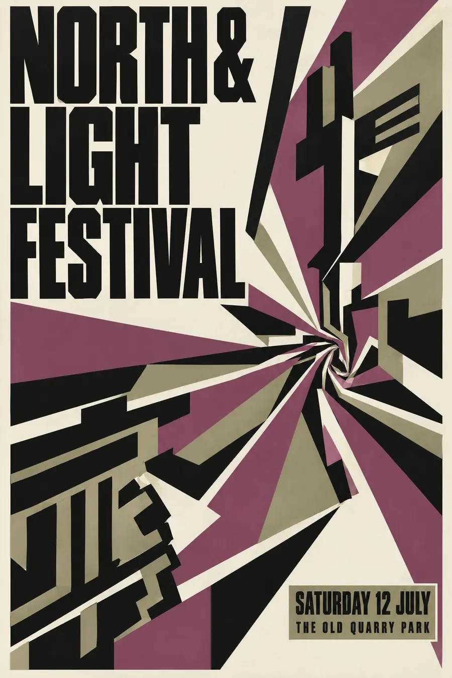
Pick a centre and explode outward. Words radiate from it at every angle, large near the centre and small at the edges.
Mix typefaces and sizes within a phrase. Letters of one word can be different sizes. There is no baseline anywhere.
Add force lines, speed marks and fragments of engines, propellers and gears. Three inks: red, black and the paper. Set one onomatopoeic word enormous.
When to use it
Use it for a noise gig, a motor event, a poetry night, a sports day, a sound art show, anything about speed or volume.
Leave it alone when people need to read the details. Futurism actively resists being scanned.
Told apart from its neighbours
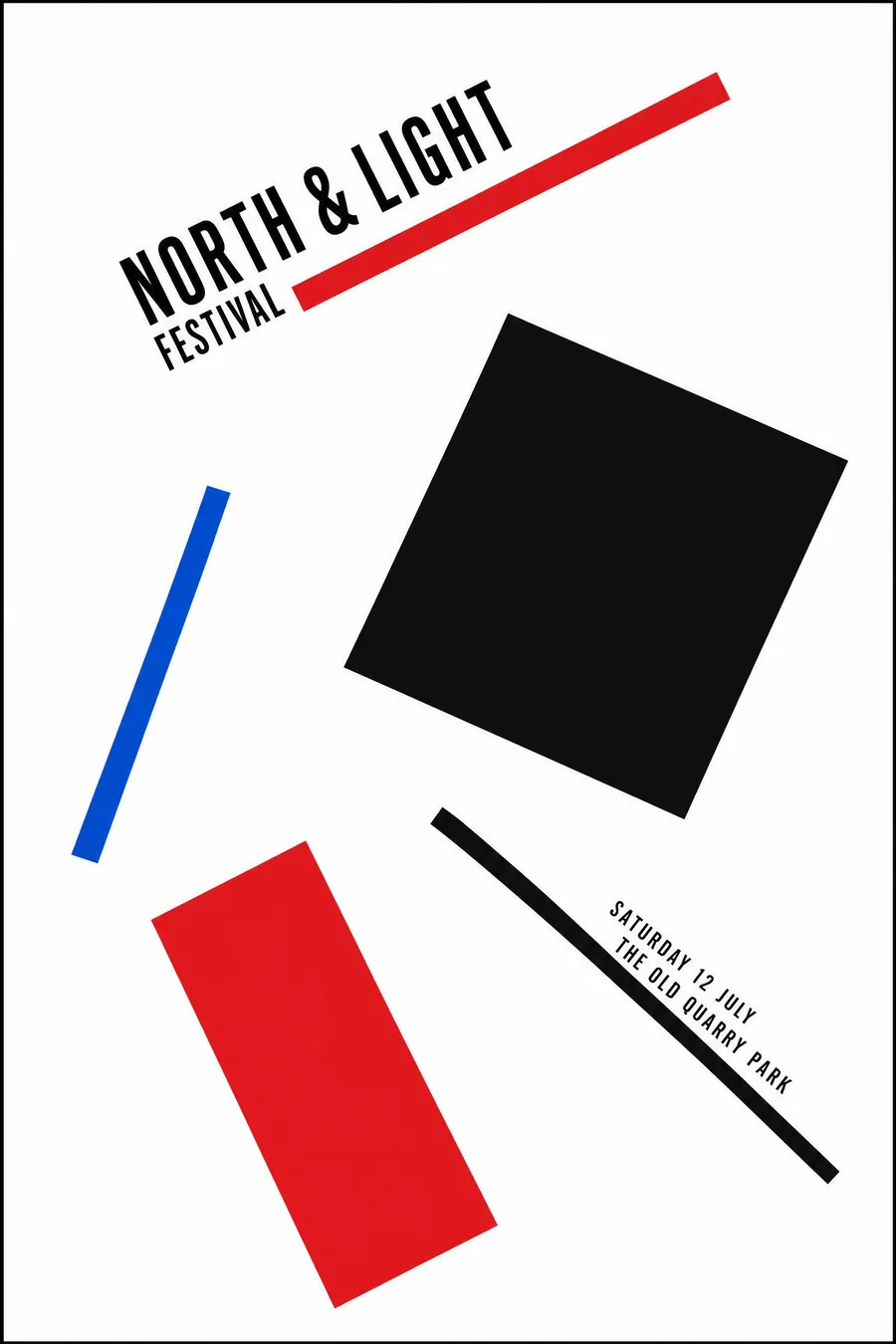
Constructivism uses diagonals too but keeps a structure and a clear message. Futurism abandons structure.
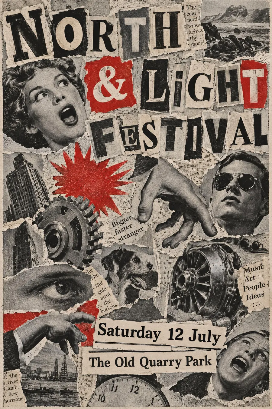
Dada collage is chaotic from cut paper and photographs. Futurism is chaotic from type and force lines.
Vorticism is the English cousin and is much harder edged, built from sharp angular planes rather than radiating words.
Where it was used
Marinetti published the Futurist Manifesto in 1909 and Zang Tumb Tumb in 1914, which is the typographic source. Fortunato Depero carried the style into advertising, including the Campari work, and the Depero Futurista book of 1927 was bolted together with two aluminium bolts.
- F T Marinetti
- Fortunato Depero
- Zang Tumb Tumb
The prompt
Replace the blanks with your own event, keep the rest. Then run it on an image model.
poster for <event>, Italian Futurist parole in liberta, words exploding outward from a central point at many angles, mixed typefaces and sizes colliding with no baseline, radiating force lines and speed marks, fragmented machine and engine shapes, red black and off-white letterpress, onomatopoeic words set very large, <date, time and place> spiralling around the edge
What goes wrong
The model returns a neat poster with the text on a slant. Say the words radiate outward from a centre at many angles with no baseline.
The second failure is one typeface. Ask for mixed typefaces and sizes colliding, even within a single word.
Leave out
calm alignment, single typeface, curves, pastel colour
Watch for
The words must radiate, not just tilt. A tilted tidy layout is not Futurism.
Questions
Print it
Pay for the one run. No subscription, and the price is on the model page before you sign in.
Next to it in the avant-garde shouts