Minimalism
- minimal art
- reductive style
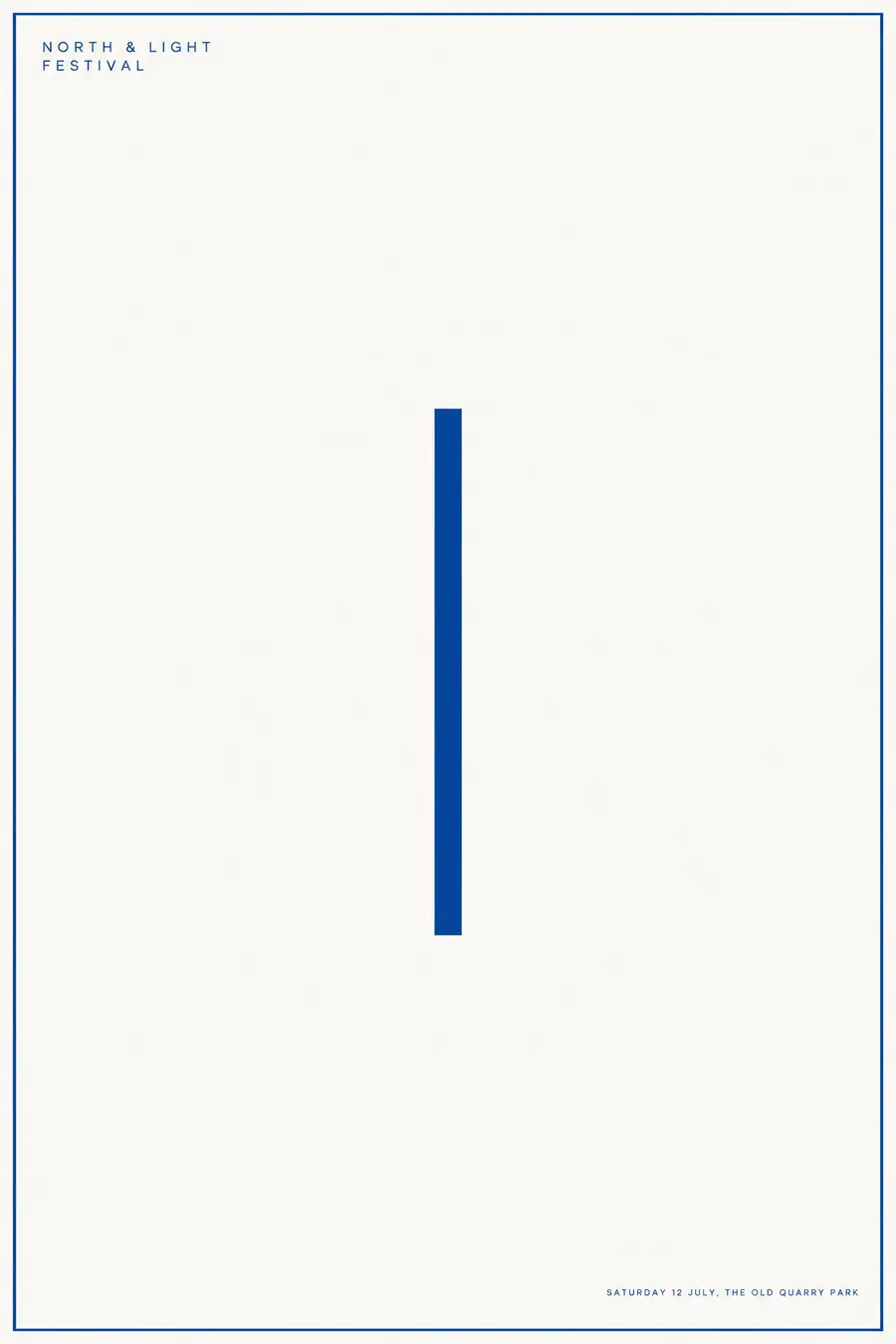
One element, placed exactly, on a very large empty field.
Opens an image model with the prompt in it. The price is on the page before you sign in.
What it is for
Minimalism gets attention through absence. On a wall of full sheets, an almost empty one is the one the eye stops at.
It is also the most forgiving style here when you have no image at all, because having nothing to show is the point.
How it works
Place one element and nothing else. A rectangle of colour, a single line, a single dot. Its position is the entire composition.
Leave at least nine tenths of the sheet empty. The margins should feel almost uncomfortable.
Two colours at most, no texture, no gradient. Type is very small, precise, and aligned exactly to the element or to the margin.
When to use it
Use it for a gallery, an ambient or classical concert, a design talk, a meditation event, a premium launch.
Leave it alone when the poster must carry six pieces of information. There is nowhere to put them.
Told apart from its neighbours
Japanese minimal poster allows one image and uses asymmetric negative space with a cultural accent. Art minimalism allows no image at all.
Swiss Style keeps a grid and several text blocks. Minimalism strips to one.
Monochrome plus a single accent is typographic. Minimalism is not.
- Japanese Minimal Poster
- Swiss Style
- Monochrome + Single Accent
- Suprematism
Where it was used
Donald Judd's boxes, Agnes Martin's grids and Ellsworth Kelly's single-colour panels are the reference points, all from the 1960s. Gallery posters for those shows are usually more minimal than the work itself.
- Donald Judd
- Agnes Martin
- Ellsworth Kelly
The prompt
Replace the blanks with your own event, keep the rest. Then run it on an image model.
poster for <event>, Minimalist art poster, one single element only, a plain rectangle or a thin line placed with precision, ninety percent empty ground, two colours at most, no texture and no gradient, very small precise sans type in one corner, enormous margins, perfect alignment, <date, time and place> in one line of small type at the foot
What goes wrong
The model adds a second shape for balance. Say one single element only and nothing else on the sheet.
The other failure is a texture or a subtle gradient. Ask for flat colour with no texture and no gradient at all.
Leave out
illustration, texture, more than two colours, decoration, multiple elements
Watch for
One element means one. A second shape doubles the noise and halves the effect.
Questions
Print it
Pay for the one run. No subscription, and the price is on the model page before you sign in.