Japanese Minimal Poster
- Japanese contemporary poster
- ma poster
- Nagai style
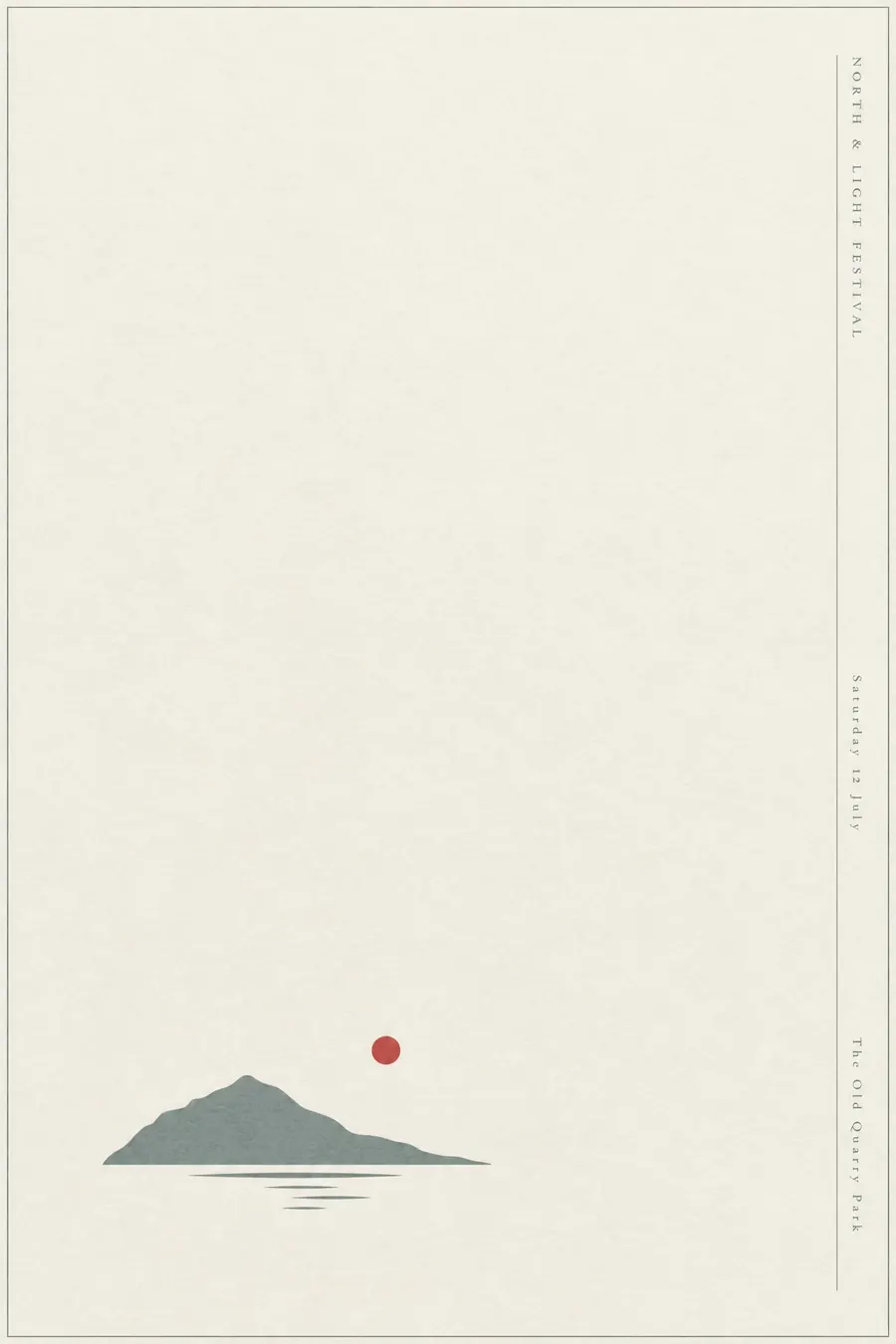
One quiet element, an enormous amount of empty space, and a vertical line of small type.
Opens an image model with the prompt in it. The price is on the page before you sign in.
What it is for
Japanese minimal posters use ma, the interval, as an active element rather than as leftover space. The emptiness is doing something, and that is why they feel calm rather than unfinished.
It is also the most confident-looking style available when you have almost nothing to show.
How it works
One element, placed low and to one side, never centred. It should occupy well under a fifth of the sheet.
Palette is off-white and one muted colour, with at most a single red dot as an accent.
Set the type very small in a vertical column down one edge, with a hairline rule. Matte paper, no texture, no gloss.
When to use it
Use it for a gallery, a ceramics or craft show, a tea event, a classical or ambient concert, an architecture talk, a premium launch.
Leave it alone when the poster carries a lot of information or has to compete on a busy wall.
Told apart from its neighbours
Western minimalism removes everything for its own sake. The Japanese version treats the empty space as a positive element with its own weight.
Swiss Style keeps a visible grid and several text blocks aligned to it.
Japonisme is the nineteenth century European borrowing, with pattern and colour still in it.
- Minimalism
- Swiss Style
- Monochrome + Single Accent
- Japonisme
Where it was used
Ikko Tanaka's Nihon Buyo poster of 1981 is the best known single sheet. Kazumasa Nagai and Shigeo Fukuda built the same tradition, and Kenya Hara's work for Muji from 2001 carried it into retail.
- Ikko Tanaka
- Kazumasa Nagai
- Kenya Hara
The prompt
Replace the blanks with your own event, keep the rest. Then run it on an image model.
poster for <event>, contemporary Japanese minimal poster, one restrained central element with an enormous field of empty space around it, asymmetric placement low and to one side, extremely restrained palette of off-white and one muted colour with a single red dot, a vertical column of very small type down the right edge, a fine hairline rule, perfect balance between the mark and the emptiness, matte paper, <date, time and place> in the vertical column
What goes wrong
The model fills the sheet. Say one element only, under a fifth of the sheet, with an enormous field of empty space.
The second failure is large type. Ask for a vertical column of very small type down one edge.
Leave out
clutter, large type, bright colour, multiple elements, centred layout
Watch for
The empty space is the subject. If the element fills more than a fifth of the sheet the style is gone.
Questions
Print it
Pay for the one run. No subscription, and the price is on the model page before you sign in.