Festival of Britain
- 1951 style
- contemporary style
- Skylon era
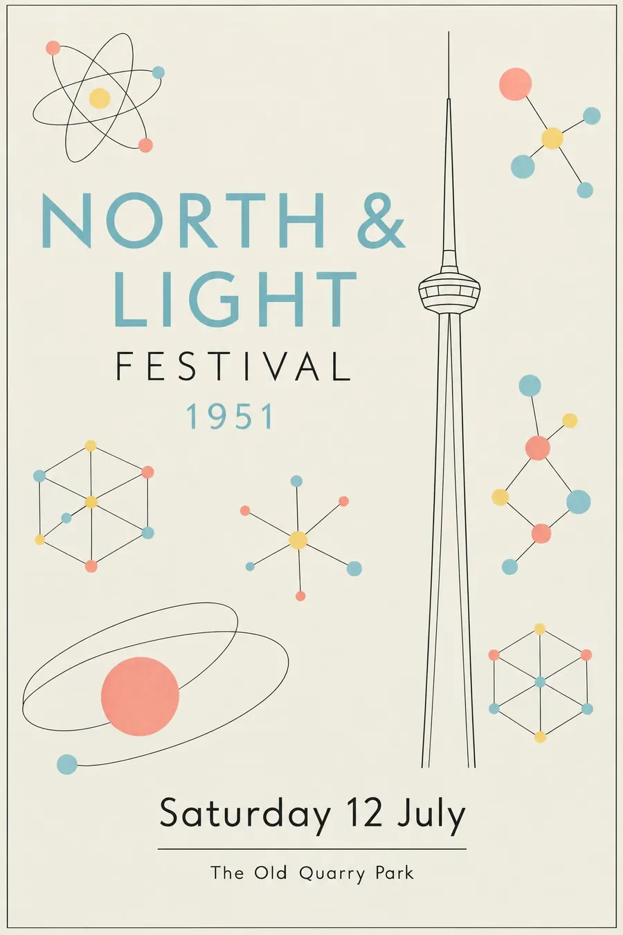
Spindly line drawing, molecular shapes and a cheerful postwar optimism about science.
Opens an image model with the prompt in it. The price is on the page before you sign in.
What it is for
The Festival style is optimism drawn as a diagram. Britain had come out of rationing and decided the future was crystallography, and the graphics say so.
The thin line also makes a poster feel light and unthreatening, which almost nothing else in this catalogue manages.
How it works
Draw thin. Fine even line weights throughout, with no heavy shapes anywhere.
Use the period vocabulary: atoms as balls joined by rods, crystal lattices, and one slender vertical structure standing for the Skylon.
Flat pale colour, duck egg blue, primrose, coral, with the black line drawn over the top. Keep the composition open, with air around every element. A friendly humanist sans in two sizes.
When to use it
Use it for a science festival, a village fete, a school event, a garden party, a design talk, a local history event, a summer fair.
Leave it alone when you need weight or urgency. The style is cheerful and very light.
Told apart from its neighbours
Mid-century modern graphic uses flat cut shapes and print texture. The Festival style is line-led and thin.
Travel posters are airbrushed and heavier. The Festival is drawn.
Swiss Style is photographic and gridded, with none of the whimsy.
Where it was used
The Festival of Britain ran on the South Bank in 1951, with Abram Games designing the emblem and the Skylon standing as the symbol of the whole thing. The Festival Pattern Group put crystallography diagrams onto textiles and wallpaper, which is where the motifs come from.
- Abram Games
- the Skylon
- Festival Pattern Group textiles
The prompt
Replace the blanks with your own event, keep the rest. Then run it on an image model.
poster for <event>, 1951 Festival of Britain contemporary style, spindly thin-line drawing with fine even strokes, atomic and molecular motifs of balls joined by rods, crystal lattice patterns, a slender vertical structure like the Skylon, flat pale colour of duck egg blue primrose and coral with black line over it, light open composition with air around everything, a friendly humanist sans in two sizes, <date, time and place> in a small line under a rule
What goes wrong
The model returns solid mid-century shapes. Ask for spindly thin-line drawing with fine even strokes and no heavy shapes.
The second failure is a saturated palette. Say flat pale duck egg blue, primrose and coral with a black line over the top.
Leave out
heavy shapes, dark colour, ornament, photographic texture, dense layout
Watch for
Everything is thin. Heavy line weights turn it into ordinary mid-century graphics.
Questions
Print it
Pay for the one run. No subscription, and the price is on the model page before you sign in.
Next to it in places sold as places