Zagreb School Animation
- Zagreb Film style
- Yugoslav animation
- reduced animation
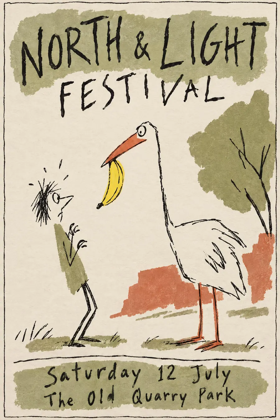
A wiry expressive line, flat washes that miss the edges, and a lot of bare paper.
Opens an image model with the prompt in it. The price is on the page before you sign in.
What it is for
Zagreb animators had no budget for full animation, so they reduced: fewer drawings, fewer lines, more implication. The economy became a style and then an argument.
On a poster the loose line and the offset colour read as intelligent and funny at once, which is a very useful combination.
How it works
Draw fast with a nervous wiry ink line of uneven pressure. Characters are reduced to a few defining marks, not fully drawn.
Lay flat colour washes deliberately out of register so they overlap the line in places and miss it in others.
Leave large areas of bare paper. Palette is muted olive, brick and ink black with one bright accent. One absurd visual gag carries the sheet, and the lettering is hand drawn and irregular.
When to use it
Use it for an animation festival, a comedy night, a film club, a theatre production, a children's event with wit, a design talk.
Leave it alone when you need polish. The whole style is built on looking unfinished.
Told apart from its neighbours
Push Pin is decorative, confident and filled. Zagreb is nervous, sparse and offset.
Polish posters are painted and surreal. Zagreb is drawn and comic.
Contemporary flat illustration is the modern cousin with perfect registration and no wit in the line.
Where it was used
Zagreb Film was founded in 1953 and won the animated short Oscar in 1962 with Dusan Vukotic's Ersatz, the first non-American film to do so. The studio's posters and title cards share the reduced line of the films.
- Zagreb Film
- Dusan Vukotic
- Ersatz
The prompt
Replace the blanks with your own event, keep the rest. Then run it on an image model.
poster for <event>, Zagreb School animation style, a nervous wiry ink line drawn quickly with uneven pressure, flat colour washes deliberately laid off register so they miss the outlines, extreme character reduction to a few defining marks, large areas of bare paper, one absurd visual gag, muted palette of olive brick and ink black with one bright accent, hand-drawn irregular lettering, <date, time and place> written along a wobbly rule
What goes wrong
The model returns clean flat illustration. Ask for a nervous wiry ink line with uneven pressure and colour washes laid deliberately off register.
The second failure is a full sheet. Say large areas of bare paper are left empty.
Leave out
clean vector line, full colour fills, symmetry, realistic proportion, dense detail
Watch for
The colour must miss the line. Perfectly filled shapes remove the whole character of the style.
Questions
Print it
Pay for the one run. No subscription, and the price is on the model page before you sign in.