Italian Futurist Typography
- Depero style
- Futurist advertising
- arte pubblicitaria
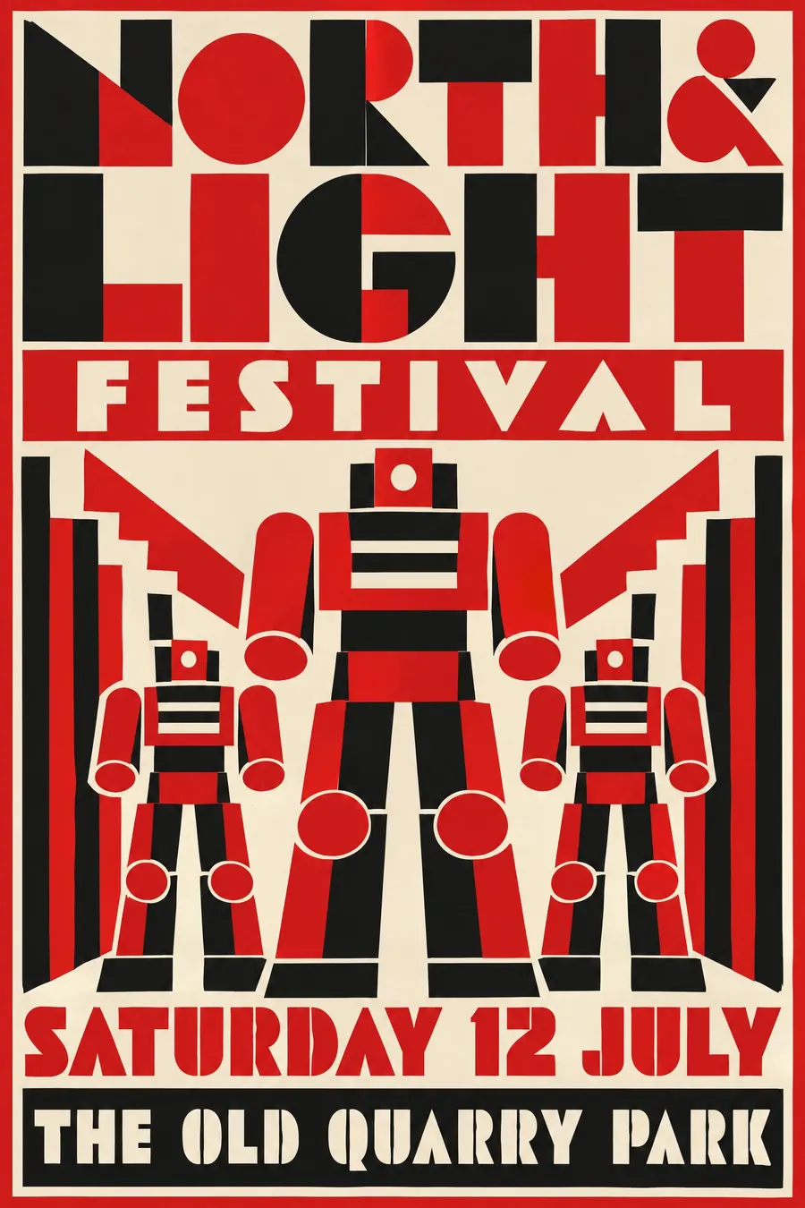
Futurism grown up and sold: mechanical letterforms built from blocks, in red and black.
Opens an image model with the prompt in it. The price is on the page before you sign in.
What it is for
This is what happened when Futurism stopped writing manifestos and started taking commissions. The energy survived and the chaos did not.
Letters built from blocks also solve a real problem: they give a title mass and structure, which makes a poster work at a distance.
How it works
Construct the letterforms from solid geometric blocks, so each character looks assembled rather than drawn. Slab and stencil capitals stacked into a mass.
Add mechanical figures with cylinder limbs and no faces, repeated to create rhythm.
Flat red, black and cream, no shading anywhere. Build a strong vertical stack and break it with one horizontal bar.
When to use it
Use it for a design event, a coffee or drinks launch, an industrial or maker event, a motor show, a typography talk, a club night.
Leave it alone when the subject is soft or personal. Everything here is machined.
Told apart from its neighbours
Early Futurism explodes words across the sheet with no baseline. This is the later disciplined version, built into a solid mass.
Constructivism is Russian, uses photomontage and carries a political message. Depero is Italian, commercial and abstract.
Art Deco is ornamental and symmetrical, where this is mechanical and stacked.
Where it was used
Fortunato Depero moved Futurism into advertising in the 1920s, most famously for Campari, where he designed the conical bottle in 1932. Depero Futurista, the 1927 book bolted together with aluminium bolts, is the typographic source.
- Fortunato Depero
- Campari advertising
- Depero Futurista
The prompt
Replace the blanks with your own event, keep the rest. Then run it on an image model.
poster for <event>, Italian Futurist advertising typography in the manner of Depero, letterforms constructed from solid geometric blocks as if built from machine parts, bold slab and stencil capitals stacked into a solid architectural mass, mechanical robot-like figures with cylinder limbs, flat red black and cream with no shading, repeated shapes creating rhythm, a strong vertical stack broken by one horizontal bar, <date, time and place> in a solid black block
What goes wrong
The model returns exploding scattered type. Ask for letterforms constructed from solid geometric blocks, stacked into an architectural mass.
The second failure is shading. Say flat red, black and cream with no shading and no gradients.
Leave out
handwriting, curves, decoration, soft colour, photographic elements
Watch for
The letters are built, not written. Each one should look assembled from parts.
Questions
Print it
Pay for the one run. No subscription, and the price is on the model page before you sign in.