Swiss StyleITS
- International Typographic Style
- Helvetica style
A strict grid, one accent colour, and Helvetica doing all the talking.
Opens an image model with the prompt in it. The price is on the page before you sign in.
What it is for
Swiss Style treats the reader as competent. Nothing is decorated, nothing is explained twice, and the hierarchy tells you what matters in the order it matters.
It also ages slowly. A Swiss poster from 1958 and one from last week are hard to date apart, which makes it the safe choice when a poster has to live on a wall for a year.
How it works
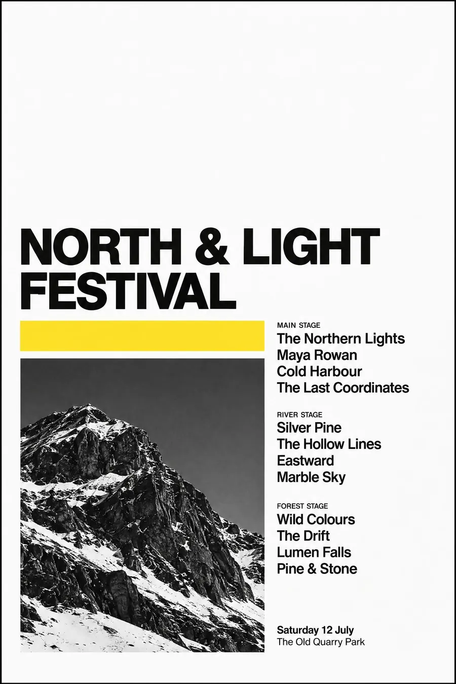
Set an invisible modular grid and align everything to it. Type is flush left and ragged right, never centred, never justified.
Use one typeface, usually Helvetica or Univers, in three sizes. Size is the only signal of importance. No bold soup, no italics.
Black, white, and one flat accent. One image at most, either a high-contrast photograph or a single geometric shape, and it must be doing real work. Leave a third of the sheet empty.
When to use it
Use it for a concert series, a lecture, a museum, a timetable, a conference, anything where the information matters more than the mood.
Leave it alone when you want warmth or fun. The style is deliberately neutral and reads as institutional on a children's event.
Told apart from its neighbours
Bauhaus composes with coloured shapes on a diagonal. Swiss Style hides the grid and lets type and photography carry the page.
Wayfinding style is the applied descendant, with icons and arrows added for a physical space. Swiss keeps it flat and abstract.
Contemporary editorial mixes a serif in and loosens the grid, which is exactly what Swiss forbids.
Where it was used
Josef Muller-Brockmann's Zurich Tonhalle concert posters from the 1950s are the standard, and his Der Film poster of 1960 is the one in every textbook. Armin Hofmann and Emil Ruder taught the method in Basel, and Helvetica arrived in 1957 to finish the job.
- Josef Muller-Brockmann
- Armin Hofmann
- Emil Ruder
The prompt
Replace the blanks with your own event, keep the rest. Then run it on an image model.
poster for <event>, Swiss International Typographic Style, strict modular grid, flush-left ragged-right Helvetica in three sizes, black and white with one flat accent colour, a single high-contrast photograph or one geometric shape, very large empty area at the top, <date, time and place> in a small aligned block at the foot
What goes wrong
The model centres the type and adds a decorative flourish. Say flush left, ragged right, no centred lines and no ornament of any kind.
The second failure is a full sheet. Ask explicitly for a large empty area, roughly the top third, and only one image.
Leave out
ornament, centred type, illustration, drop shadows, more than one accent colour
Watch for
The empty space is the design. Fill it and there is nothing left of the style.
Questions
Print it
Pay for the one run. No subscription, and the price is on the model page before you sign in.