Arts and Crafts
- William Morris style
- Morris & Co
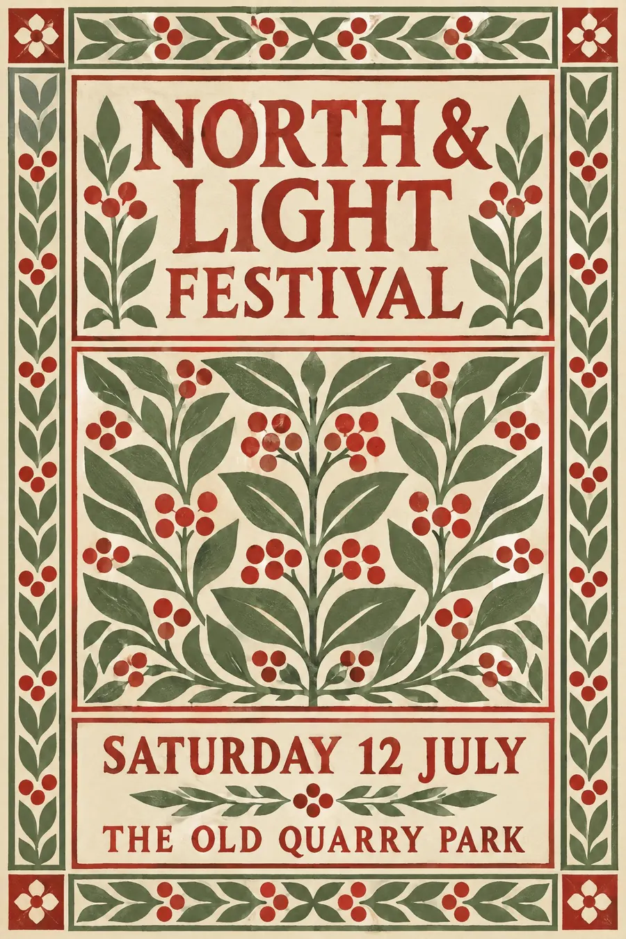
Flat repeating plant pattern, a heavy border, and lettering that looks hand cut.
Opens an image model with the prompt in it. The price is on the page before you sign in.
What it is for
Arts and Crafts reads as made by a person who cared. The pattern is dense, the border is heavy, and nothing is left to a machine, so the poster promises care about the thing it advertises.
It also reads old on purpose. The movement was a protest against factory printing, so the look carries a village hall, a church fund and a craft table before you have written a word.
How it works
Build it in panels. A border wraps the sheet, a title panel sits at the top, and the detail goes in a matching panel at the base. The symmetry is strict.
The pattern is flat colour with a drawn outline, repeated edge to edge. Leaves, stems, berries and birds, all facing front, all the same weight of line. Nothing casts a shadow.
The type is drawn rather than set: roman capitals with thick stems, tight spacing, sometimes a woodcut initial. The palette stays earthy, four or five colours mixed from madder, indigo, sage and cream.
When to use it
Use it for anything with heritage in it: a village fete, a church restoration fund, a craft market, a garden opening, a small press launch.
Leave it alone for anything that has to read fast or feel current. The border eats the space a big headline needs, and the density slows the eye down on purpose.
Told apart from its neighbours
Art Nouveau uses the same plants and lets them whip. Arts and Crafts keeps them ordered in a repeat, so if the stems are curling into the title you have crossed over.
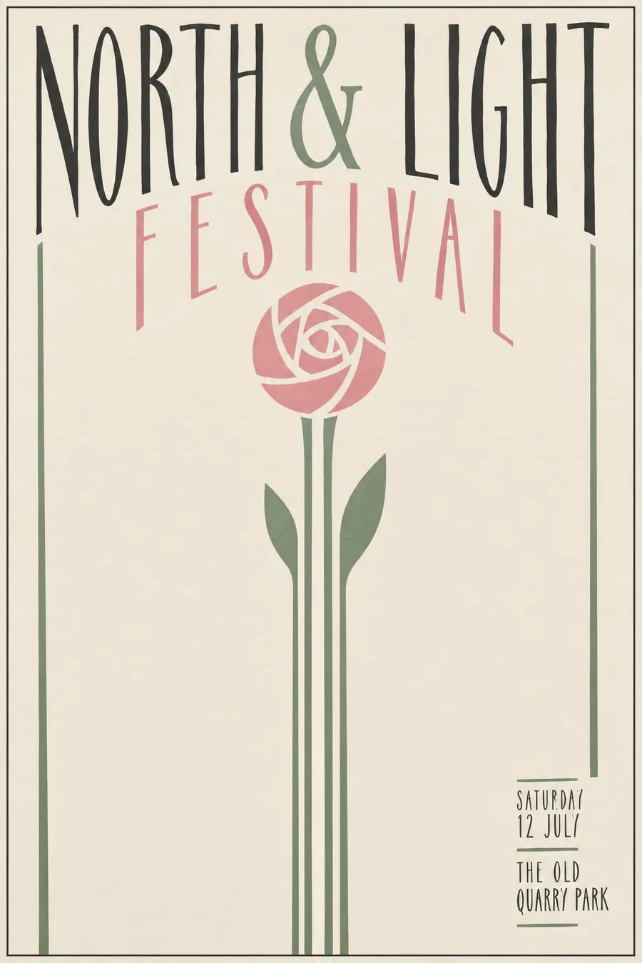
Glasgow Style strips the pattern back to a few tall stems and a lot of empty space. Arts and Crafts fills the sheet.
Where it was used
William Morris built the vocabulary at Morris & Co and then set it in type at the Kelmscott Press, where the 1896 Chaucer put a drawn border around every page. Walter Crane carried the same flat pattern onto trade union banners and children's books, which is where most people have actually seen it.
- William Morris
- Kelmscott Press
- Walter Crane
The prompt
Replace the blanks with your own event, keep the rest. Then run it on an image model.
poster for <event>, Arts and Crafts style, flat repeating plant pattern of leaves and berries, thick decorated border framing the whole sheet, hand-cut roman capitals, muted madder red sage green and cream, symmetrical panel layout, <date, time and place> in the lower panel
What goes wrong
The model returns Victorian wallpaper: shaded leaves, gold embossing, a photographic sheen. Ask for flat colour, a drawn outline on every shape and no gradient anywhere.
The second failure is modern type dropped into an old frame. Say the lettering is hand cut roman capitals drawn to match the border, not a typeface placed on top of it.
Leave out
photographic depth, gradients, gloss, sans-serif type
Watch for
The pattern is flat. Any shading on the leaves turns it into Victorian wallpaper instead.
Questions
Print it
Pay for the one run. No subscription, and the price is on the model page before you sign in.